Definition of a conversion rate
The conversion rate of a website (its optimization is called CRO, Conversion Rate Optimization) is the ratio between your number of visitors and the number of visitors who have performed an action on your site.
The conversion rate is a very important performance indicator. It allows you to understand the behaviour of your visitors by analysing their actions: downloading a document, making a purchase or transaction, subscribing to your newsletter, sending a message, etc.
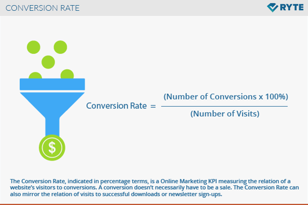
To calculate it simply: Conversion rate = (Number of conversions (e.g. transactions) x 100) / Number of unique visitors.

Knowing your conversion rate allows you to better control your SEO: generate / convert leads or improve your sales figures through A/B testing and other experiments, for example.
There is an overall conversion rate related to your main goal, namely maximum winnings. But there can also be intermediate conversion rates related to sub-objectives, which correspond to the various steps of the buying process, and that are independently interesting.
The final goal, as you can imagine, is to get the highest overall conversion rate possible.
💡 First: be aware that the average conversion rate is around 2,35%. So no need to panic, if yours seems very low. The conversion rate varies depending on the industry, the product, the channel, the country…
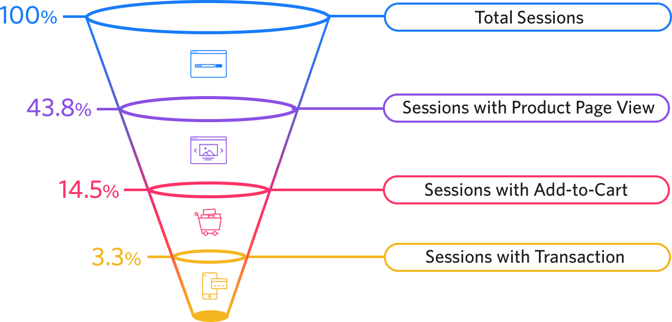
The customer purchase path is a conversion tunnel, called a funnel, as shown below.
As you can see, at each step, the session rate decreases until the purchase step.
To reduce this gap between traffic and conversion rate, you must first qualify your prospects. To do this, you must target the people you have defined as your ideal customers, by using buyer personas, but also by improving your acquisition channels (natural and paid search, advertising on social networks, email campaigns…).
But, then, how do we increase this conversion rate?

How to improve your conversion rate?
There are various easy techniques to increase your number of sales, and therefore your turnover.
However, you should know that there are many factors that can influence the conversion rate of your prospects:
-
Your registration tunnel is too complicated, or cumbersome
-
And / or the same goes for navigating your site and finding the right product
-
The general appearance of your site is not very reassuring, for example, you do not have HTTPS protocol enabled.
-
The user encounters technical problems during the visit
-
You have not optimized your advertising campaigns, for example, your website presents something different to the one presented in the advertisement
-
The payment modes do not fit their culture or their shopping habits
-
Your CTAs (calls-to-action) are not visible enough or not optimized
-
….
But don't worry, we will see throughout this article how to improve your website navigation and implement (easy) techniques to make your products and services more attractive.
Grab your notepad, let's get started!
Improve your conversion rate: make your online store technically reliable
You should know that the page loading time may cause your visitors to leave your site (and it would be a pity once you have promoted your website, worked on SEO, or invested in advertising (SEA).
If your page doesn't charge within 3 seconds, a large portion of your visitors may go away. According to some studies on mobile services, each additional second of loading time reduces the conversion rate by 7%.
And that is a pity, especially for a detail (which is not actually one). Especially since the vast majority of these runaways will be lost forever.
In view of these figures, we can say that having performing pages, for an e-commerce website, is a must-have.
Small reminder
To improve the loading time of your pages, here is a checklist of elements to take into account. Contact your webmaster if you have your website made professionally, while most of the work is already done with a website creation platform.
-
Test your site on platforms such as Google PageSpeed Insights and Google's mobile friendly test tool.
-
Be sure to select a web host that matches your traffic
-
Optimize the weight/quality ratio of your images and videos
-
Check that your JavaScript/CSS files don't slow down the display, if this is the case, just place them in the page code or load your scripts asynchronously.
-
Set an expiration date for static resources in HTTP headers: this means properly using the browser's caching features, to look on the hard disk rather than on the network.
Admittedly, this is a bit technical. However, no one can deny it: you need to have a high-performance website in order to have a great online experience.
Have a higher conversion rate: work on design and navigation
We sometimes underestimate the importance of appearance, both in life and on the internet.
More than 90% of Internet users say that the visual aspect of a site influences their behaviour.
Consequence: work on the taxonomy of your website. This astonishing word has nothing to do with stuffing animals.
It is rather the classification and categorization of the contents, according to different keywords. This allows you to guide visitors to your site, and to facilitate the understanding by search engines.
Of course, make sure that your products are easy to access: the tree structure of your site should be logical and consistent.
Don't forget the responsive design
You certainly already know it, but be sure your online store is mobile-friendly. In 2019, according to the RetailMeNot study, more than 60% of online shoppers are using their smartphone or tablet.
Even today, few e-commerce sites are designed with a responsive layout: readability is not optimal, general terms and sales conditions are not always clear, there is no search bar and / or SEO has not been done…
Let's see how to take advantage of this untapped potential.
-
Limit the steps of the funnel: search > product > cart > transaction
-
Add a breadcrumb trail
-
Pay attention to font sizes, make your pages lighter and reduce the number of words
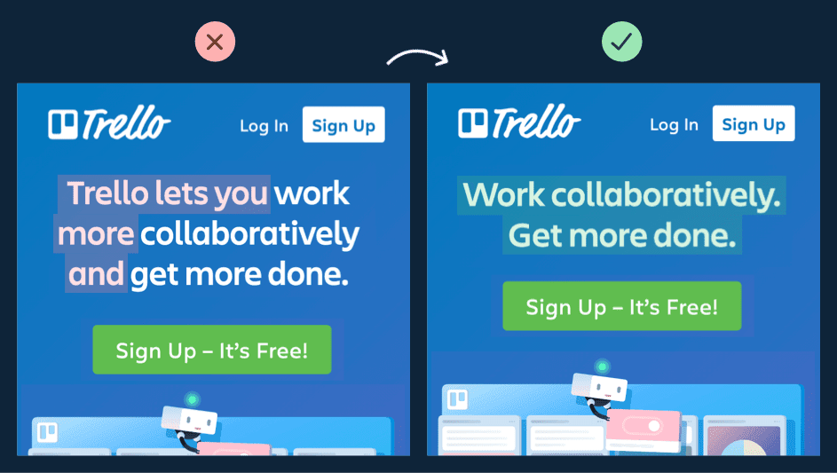
Design should be based on UX (User Experience), UI (User Interface), but also on the quality of UX writing, which is the attention paid to the content, the language, and the tone used to convince your prospects.
Here is an example of optimized UX writing, done by Trello 👇

Is customer experience the key to an excellent conversion rate?
Denis Boschard, Digital & Business Director of Boulanger, underlines: "Creating a fluid, fast, simple and seamless navigation experience is an imperative to meet brand image and business expectations".
As we have just seen, technologies related to website design, especially on mobile devices, have made huge advances. The attention paid to the user experience is necessary to add value to your service.
This should be the case on the shopping cart page where the transaction is validated, and other products are also offered.
But also suggestions of items purchased by people that have viewed the same product; they use data collected by tracking pixels to suggest relevant products.
Netflix

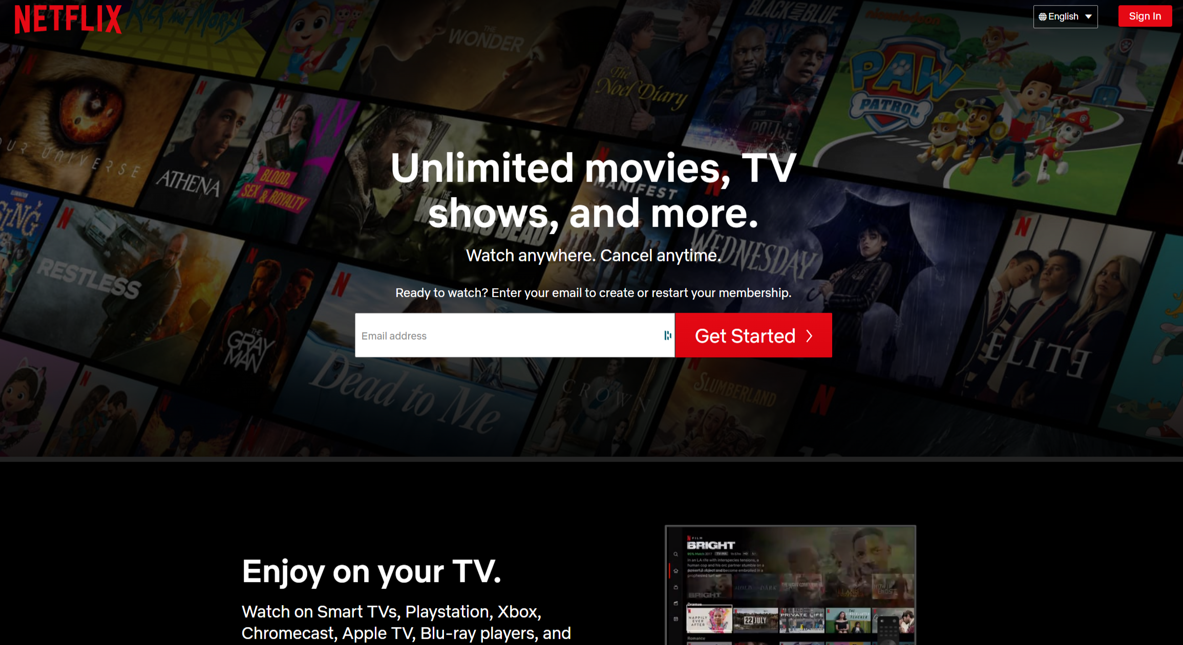
The strength of Netflix, which we no longer need to introduce, is its very advanced algorithm that allows it to suggest movies and series that you may like.
What users love about Netflix is its ease of use and video suggestions.
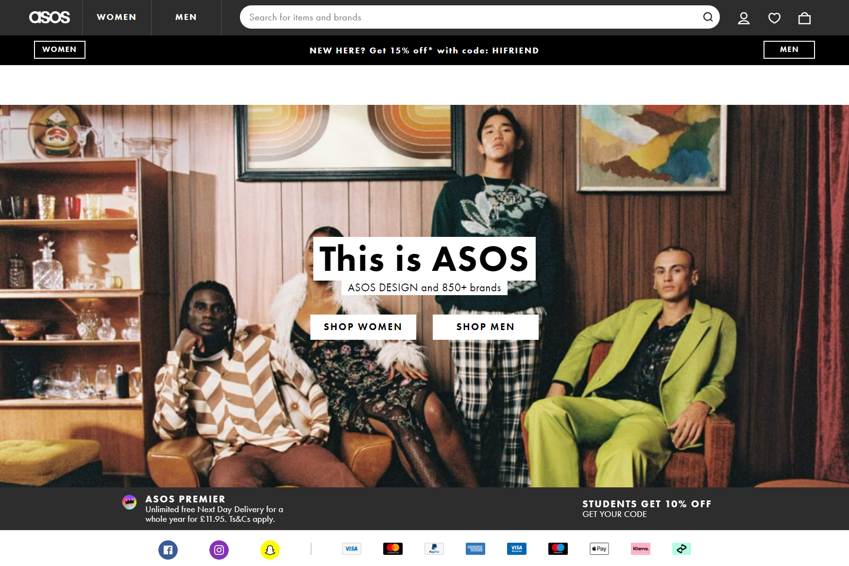
Asos

Asos is an e-commerce company that assists its customers in purchasing. It also values customers, after they've made a purchase, by sharing outfits with the hashtags #asom (As Seen On Me) and #asos (As Seen On Screen).
Asos, in this case, uses micro influencers by reaching out to their community; and inspires others with concrete examples.
Increase your conversion rate: a shortened purchase funnel
Logically enough, your purchase funnel should not be too long. On the contrary, the shorter it is, the better.
So, to avoid embarrassing situations, and to optimize your buying process as much as possible:
-
Avoid requiring your customers to open an account to buy (make it possible to do without), or at least, allow the creation of an account, via social media or Gmail.
-
Try not to exceed 5 steps in the buying funnel
-
Don't ask too much information to your users when they register
-
Display a breadcrumb trail (or other progress line) to follow the purchase process
-
Add a back button, so you can go back in case of a mistake,
-
Allow quick access to your items
One of the keys to a good conversion rate: the CTA
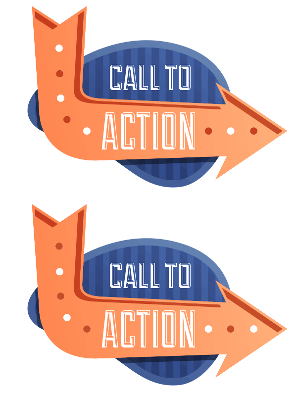
What we call call-to-action buttons (CTA) are buttons, links or visuals that encourage users to perform specific actions (registration, purchase, etc.).
These CTAs are very important, because they considerably influence the conversion rate, and therefore your sales.

What does an effective CTA look like?
A good CTA should go “Boom.” 💣
First and foremost, a Call to Action should be visible: its presence should be obvious, and immediately catch the eye.
It should contrast with the rest of the site.
Contrast and emphasis can be based on different parameters:
-
Colour: try to choose a bright colour (green, orange and yellow buttons are good converters), the most important thing being that it stands out from the rest of the website. However, be careful not to choose colours that are contradictory to your brand's keywords and values. Hence, the interest (maybe) of having an uncluttered site, with a rather neutral colour, with which you can mix all other colours.
-
Typography and wording: buttons can have a different font. Don't hesitate to add effects, such as 3D or shadow. As for the text, try to use action verbs, but not imperatives that are a bit too aggressive (for example, it’s better to say “Get started” rather than “You should get started now”).
💡 Note that in a blog post, it can be useful to create CTA links, rather than buttons, as we have noticed that users tend to ignore them, considering them as advertising.
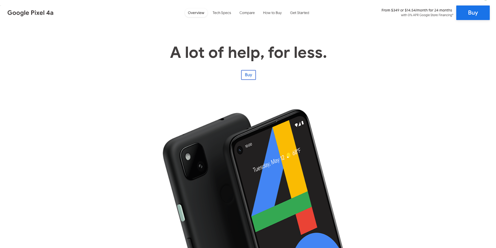
Google relies on a style, similar to Apple's, to present its new products: clean pages, a simple but impressive catchphrase, efficient and visible buttons, and the product at the center of the page. 👇

Conversion rate and A/B Testing
If you hesitate between several colours, several layouts, several styles, several... In short, if you hesitate, you can simply do some tests. To do this, you can use Google Analytics, and analyze your website's statistics, in order to improve your pages according to the results.
There are also tools specialized in this kind of tests, like AB Tasty or Optimizely.
A/B tests are particularly useful for your landing pages.
How to increase your conversion rate by using reassurance?
One of the main obstacles to achieving a good conversion rate is the fact that users are by nature distrustful. We can't blame them, as there are many scams on the internet.
To counter this mistrust, there is nothing like reassurance: that is to say the elements that reassure consumers, and help you to remove the disincentives to purchase
Here are some examples:
-
Your website appearance: clean and clear layout, good site structure, correct language… everything that gives your website a “professional” appearance.
-
A FAQ section to answer your customers' queries.
-
Storytelling, pictures of you, your team, your office… everything that makes you real and authentic
-
Labels and certificates of guarantee
-
The choice of payment solutions
-
Commercial arguments
-
Testimonials, reviews, and customer ratings
A note about customer reviews: if you are reluctant to post them for fear of receiving negative reviews, you should know that it would be a shame not to do it. Because reviews will help you to know your audience better, and to improve the quality of your products or services. This will be beneficial in the long run.
Great buttons, an efficient purchase funnel, a lot of reassurance elements… At this stage, you are already very convincing… Let's continue!
How to get a good conversion rate? Highlight your products!
Great importance must be given to the presentation of products.
The information must be clear, research must be relevant, texts should be well-thought-out, and images should highlight the product.
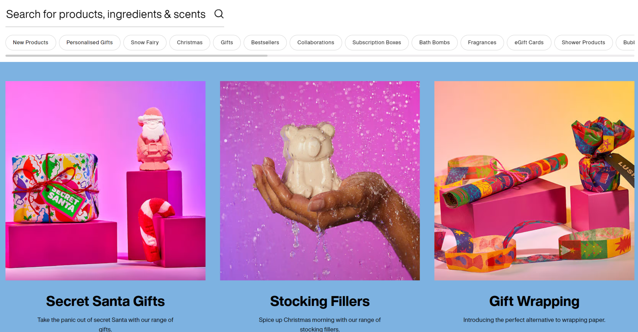
The cosmetics brand Lush, for example, has decided to stand out using videos to make product descriptions more attractive, and to show them more accurately. The recommendations are adapted according to the products: and the descriptions are fun and refreshing.

For Halloween, the brand decided to release a special collection. They changed the whole website (“a click or a spell”, “No tricks… Just treats”, “No monster was hurt during these experiments.”), but also the name of the products and their description.
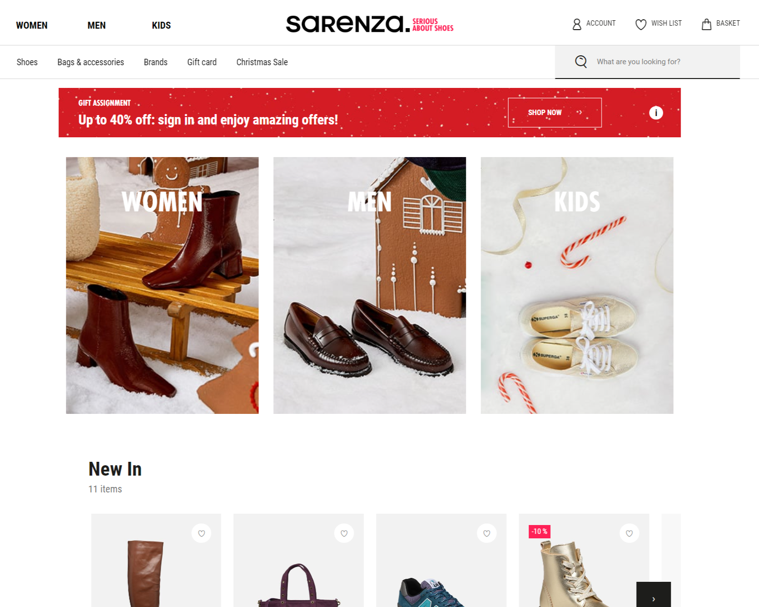
Sarenza is also known to offer a great user experience. Products that may interest the user are associated with each product, but also guides and inspirations.

Start by optimizing your product descriptions
Highlight your star products, they will catch your visitors' attention.
On your product descriptions: detailing your products, and adding multiple photos, or even videos, will have a double advantage. This will not only allow you to enhance your products, but also to reduce the return and refund rate.
You can use cross-selling (complementary products, in the form of advice, for example), or compare your products, to support the customer's choice, and thus facilitate the purchase.

For example, if we look at the list of products on two different online stores, we can see two types of design: a list and a Z shape, which does not have the same impact on the reading of the text.
A linear organization is much more intuitive, making it easier to focus on the products.
Once you have chosen the organization, highlight your products in order to make it easier to find information, to avoid users getting frustrated.
For example:
-
Set up an infinite scrolling on the product pages to limit the number of clicks and improve pagination.
-
Try to simplify your information. Filling in a form should be simple: whether it is a quantity, a weight, a size, or a colour… Make sure that you have everything set up so that it is possible to select the product without filling in any fields.
-
A product is no longer available? Add a pre-order form, or a form to be informed when it is available again.
Coupons and discounts could be time limited to create a sense of urgency. They are a marketing tool that shouldn't be overlooked! According to a study by the website Smartbear, from 2017, 57% of consumers say they wouldn't have made a purchase without a coupon
Sometimes all it takes is a little push!
Put forward your sales pitch: free delivery, money-back guarantee, free technical support, etc.
The importance of video
According to studies on the impact of online videos, the conversion rate of an email is 300% higher with a video, and 64% of consumers say they are more likely to buy online after watching a video of a product or service.
Impressive!
So call on professionals, or invest in a camera, and start shooting! 🎬
Inbound marketing practices for a better conversion rate
Inbound marketing allows you to get what you want, namely to increase your conversion rate for example, by being gentle.
Here are some examples of inbound marketing practices:
-
Newsletter: writing a good newsletter is creating a special relationship with your readers, establishing a climate of trust, providing them with real added value.
-
Abandoned cart email: this is an automated practice. Sending an email, at the right time, to your cart abandoners will give you a good chance of catching them up.
-
Social media: being active on social media, will undoubtedly allow you to increase your visibility, and to attract new customers to your site.
Optimize your conversion rate: listen and follow up
Getting the best possible conversion rate means acting on all fronts.
Listening to your feedback, and carefully monitoring your statistics, will help you optimize your conversion funnel.
Listen to feedback
Paying attention to customer feedback is a valuable practice. It should be done carefully, because only a minority of dissatisfied customers make complaints.
To go fishing for information, you can send a satisfaction survey by email, a few days after the delivery.
Observe the results
It is interesting to use Google Analytics to check at what point in the buying process consumers quit and don't complete the purchase. This allows you to implement changes to overcome these specific obstacles.
Here are the indicators that allow you to measure the quality of your conversions:
The lower your bounce rate, the more time users spend on your site. This indicator underlines the interest of the Internet users.
You can see the evolution of your traffic over time. And thus have a global vision of your site.
How long a user stays on your site or on a specific page.
What do your users search for in your website search bar?
On average, how many pages are viewed during a session…
The above-mentioned KPIs tell you about your conversions, and allow you to know if your visitors are finding what they want.
You can find much more detailed reports, after configuring objectives (registration, download, purchase…) in order to track:
We will explain everything about it later!
But for now you know how to calculate your conversion rate, we hope we've also given you some ideas to think about (last tip: take care of your customer relations).
Now optimize your purchase funnel, polish your product descriptions, design your calls-to-action, and write your next email campaign…
We wish you the best sales! 👛
