Call-To-Action: definition and use in marketing
First, let's explain what a Call-To-Action is and how it can be useful to your online business.
We will answer this question and at the end of this article, you will be able to create call-to-action buttons that will attract your visitors’ attention, and above all, that will boost your conversion rate.
It is important to start with a very simple clarification. A call to action is not necessarily a button, and a button is not necessarily a call to action.
A call to action is simply a graphic element that invites the visitor to perform an action.
It can be a button, a hyperlink, or even an image.
A call to action is an important marketing concept. It can have several intentions:
👉 Invitation to purchase
👉 Invitation to contact
👉 Link with the visitor
👉 Guiding the visitor
The purpose of a call to action is to encourage users to perform an action, and come to you and then convert them into a customer.

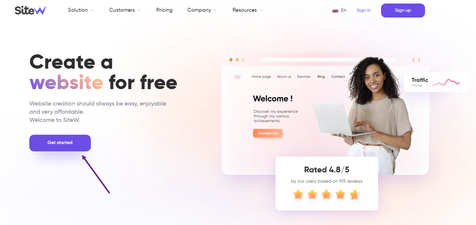
Example of a call-to-action button, on the SiteW landing page
Keep in mind that an effective call to action is an e-commerce tip not to be neglected!
When & where to use CTAs
Now that the definition of the word “call to action” is clear: where to use a call to action?
Well, the call to action can be used on a number of media, and you should not hesitate to use it on your e-commerce website.
Call-to-action buttons can be used on:
👉 Website pages
👉 Blog posts
👉 A newsletter
👉 Social networks
Etc.
Indeed, calls to action are very important to set up and are a real marketing asset. Especially for an online store.
These buttons will allow you to convert visitors into potential customers, and thus increase your sales.
You will be able to add links to specific pages. No need to send your visitors to the home page. The goal here is to limit clicks and take users directly to what they are looking for.
Don't be afraid to add calls to action! It is an (almost) indispensable action to guide the visitor in the right direction.
How to use Calls-To-Action on your website?
You now have all the keys in hand to start adding your call to action to your ecommerce website.
Here are our tips to create the best call-to-action buttons on your website! 🚀
Content of a CTA
Action buttons can be a good solution to give prices, promotional offers on your ecommerce website. Be concrete and explicit.
You must at all costs avoid the classic call to action "Click here" which provides no information and can discourage users, because they don't know what to expect.
Concerning the choice of words, action verbs are very popular:
👉 Buy
👉 See
👉 Subscribe
👉 Create
Etc.
A small text can go a long way, for example, “I'm taking advantage of the offer!”.
Using the imperative is a good way to increase the conversion rate of your ecommerce site, but don't be intrusive and overbearing about it!
You can create a sense of urgency with your call-to-action buttons.
For example: “Sign up now!”, “Take advantage of our discount now” or “Only 24 hours left to...”
An effective way to increase sales and grow your business can also be to use stimulating words like “free”, “fast” and “easy”. Also try to anticipate possible obstacles and questions from the audience with, for example, phrases like “Guaranteed ad-free” or “No commitment”.
Also keep in mind that these call-to-action buttons should highlight the benefits the customer will get by clicking on your link.
Remember that your call-to-action buttons must be homogeneous. They must be recognizable as such on every page of your online store. There must be a consistent path.
You can also create secondary calls to action to allow visitors to take information before returning to the main button.
Your main button should be larger or in a brighter colour to be identified as more important.
As we have seen, using call-to-action buttons is a good trick to improve your online store and boost your sales.
The placement of your call-to-action buttons is essential to make them effective.
There are several elements to take into account:
To capture the attention of visitors, it is essential to place a call to action above the fold of the page. That is to say, the content before scrolling.
Sometimes, it is also wise to place a call to action at the end of the page. Especially on blog articles: the visitor needs more information before taking action. They read the whole article and find a call to action at the end to take an action.
The most important call to action should be placed in the centre. This way, it stands out and catches the eye of the reader.
For your online store, you will probably need to put several buttons on the same page. If you have several buttons, the main one should be located at the top of the page and stand out from the others (different colour, bigger…)
In terms of positioning, your buttons should be located in an easy-to-find position on your page (don't get lost in too much information) but don’t spread them out too much.
Create sections by grouping the arguments related to the calls to action and separate this section from the rest to emphasize it. Put yourself in the shoes of the Internet user, make sure the CTA is visible and clear.
There is another way to place CTAs. You can put them in pop-up windows that appear after some time, for example.
Be careful not to multiply the buttons unnecessarily. Prioritize the information in order not to disperse attention.
Master the design of Calls-To-Action
The appearance of your buttons is obviously a criterion to be taken into account. The design of your buttons will have an influence on the user experience, but also on the click and conversion rate.
It is important that your CTA:

For example, here, Spotify created a black button with vivid colours in the background. So It is very contrasted.
Calls-To-Action and online sales are complementary
You now have an effective tool to increase your sales with the Von Restorff effect and develop your ecommerce website.
Don't forget to test your CTAs, and to perform A/B tests, in order to analyse what works best in terms of CTAs on your ecommerce website.
These tests will allow you to improve the design, but also the placement of your CTAs.
This way, you will be able to place your call-to-action buttons in the best places on your website, and improve their click through rate.
Don't wait any longer and start creating your calls to action!

