This guide will help you understand the concept of online visual identity and answer the following questions:
Are you ready to get all the answers?
Visual identity and brand image: what is the difference?
The online visual identity is one of the essential elements of the brand image: the first one makes part of the second one. Therefore, if you want to improve your brand image, you’ll need to create your visual identity and vice versa.
Your company’s online visual identity
It’s like its “graphic identity card”: it’s composed of all your business’ visual elements. It may be:
Don’t worry, we’ll see all these elements in detail.
The visual identity conveys the values, spirit, and activities of your business.
💡 For example, if you mention a yellow “M”, an apple or a green mermaid, you have the name of these brands in mind thanks to their visual identity.
An effective visual identity summarizes all your company quickly, and enables your visitors to recognize your brand immediately.
Your brand image
It’s all the opinions and feelings consumers may have about your business. It determines the way users will talk about you.
Your visual identity determines it highly.
Now you know the definition of a visual identity, but what is its purpose?

Why should you create a visual identity?
Ideally, your visual identity will fulfil the following objectives:
👉 Please your target audience: you create a wide community of consumers attached to your brand.
👉 Establish the fame of your business: just make your entity recognizable immediately with an excellent fame. 🙂
👉 Give credibility to your different partners to inspire trust in your co-workers.
As you have understood, your online visual identity is more useful than a basic logo.
You have easily reached these objectives if your visual identity has the following main qualities:
Simplicity is essential online. Don’t lose your consumers with much difficult information. A basic message will always be effective. You need to get straight to the point! 🙂
The consistency of your visual identity will need to be respected at several levels. Consistency is the most important element when you create your identity.
It will be in accordance with your corporate values. It will also have a perfect graphic consistency on all the print or digital communication medium used.
To sum up, the graphic consistency will enable you to both know and recognize your brand.
You will choose the elements of your visual identity depending on their aesthetic appearance, sense and psychological impact.
As you have understood, there is no chance for your visual identity. You make a choice deliberately and for a good reason.
If your online visual identity makes sense, it’ll speak to the visitors of your website more easily.
Finally, your visual identity will enable you to make a difference and impact. You need to stand out from others without offending the principle of consistency with your business mentioned above.
You know exactly the objectives to reach thanks to the creation of your visual identity. Let’s move into practice!
The issues to examine to create your visual identity

Before starting the creation of your visual identity, you need to list the following points:
Who are your competitors? What is your difference? What are the elements of differentiation (that make you the best 😉)?
What is the typical profile of your customers?
Who is interested in your brand? Why?
Understanding the decisive elements that attract customers to your website is essential.
Which values and atmosphere do you want to link to your brand?
Kindness or dynamism? Modernity or vintage spirit?
Once you have defined your intentions, lets’ move on to the following steps:
To that end, visit their entire website. See all the categories, subscribe to the newsletter, start a buying process, and analyse the email reminders…
Make a complete analysis to understand the central theme of their online visual identity.
👉 Choose the communication channels you want to use depending on your customers and objectives. Now you know your public and their habits: do they prefer to go to Facebook, receive an email or watch a video…? Find your customers where they are!
👉 Choose your style. You can opt for a vintage style, flat design or a classic and proper identity.
👉 Ask your relatives and customers their opinion. They will make judicious comments that you may not have thought of. It enables you to step back and better understand users’ expectations.
👉 You can write a graphic charter to define all of this in writing and accurately. You can write a Word document to get everything clear for everybody!
Now it’s time to create your online visual identity, but where do we start?
The elements of your online visual identity
To create the visual identity of your website, you can ask a professional web designer to help you.
In any case, you will have to study scrupulously all the following elements:
Your logo
You have two options to create a logo:
-
If you have the appropriate budget, if you want a professional result and if you don’t have enough time, asking a professional web designer is the best option for you! It may take between €300 and, €1300 if you hire a novice freelancer or an agency.
-
Creating your logo thanks to online tools. Go to the end of the article for our selection of the best tools. 😊
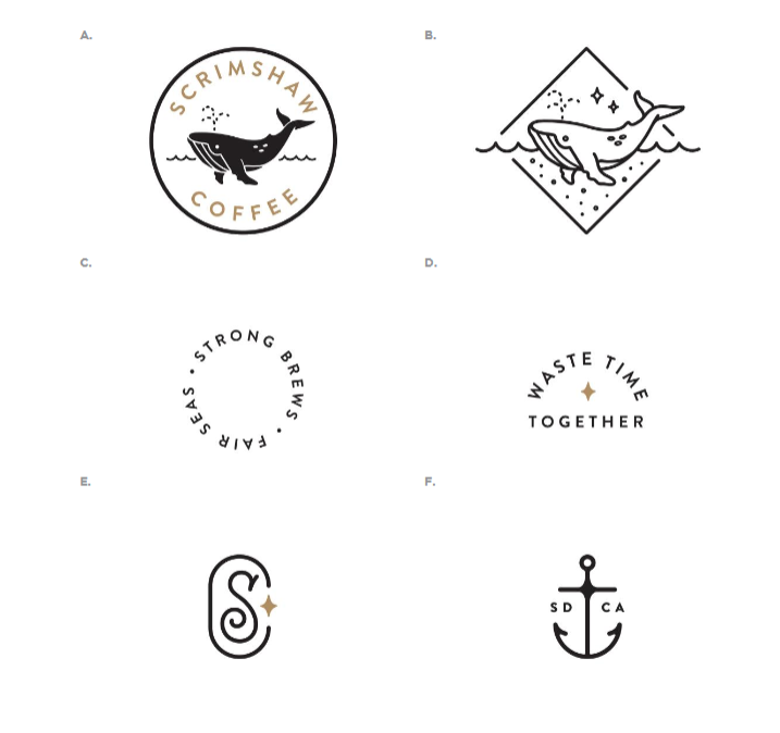
Your logo will be available in all sizes and colours (black and white). You can also create submarks to put your identity on all supports.

For example, you find submarks on the graphic charter of Scrimshaw Coffee. Although they have different shapes, they maintain a visual consistency.
Don’t forget to protect your brand-new logo legally by filing it with the National Institute of Industrial Property. You can file your logo, all your visual identity and your brand name at the same time.
Your colours
Colours have an impact on our behaviour, unconsciously.
For example, the purple colour evokes the monarchy, the mystery, the spirituality, and the luxury. The blue colour adapts to high technology, intelligence, calm, confidence, stability, and power.
Some colour combination gives an atmosphere or specific state of mind in a few seconds.
Choose your colours knowingly!
To get a clear and recognizable visual identity, choose 5 colours at the most, with 2 plain colours for your fonts.
Speaking of fonts…
Your fonts
In the same way, your font choice will have a direct impact on your visitors.
For example, a handwritten font will suggest privacy, contrary to a thicker font that will refer to strength and stability.
If you don’t like any font, you can ask a web designer to create your own font!
In all cases, try to use less than 3 different fonts on your website. One of them must be very clear and pleasant to make users’ reading easier.
💡 In all cases, don’t use Comic Sans MS, that risks weakening your brand a lot.
Your key visual elements
For your key visual elements, you can choose illustrations, photos, videos, effects, or animations…
In short, the only problem is choosing!
However, remember the following advice to help you create your visual elements:
Try to avoid free image banks for your visual elements. If you use original photos, you are more authentic, and you stand out from the competition.
The video is the most engaging format for users. The conversion rate of websites integrating video is 34% higher than that of sites not using this format (Semrush). Convincing, isn’t it?
To take the opposing view of basic illustrations, you can opt for the 3D dimension! You can differentiate yourself from the competitors by offering a friendly spirit to your website.
In any case, choose illustrations according to emotions you want to arouse with your brand.
Your graphic elements
Choose your graphic elements coherently. The graphic elements include:
You will still look for this “graphic consistency” as already mentioned.
You can also use lines, geometric shapes or swathes of colour…
The range of possibilities is unlimited!
Your page layout
Work the layout of your website.
A clear and meticulous layout makes the difference. Your main objective is to make your visitors’ life easier: a visit on your website seems like a pleasant marked path rather than a dangerous off-piste skiing.
Consequently, create a rational navigation menu as well as clear and relevant sections. You can structure your menu with separators, full-width images or colour backgrounds.
Moreover, in function of the position of the different elements, the information of your pages won’t have the same impact on your visitors.
For example, everything on top of a website will be more visible, especially the elements in the top left corner.
That’s why almost all the websites have their logo in the top left corner.
Highlight your call-to-action buttons so that they are highly visible. In general, they are in the middle of the website and define content if necessary…
The custom email signature
We rarely think about it, but your email signature is an element of your visual identity.
If you create a custom signature that matches your website, you convey your identity easily and quickly.
And now you realize that the work to create a visual identity is more tedious than you might think.
Fortunately, you can use these effective (and free for most of them) tools to help you create your visual identity.
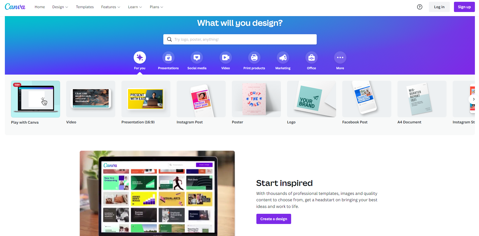
Canva is the best free tool to create visual elements. It is very intuitive and complete and enables you to create logos, designs and add different fonts quickly.

✔️ The sizes of the different formats for each social network are already saved. Your visual elements may adapt to a Facebook cover such as a post on Instagram in a few clicks.
❌ You need to pay a Canva licence to have access to some features, but don’t worry! You’ll have a wide choice with the free version.
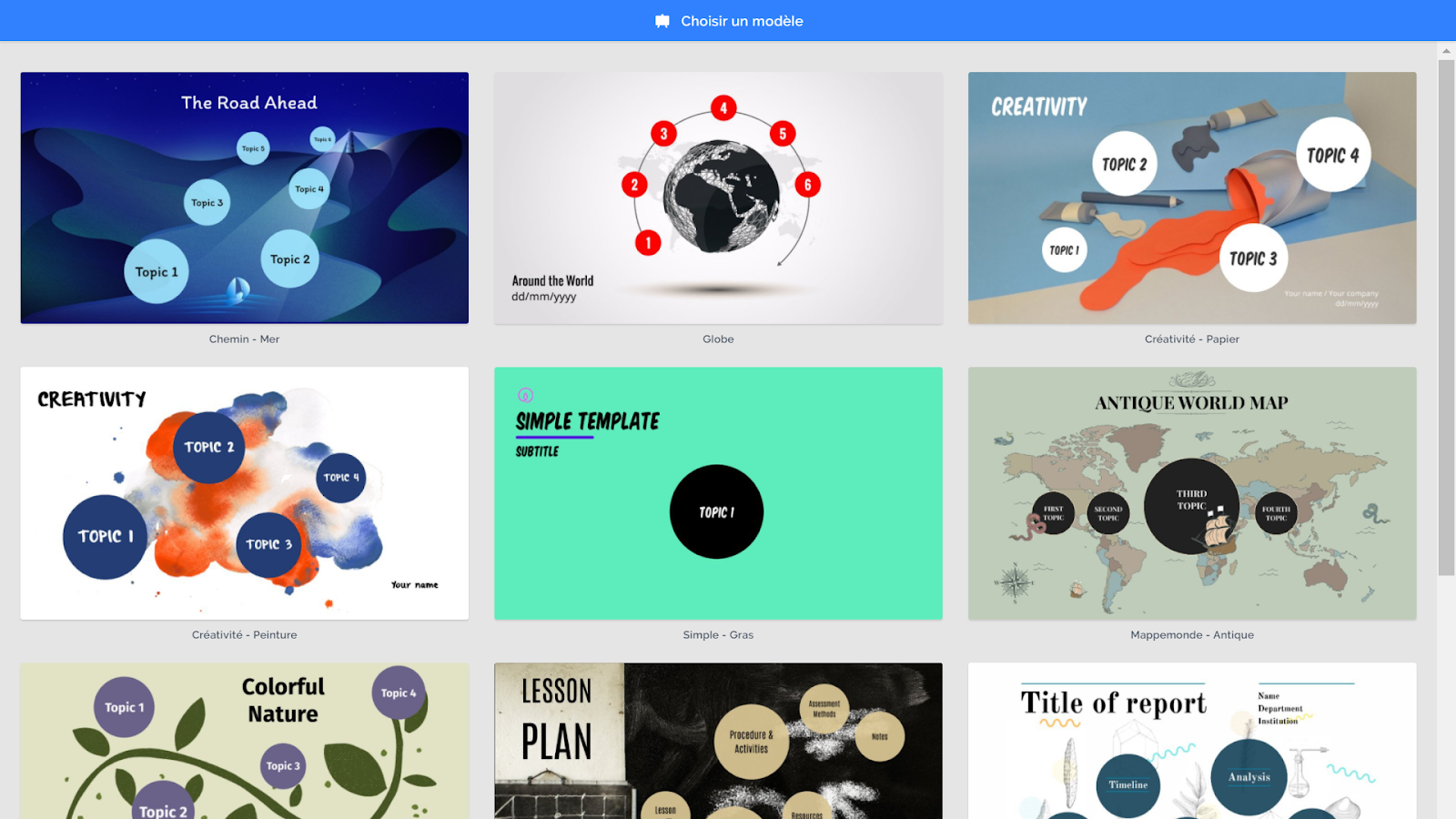
Prezi is a useful free tool to present your visual identity. Like an improved PowerPoint, Prezi enables you to scroll the elements of your presentation thanks to zoom and zoom-out. It’ll change the codes of the basic slide to make your presentation more dynamic!

✔️ Prezi gives you many customizable templates, or you can also start from a blank template.
❌ If you opt for the free version, you can’t download your presentation. Therefore, choose Prezi to use it just under connection.
Experts can opt for Photoshop. The software of Adobe indeed is the best tool for a visual creation.

✔️ Photoshop enables you to create all the visual elements possible…
❌ …on condition that you master the software. For beginners, it may be difficult to master it. It has a free trial version, but you will quickly need to upgrade.
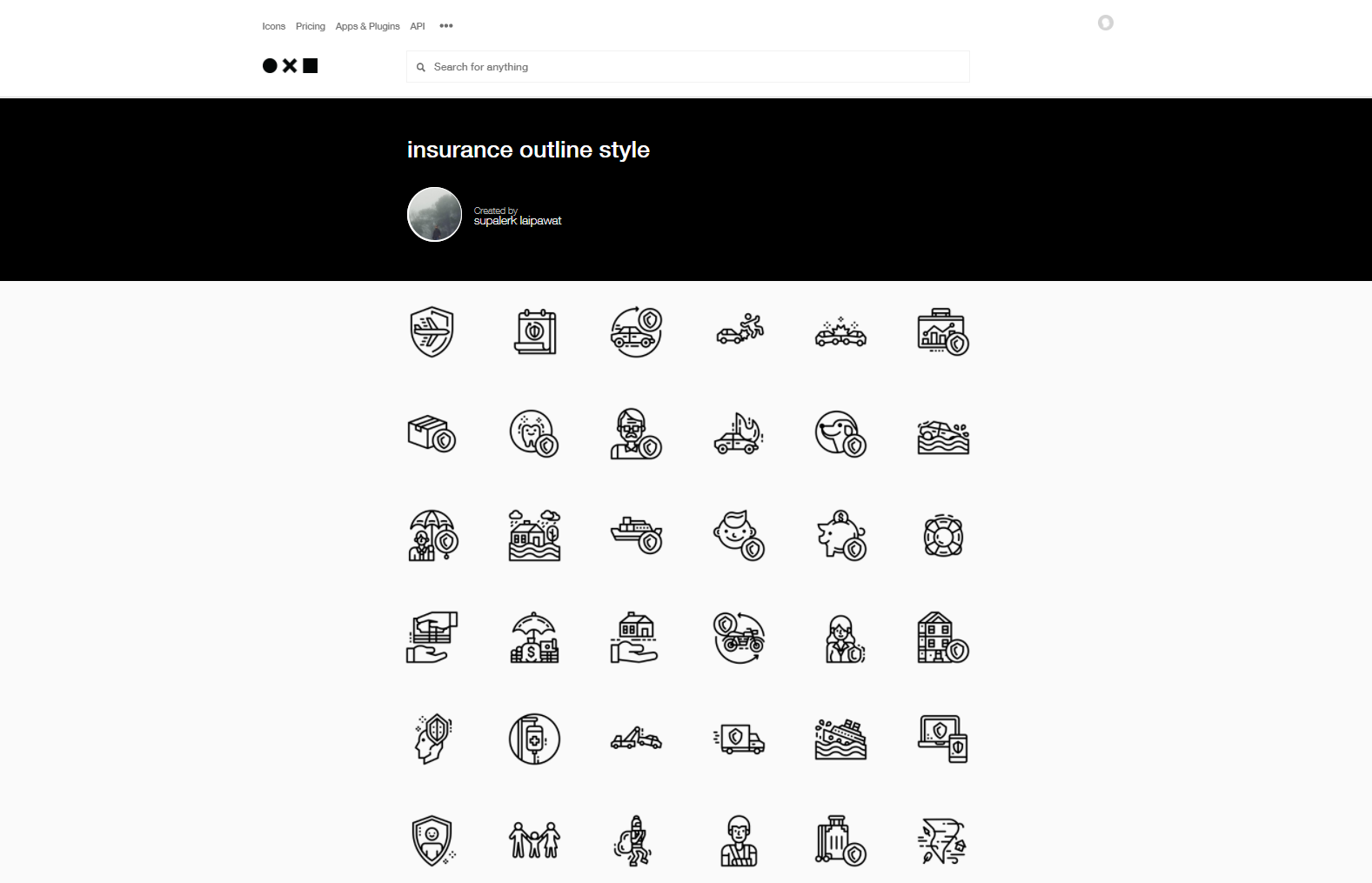
The Noun Project is an original and minimalist icon bank. You just need to create an account with an email address to accede to it.

✔️ You will find what you are looking for among more than 2 million available icons and a bank which is regularly fed.
❌ To customize the icons without getting the signing of their designer, you need to pay for downloading.
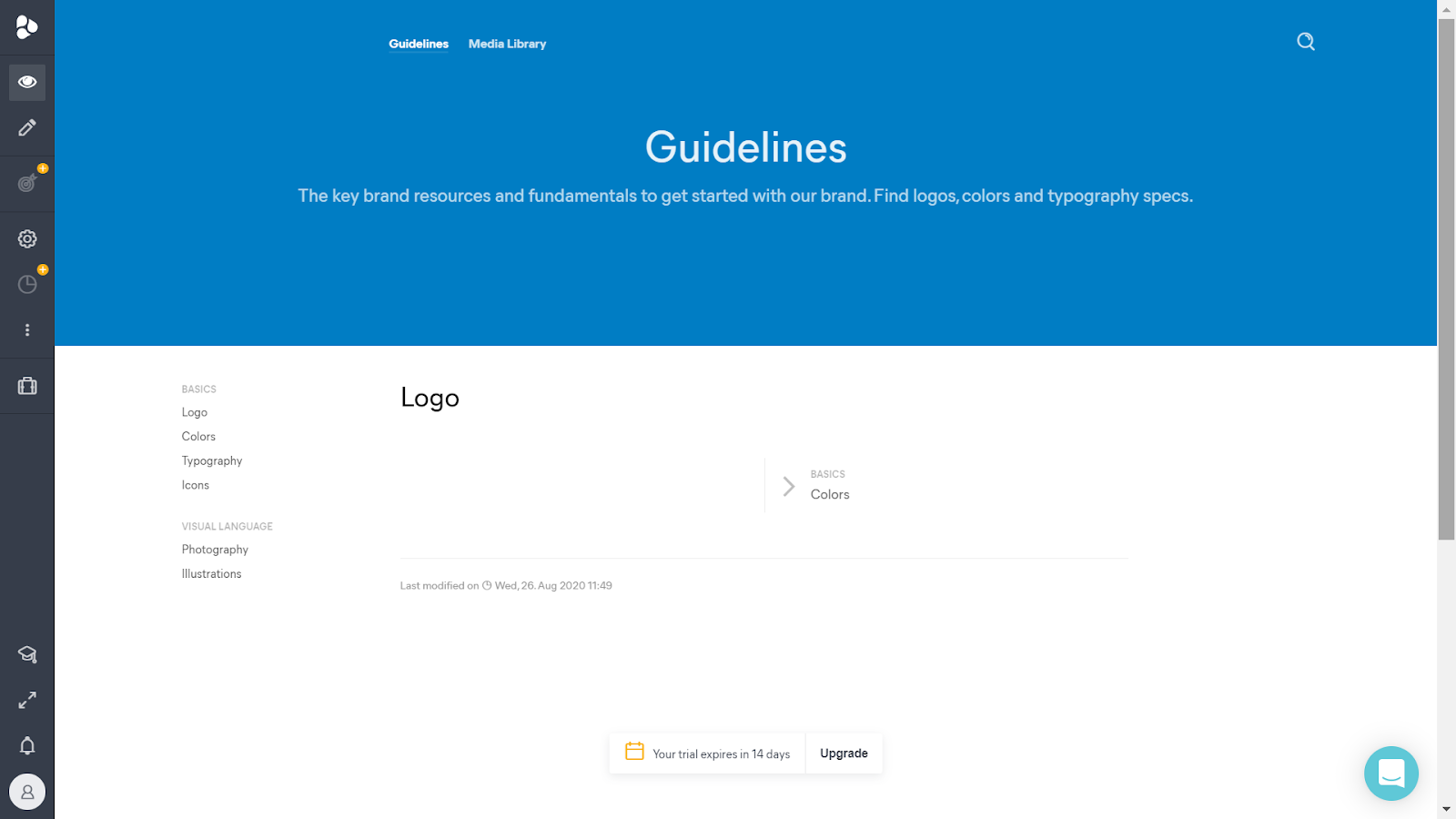
Frontify is a useful platform to create a visual identity. You can gather all your elements in one place and share it to all your co-workers. You won’t need to look for the colour codes and the name of fonts, as everything is here!

✔️ Frontify enables you to edit your visual identity if necessary. Your changes will be updated for all the persons who have access to the document.
❌ The charged Frontify’s licence may be expensive if you need to create visual identities for several websites.
The mood board is the easy, free method to create your visual identity. The mood board enables you to gather all your inspirations and give an atmosphere to your brand.
Are you tempted by the mood board? Discover all the steps to create a mood board.
Now you have defined all the elements of your brand-new online visual identity.
Let’s move on to the final step: use them on your website.
Use your visual identity on your website
If you have created your website with a website builder such as SiteW, you will see that you will already have done most of the work. Once you have defined the elements of your visual identity, it’s easy to add them to your web platform.
Let’s see all the elements of the visual identity you have mentioned earlier to understand how to add them to the SiteW editor:
Add your logo
First, you need to create your logo and translate it into the PNG format.
The PNG format enables your logo background to be transparent and match all the background colours of your website.
To add it, nothing could be easier!
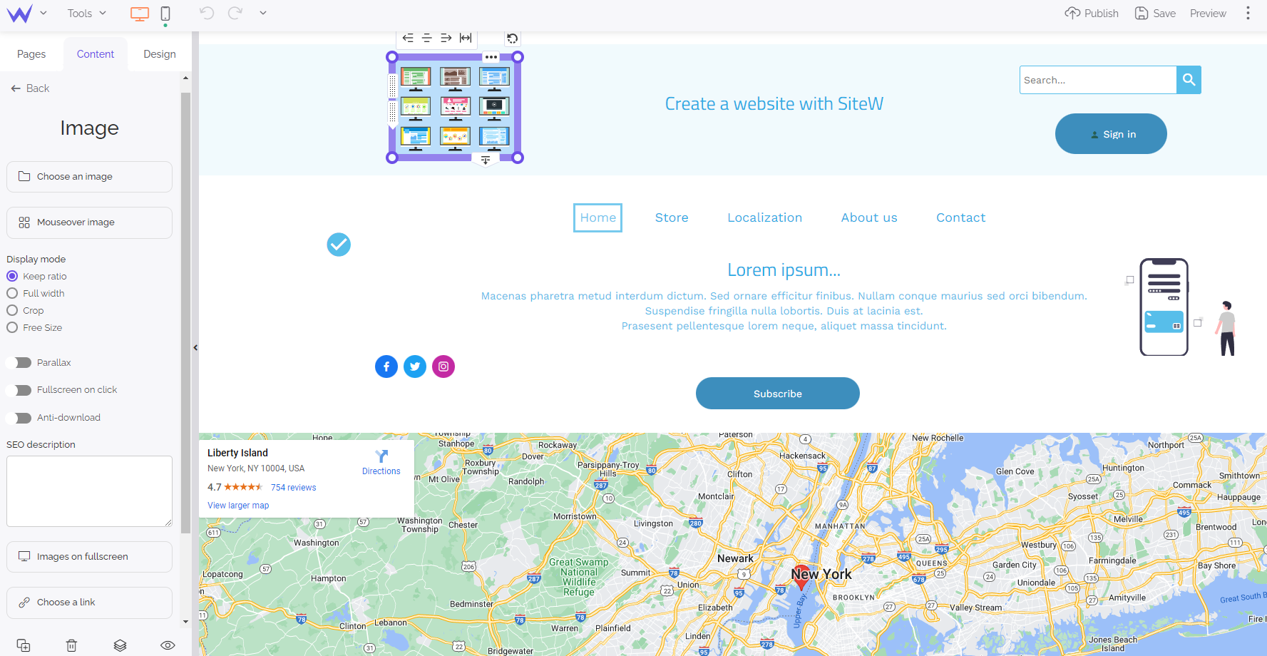
You can add the Image block to your website at the top left of your website.

By clicking on Choose an image, you just need to select or import your logo.
💡 Additional tip: moreover, you can add the link of your homepage to your logo to enable users to come back to your homepage by clicking on it and thus improve the user experience and friendliness of the website.
Logo: done.
Let’s move on to the colours.
Add a colour palette
You have already done most of the work if you have defined your colours in advance.
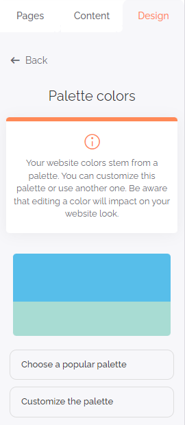
On the SiteW editor, go to the Design section and click on Colour palette.

You can opt for:
If you lacked inspiration when you looked for a colour palette, you can consult the popular palettes. In this way, you may have access to combinations that you haven’t thought of.
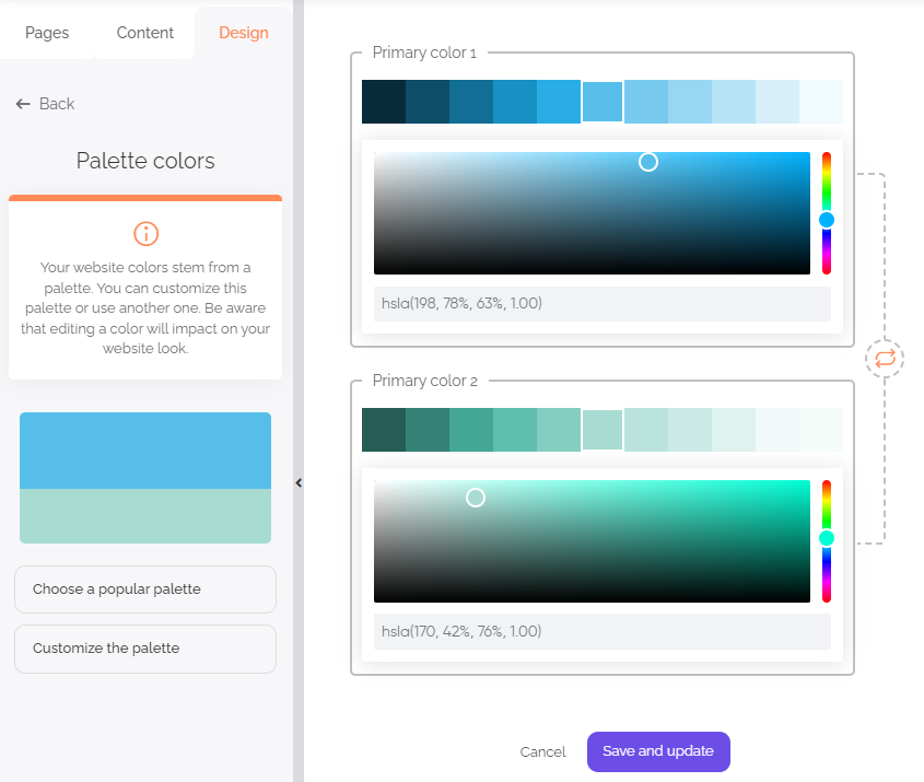
If you already know what you want, click on Customize the palette.

You can easily fill in the RVB colour code and define your deep and light colours.
Edit its fonts
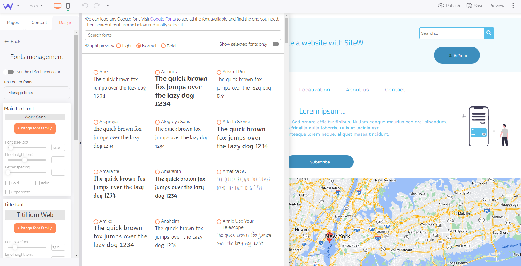
Fonts are other essential elements of your visual identity.
The block to add your fonts to your website will be next to the colour palette mentioned above.

You can consult all the available fonts or directly look for a specific one if you know its name. You can also edit its size, line height, aspect…
In a few clicks, you added your primary and secondary fonts to your website, and they will be effective on all your websites.
Magic, isn’t it?
Illustrations and pictograms
The last thing: illustrations.
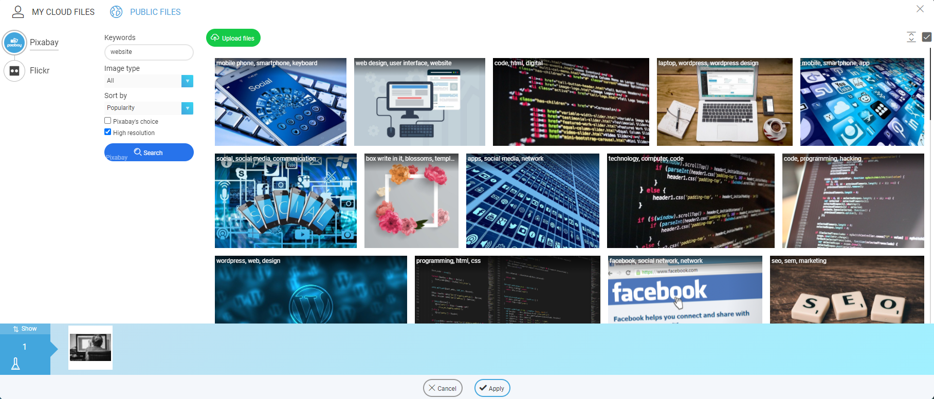
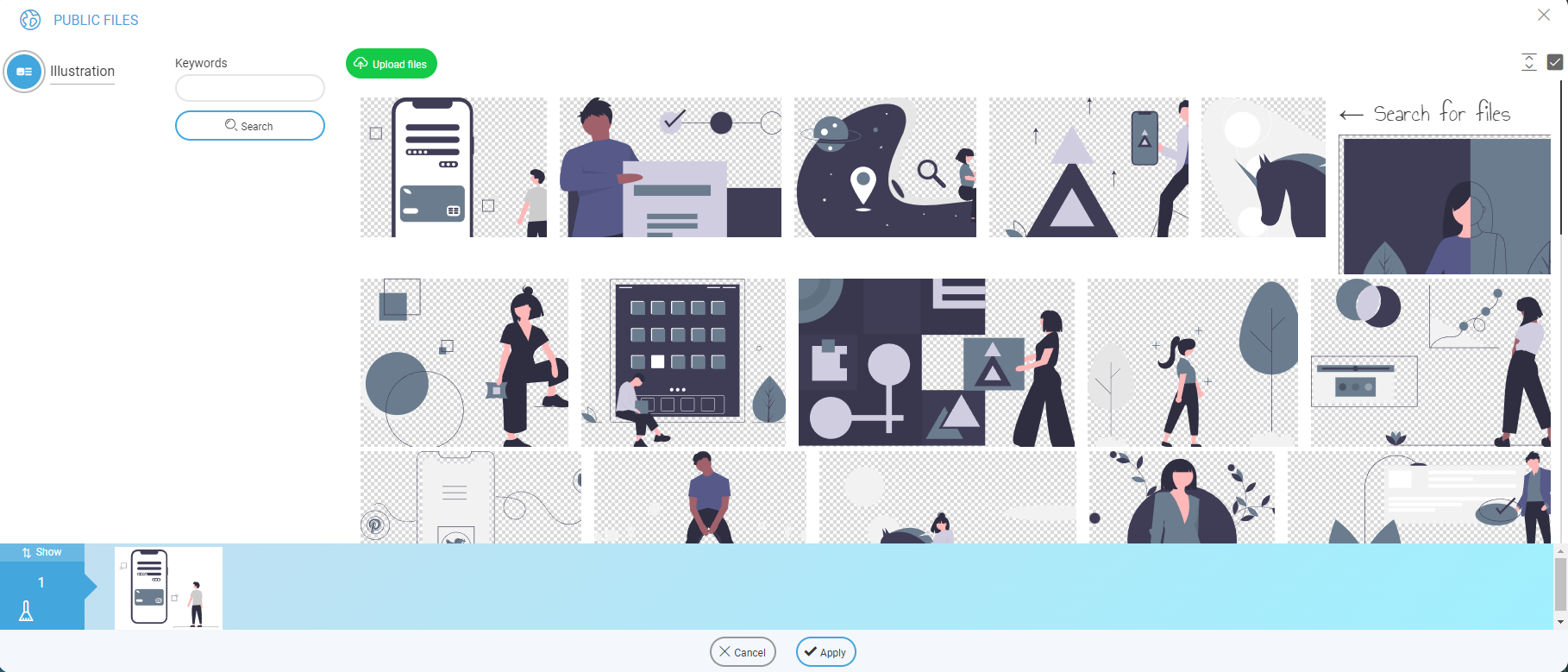
It will be possible to add your images, photos, or pictograms as easily as the other elements to your website. To that end, go to the Content section, then drag and drop the Image block to add your photos.
You can add your photos or import them directly from a royalty-free image bank.

For the icons and pictogram, it’s a bit different. You just need to scroll down to reach the Design section.
You can add icons and forms to structure your website easily. Moreover, thanks to the Illustration block, you have access to many modern and customizable graphic design:

You can customize your website effortlessly and without graphic knowledge.
We have just seen all the guiding principles to start creating the visual identity of your website. If you proceed methodically and with some advice, it’s easy to create an online visual identity!
Now you just need to give the best of your creativity, and we can’t wait to see the result of your work!

