This is a legitimate and essential question, as the header is an important element of a website.
Despite the header takes up little space on a website, it is the first element users see when they arrive at your homepage.
Here are three reasons why your header should be comprehensive, optimized and attractive:
Make the best possible first impression
The header is the first impression made on new users.
In general, design takes priority over content: if you have a comprehensive and expert website with an unpleasant header, you’ll probably lose many users.
You indeed make a first impression online in just one second. During that period of time, you need to make a difference immediately.
Your header is in charge of keeping users more than one or two seconds on your website to discover your values, universe, and brand.
A landmark for users
The header is essential for new and former users.
The header and footer are landmarks for users to find essential information such as the login section for members, menu, current discounts or social media.
These elements need to be displayed in a comprehensive header so that users save time and improve their experience.
As already mentioned, patience isn’t required online. Users will leave a page that takes more than 3 seconds to load.
Moreover, Google calculates the time taken to load the visible part of the page with the header that needs to load faster.
Therefore, an effective, functional and well-optimized header will be a technical quality guarantee for users.
As you have understood, the header is essential on your website. Pay attention to it during its creation, as it must contain all the necessary information to interest visitors and retain them on your website.
But what is this important information? 🕵

Create a website
Before creating your header, ensure you can add all the following information:
Your website identity
Oh yes! Your header is for telling your website users about where they are. Therefore, your header needs to have all the elements about your website identity:
The name of your website must be first displayed. It enables users to identify your digital platform immediately.
Your slogan or phrase that describes your website must be shown on your header. In this way, users have a direct opinion about your tone, spirit, and brand.
Of course, your logo must be present immediately. In general, users remember images more easily than text. Place your logo so that it can be immediately identified.
Now you have the basis of your header.
Let’s continue!
Your graphic charter and universe
These essential elements make part of a universe and graphic charter. That’s why you should define your graphic charter right from your header, thanks to:
The header determines the rest of your website. Therefore, it needs to be coherent and harmonious with the rest to directly create an atmosphere.
Your title, slogan, and menu will have specific fonts that show the image of your website on all your other pages.
Your header will be friendly, inviting, and dynamic if you add original and modern illustrations.
The elements that boost user experience
Now it’s time to work on user experience. Its optimization starts right from your header:
The header needs to directly call to action, whatever it’s a subscription or redirection to a landing page.
A call-to-action button is a key and essential element so that your header be interactive and effective.
You would probably like to accede to your member space directly when you arrive at a website.
Users indeed like signing in to the member space right from the header. Therefore, this needs to be possible immediately.
Users often consult the header of a website when they want the phone number or email address to get in touch with a service.
Therefore, indicate your contact details or highlight your Contact section in your header.
Drop-down menu, search bar… The elements that make browsing easier must be displayed in your header to enable your familiar users to reach the page they want to consult in a few clicks.
If you have a multilingual website, you can enable foreign users to translate your website into their languages so that they also understand and enjoy your content.
Social media are the last essential element. Users will have the possibility to join immediately your communities to share, exchange and participate in your website.
A simple space on a website may contain many essential elements.
To reconcile user-friendliness and space on the page, you need to use a graphics tool for a comprehensive customization with functional, easy to configure and original blocks.
Don’t look further: SiteW is the tool that will suit all your needs.
Thanks to SiteW, you don’t need to hire a web designer’s services or train to get an effective, original and beautiful header.
Our drag and drop system as well as functional and customizable blocks enable you to create your header step by step, by adding easily all the elements listed above.
Here is how to design your header:
Step 1: Work on your background
First, define your header background.
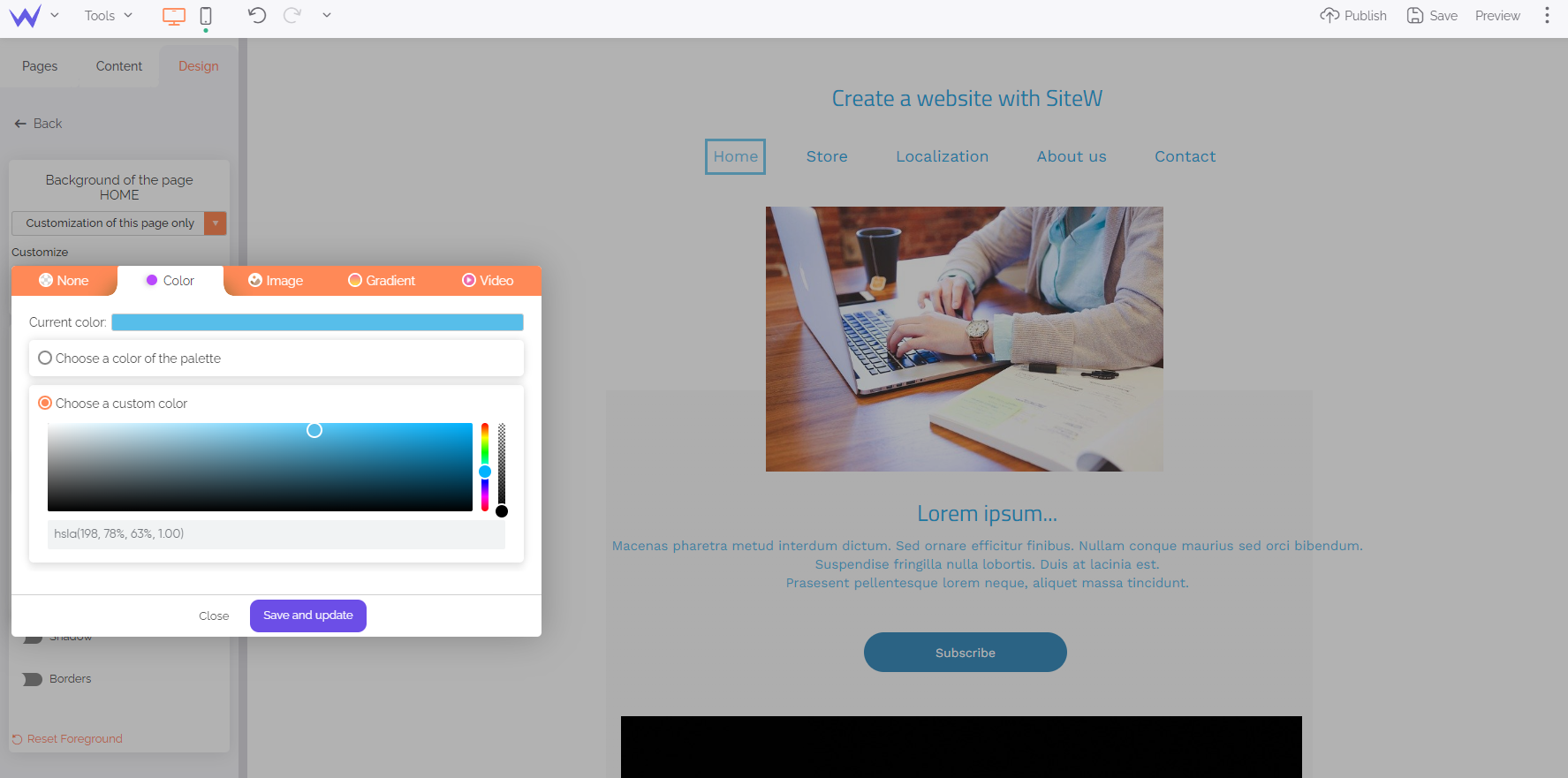
To that end, go to the Design panel > Website background and content area.

Thanks to the custom palette, you can choose your website background colour that will be then applied on all pages. In this way, thanks to a plain background, it’ll be possible to add the new elements of your header easily, without damaging its readability.
Build a website
Would you like to highlight your header? You can stand it out from the rest of your website thanks to two methods.
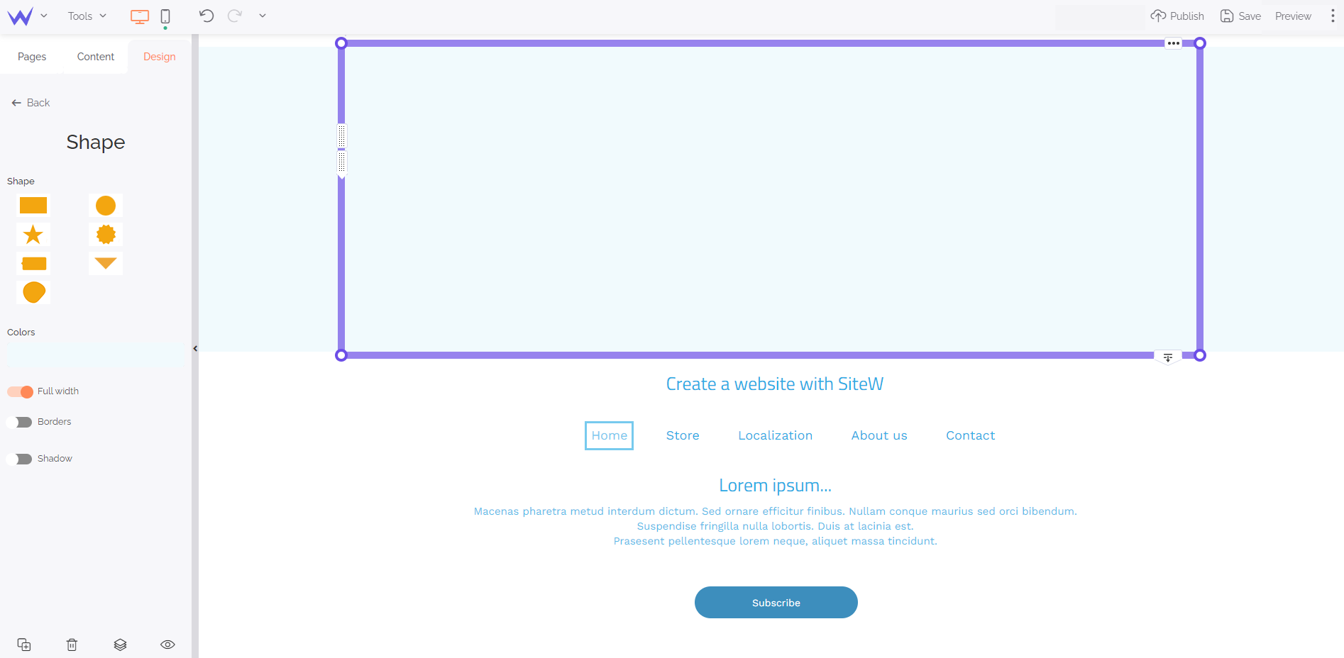
The first method consists in adding a Strip block to separate your header from your other website elements.
You’ll find the Strip block in the Content panel.
To configure the Strip block, you have three options: strip, wave, skew. In the following example, we’ll use the basic Strip block, but you can create a more original header.

Enable the full width button so that it takes up all the superior space of your home page. You can change its colour with a plain or gradient background.
To go further
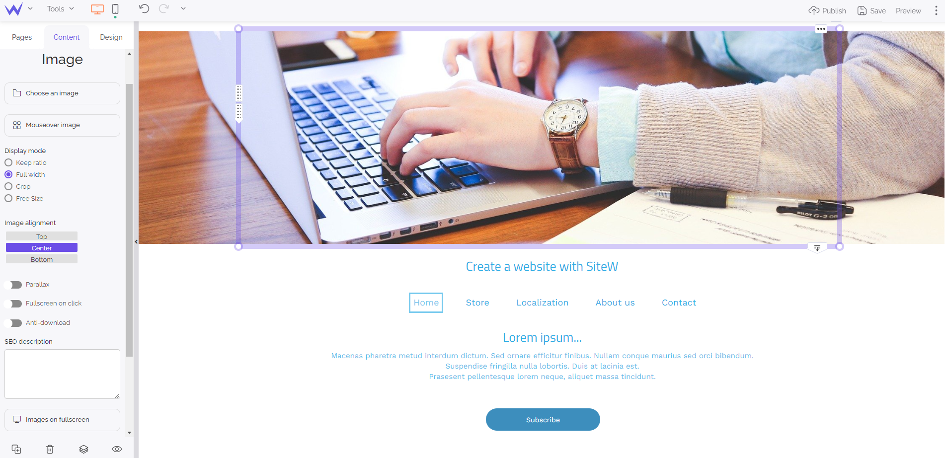
You can also use a picture for your header. To that end, choose the Image block in the Content panel.

You just need to load a personal or royalty-free image for the creation of an original header.
If you use a photo, ensure you select a picture with the same colours so that you can add all your texts and browsing elements, without loosing readability.
To be even more original, here are 2 ways of creating a dynamic header.
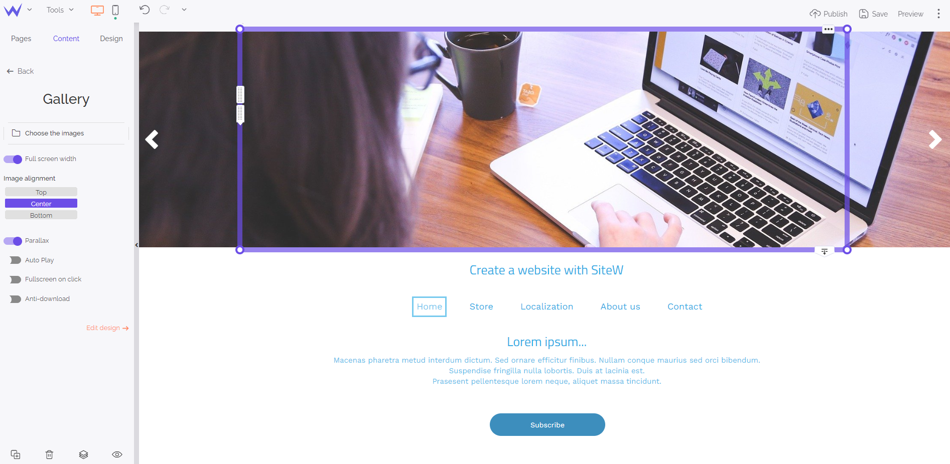
First, try the Slider option of the Gallery block in the Content panel.

You just need to load the images of your slider, such as for the previous image.
Enable full screen width and autoplay for a beautiful dynamic effect.
💡 If you want to be more original, enable the “Parallax” option to modify the scrolling of your images with a harmonious 3D effect.
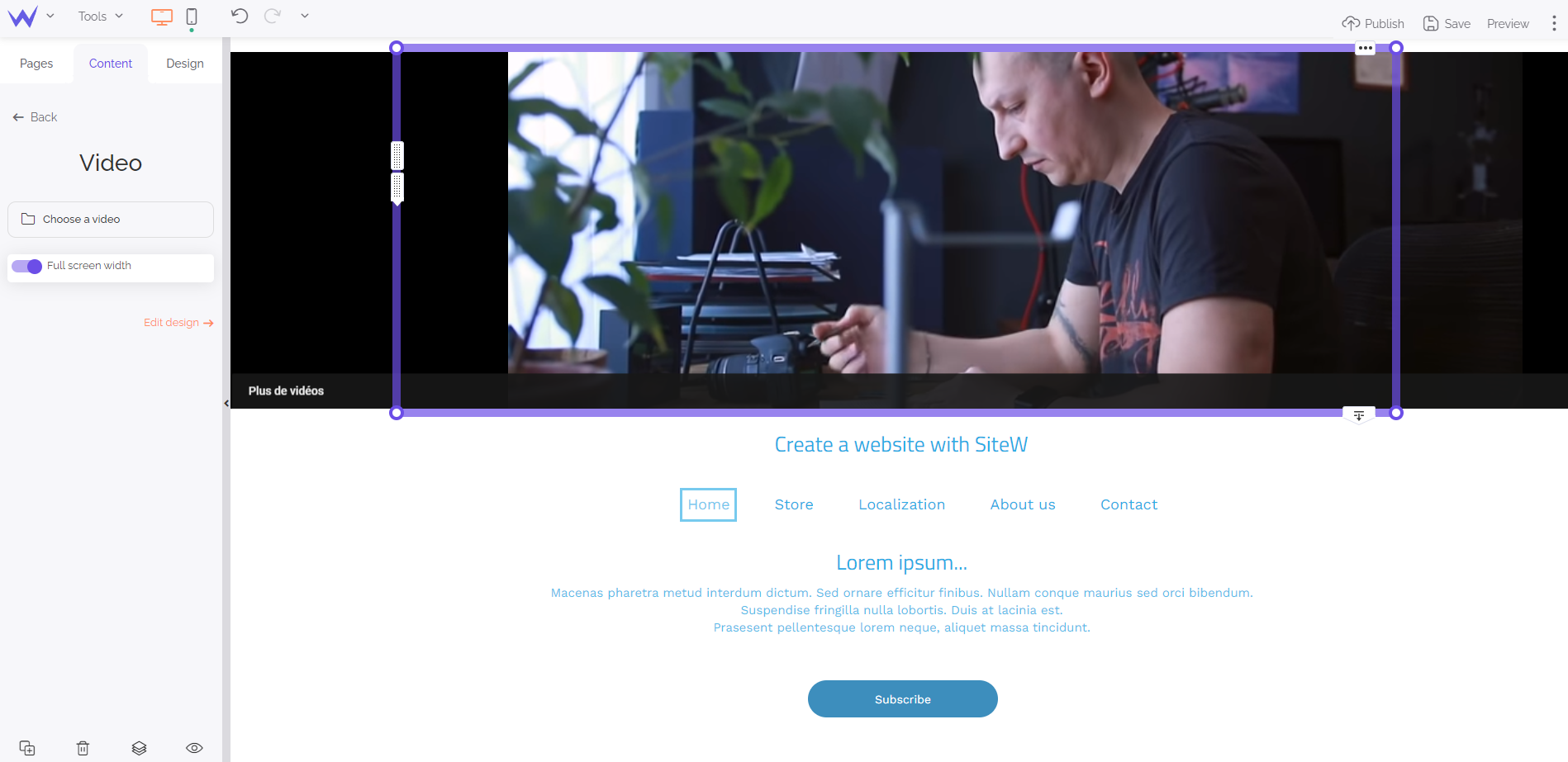
Moreover, you can add a video to make your header more dynamic while creating a universe for your website immediately.
To that end, add the Video block to your website to the level of your header. You can download your videos or search them directly on YouTube, Twitch, Vimeo, or Dailymotion.

For an optimized effect, enable autoplay and the mute mode.
That’s it! You have a dynamic background in a few minutes! 🥁
Step 2: Add your website identity
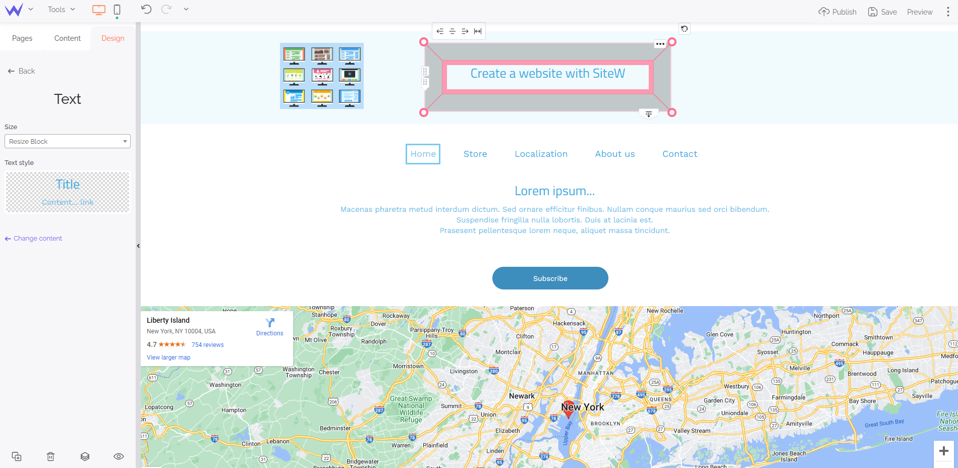
Now it’s time to work on your website identity, that is to say your logo, website name, and slogan.
To that end, add the Text block and choose Title + paragraph.

You can edit its fonts, colour, size… You can customize all the settings to create your own style.
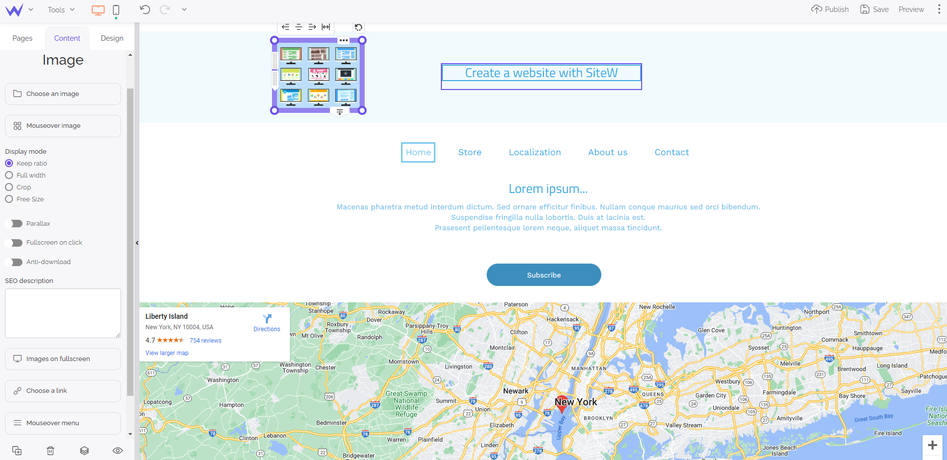
For your logo, choose the Image block and place at the top left so that users better see it and remember your logo more easily.

💡 Create a PNG version of your logo with a transparent background to add it easily to any background.
As mentioned before, the header is the favourite place for browsing elements that enhance user experience in genera
To that end, here are the blocks you need to add:
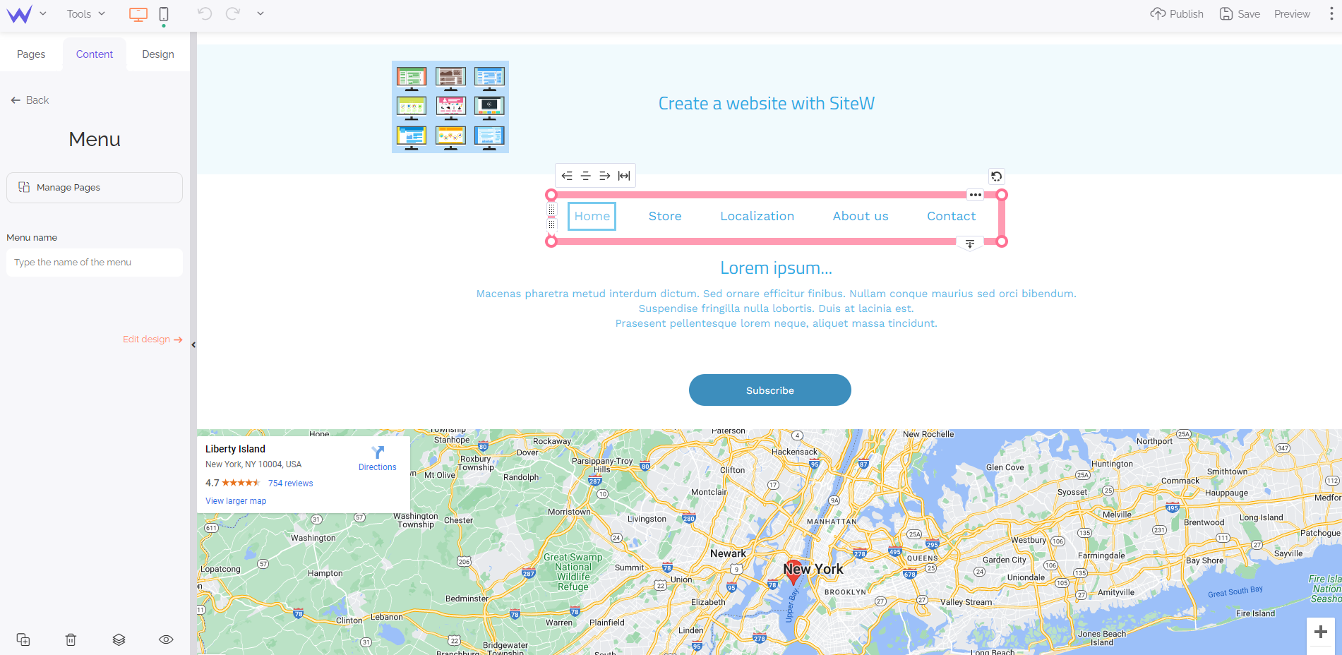
The Menu block is in the Content panel. You just need to drag and drop it wherever you want in your header. You can place your menu in the middle of your header.

To edit the links and name of the categories, click on the left button Manage pages.
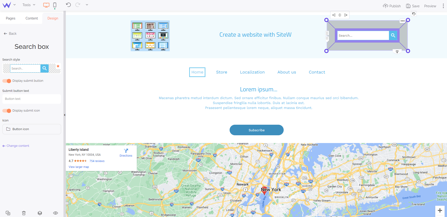
You’ll find the Search block in the Content panel. It offers a search bar you can customize totally and place wherever you want on your header.

In general, the search bar is to the right of the header.
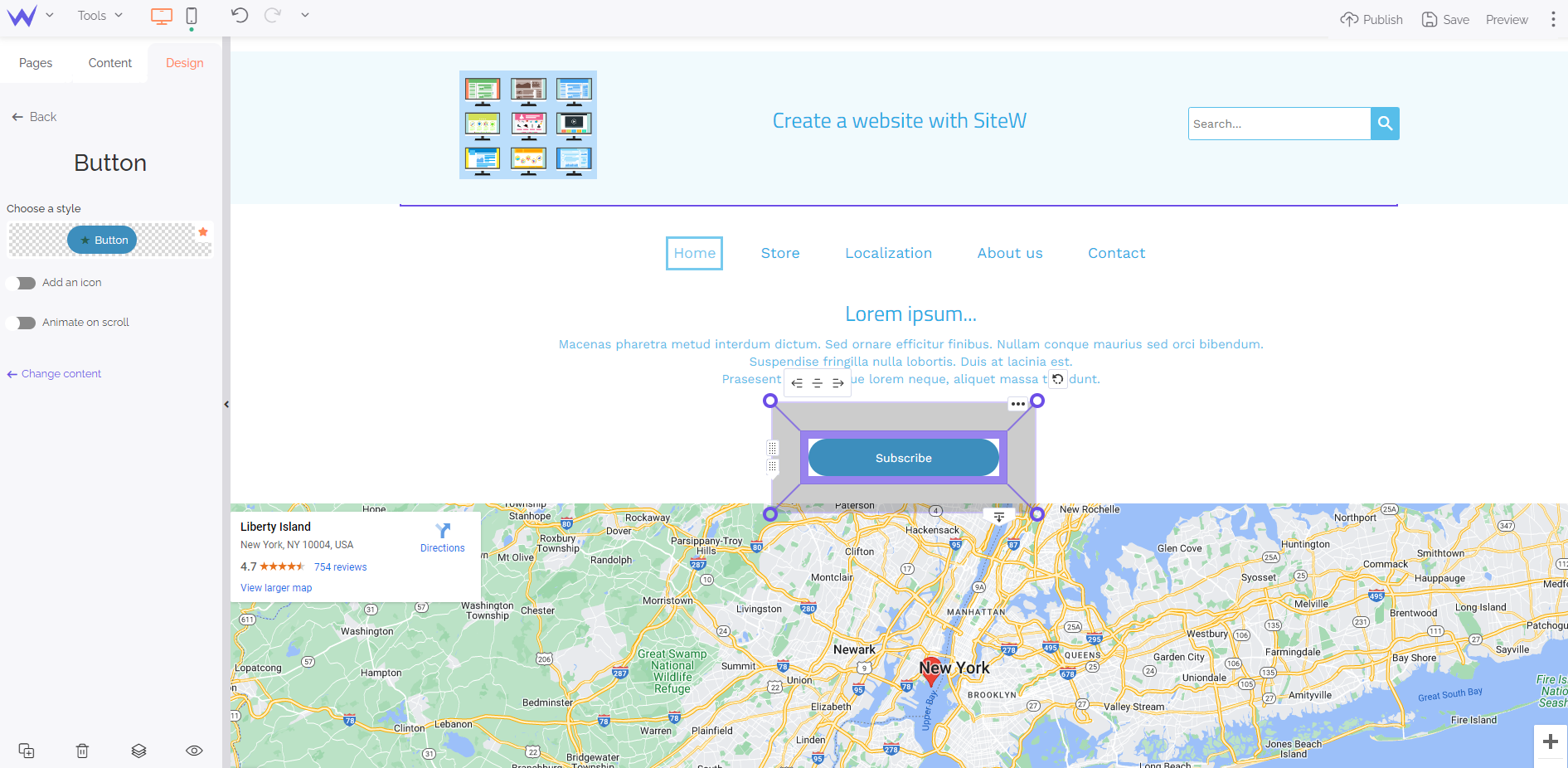
It’s important to add a call-to-action button to your header to enable users to act when they arrive at your website.
To that end, choose the Button block and configure it as you please.

Drag and drop the Button block in the middle of the page so that users see it perfectl
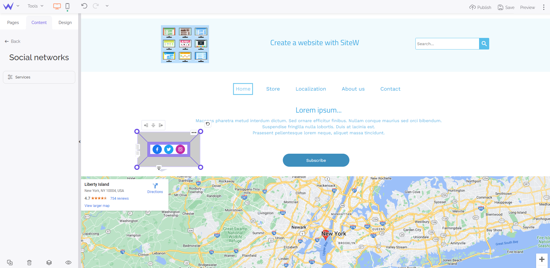
Social media are essential for your marketing strategy and creating loyalty. You can add your social media directly to your header thanks to the Social block.

In the blue panel, click on “Choose a link” to configure your buttons and add links to your social media.
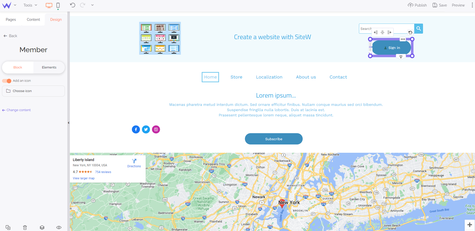
Your website may have a member space for your community. Add the member space directly to your header to enable your community to sign in easily thanks to the Member block.

You can edit its colour and text in a few clicks.
Psst… If you have created a multilingual website, add small flags to enable foreign users to translate it directly.
Step 4: Your website design
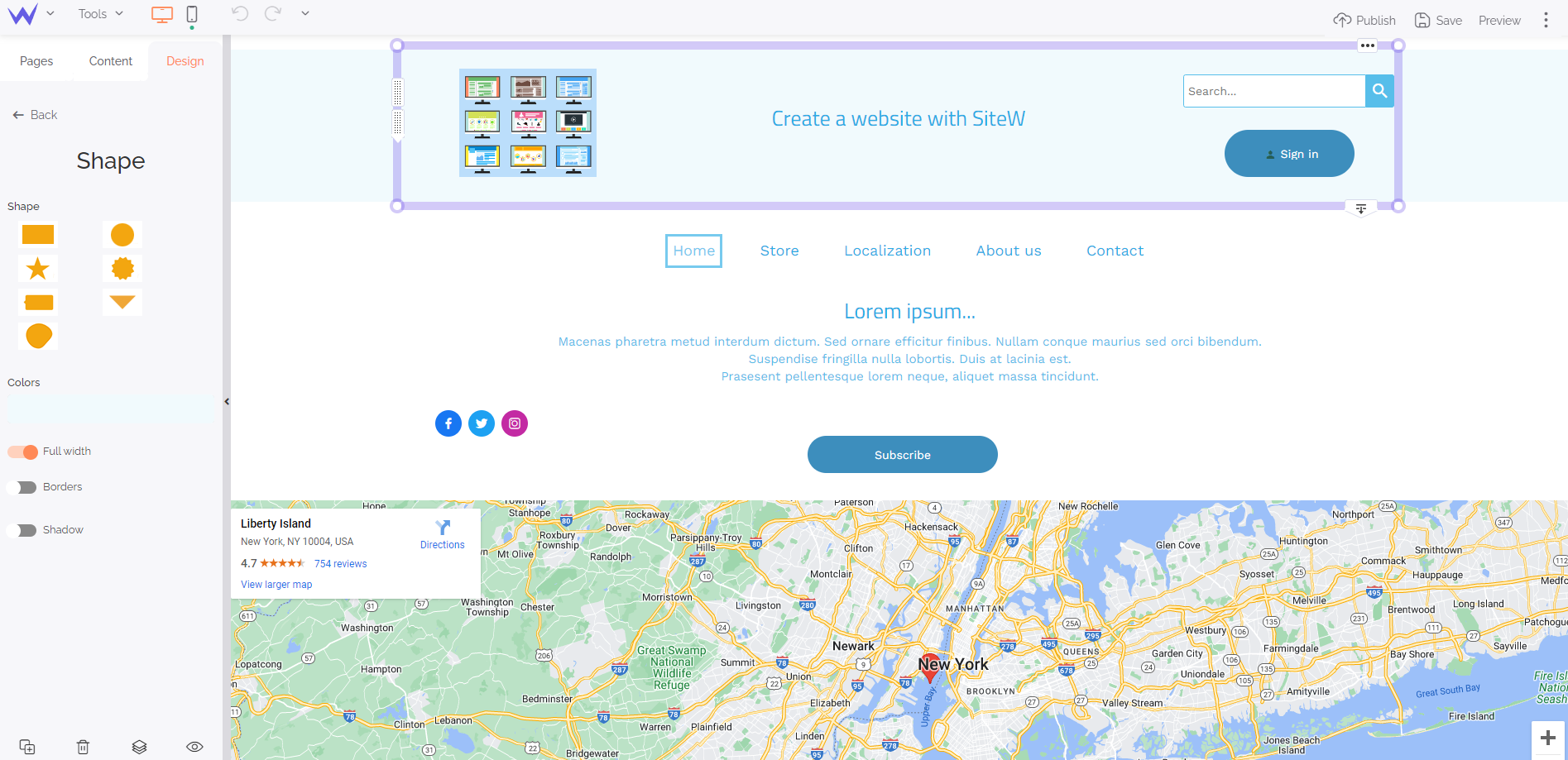
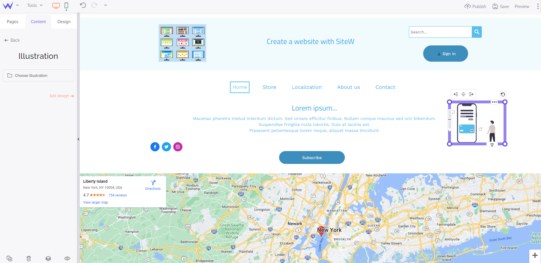
It’s time to enhance the design of your header to make it more original thanks to the Shape, Icon, and Illustration blocks.
The Shape block enables you to add coloured forms to structure your header and make it graphic.

The Illustration block enables you to add modern, customizable and beautiful illustrations quickly.

You just need to drag and drop these blocks wherever you want on your header and edit them.
The Icon block enables you to add discreet and relevant small elements to make your header even more interactive.
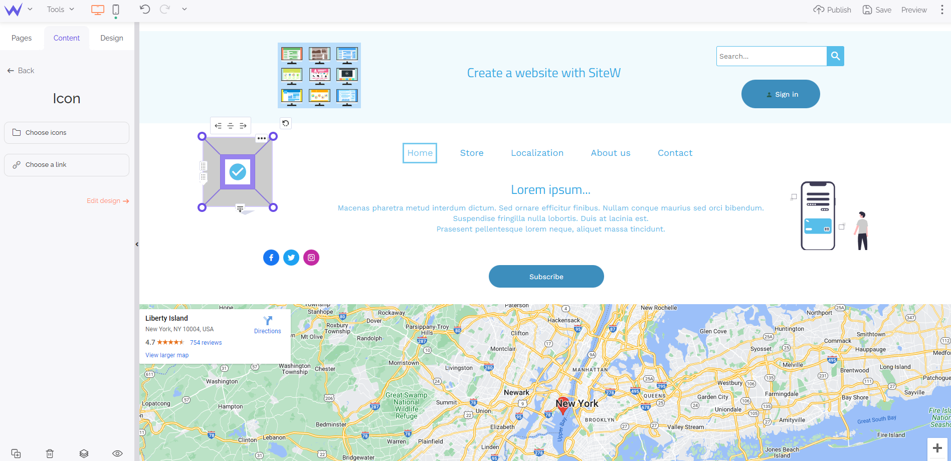
Moreover, you have a wide and comprehensive icon bank to find yours.
Now you have everything you need to create an effective, customized and optimized header.
Are you ready to make the best first impression?
