As seen above, the creation of an effective footer for your website enables to inform, guide, catch up and convert visitors.
After the header of your page, your visitors get to the footer. If they get to the bottom of the page, it’s likely that they didn’t find what they were looking for. Therefore, it is time to give all you have and consider the footer to be the last impression left on users.
The footer enables you to make users’ browsing on your website easier, as they can find:
-
your website structure
-
the navigation menu
-
a back to top button
-
calls to action
In short, this is one of the most favourite place for each visitor who is lost on your website, or who is looking for specific information (contact, place, customer support, social networks…).
If the footer is an essential component for the user-friendliness and user experience of your website, you must wonder if there is an optimal page length or a scroll limit.
Not really!
Obviously, don’t go too far, but according to an English study, users usually scroll all the page.
Scrolling a page is a daily action, especially on social networks, which layout and ergonomics require infinite scroll.
An optimization component of your website
An effective footer means that you have a well-optimized and well-thought-out website.
There are tools to provide an accurate picture of the visitors who reach your footer and know scroll depth:
This app enables you to see where your visitors click and know which parts of your website they interact with the most. The setting up is free, but the subscription costs €10 per month.

Contentsquare bought ClickTale that is for understanding the clicks, scrolls, and mouse movements of your website visitors. The monthly subscription changes depending on your number of websites and pages to analyse.

Crazy Egg is cheaper, more intuitive and easier to use than ClickTale. It also gives you the possibility to see the most clicked and visited parts by users.

These tools enable you to understand the behaviours of your community to optimize your website and footer. Make good use of them!
So, how to create the best footer for your website? Such as for any project, let’s start by gathering the main ideas…
It is time to create your footer.
Here are the essential elements for an effective footer.
This is the first rule to respect: remain coherent with your website design.
In general, the design of the footer is incoherent visually with the rest of the website.
However, it is important to create a footer that matches aesthetically the rest of your website.
On the Internet and in your footer, simplicity is advantageous.
Your footer elements must be clear and divided correctly.
In general, a footer has a lot of information, so it is important that the access to this data remains easy and enjoyable.
Remember that users have already scrolled all your page and read all your content before reaching your footer.
On average, a user spends 2 minutes and 17 seconds on a website. This means that they must find the information they require quickly, before leaving the website.
To create a simple and effective footer, ensure you use simple and readable fonts as well as contrasts to improve the visibility of some information.
However, don’t use too many colours or complicated patterns. Users must have easy access to the information: if they don’t find in the footer what they require, there is no more option!
Be simple, coherent, and organized!
You must consider your footer to be independent of the rest of the page.
As for all your website, you must categorize and order the information. Your footer is a confined space with much data: therefore, this organization is essential to be clearer and highlight the most important information.
To that end, divide your content into categories and opt for a ‘visual division’ method to separate these sections clearly.
You will have the possibility to use:
-
colours (for the fonts or the background)
-
font changes (size, case, font style…)
-
lines and columns to create blocks
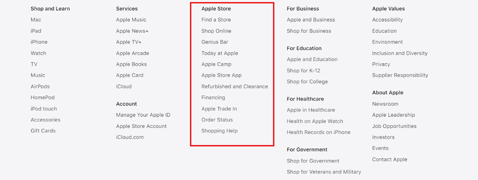
For example, the footer of Apple’s website has columns.

- You can also separate the information by changing coloured backgrounds.
Opt for visual elements
It is often said that a picture is worth a thousand words.
It is true for your footer because it is necessary to put as much data as possible in a confined space.
For example, a map may be better than a written address, as it shows your address and its surroundings: users know directly how to visit you.
Moreover, social media icons are eloquent enough and replace links or double-barrelled phrases that encourage your visitors to follow you on Facebook or Twitter.
It is also possible to use illustrations to indicate your contact form, email address or help centre.
Remember that you can add videos to your footer. They have a strong commitment rate to visitors. However, don’t make information search confuse because of too rapid or uninformative videos.
Here is a non-exhaustive list of the different elements that form an effective and useful footer for your visitors.
Make the visitor’s browsing easier
You are advised to repeat the navigation menu in the footer, but don’t recreate your main menu.
Reminding the navigation menu is very useful for lengthy pages or mobile browsing: it’s possible that internet users need to change to another page once they reach the footer, or waste time if they need to go back to the top menu when they are at the bottom of the page.
The sitemap in the form of Sitemap.xml file can also be shown in your footer.
Users see it rarely, but it is useful to improve the web crawlers’ content understanding.
💡 However, don’t add all the sitemap.
The objective is to bring additional information or information presented differently to offer browsing alternatives to better guide visitors.
Your footer can also have a search bar that enables users to browse easily and quickly on your website if it isn’t in the header of the page yet.
A “back to top” button enables you to give your visitors the possibility to go back to the top of the page in just one click, instead of scrolling all your page in the opposite direction.
Put yourself in your visitors’ place to understand the elements that will make them save time and improve their experience.
It is essential for your website ergonomics!
If users need additional information about your website, they will naturally see the section at the bottom of your page.
Why?
Because everyone usually seeks for detailed explanations in the footnotes when they read books.
In this way, your footer can also be the perfect place for additional links related to your website, and you want to see on your pages. It enables you to specify them without consecrating a section or a full page.
Present your company to show off your credibility
You can add links to your “About us” and “Press” pages in your footer.
The “About us” page presents your company and its identity, your business sector, your team, and your history. It is essential to fix your personality in users’ mind and encourage new users to know more about you.
The “Press” page is the perfect place to show all your social proofs.
This page gathers:
👉 all the articles which are about you
👉 your prizes or trophies (innovative company, regional competition…) if you received rewards
👉 certified logos (for example, for “green” companies) that can also serve as social proofs
👉 your logos and visual elements users can download easily and for free
👉 other documents such as photos for journalists or a complete graphic charter for your future collaborators
You can also show some customers’ reviews that will favour your credibility because social proof is powerful to reassure your visitors.
💡 It is also possible to add a five-star rating to your footer.
The footer is the perfect place to highlight your events: your presence in a show, your current promotions, your latest news…
You can also publish your latest articles on a blog.
Reassure visitors with your guarantees and legal notice
You can show your guarantees in your footer:
These guarantees can be shown as a sticker or a banner in your footer.
Your footer is also the perfect place to show your corporate values, such as the useful information about customer service. If you manage an online store, you know your customers’ frequently asked information:
-
questions about delivery
-
return policy
-
order follow-up, etc.
Make your visitors’ life easier by anticipating their request for information: answer all their questions in your footer, thanks to legal elements you must specify:
-
copyright
-
legal notice
-
terms and conditions
-
privacy policy, etc.
All these legal details enable you to protect your website and its content, as well as inform your visitors about the regulations in force.
Most of the users go to the footer to contact the website.
The Contact page enables you to show your contact details with your opening hours, for example. You can also make the access to the contact form easier to keep the link between you and your visitors.
It is also possible to add these contact details, directly to the footer. For example, you can use Google Maps and configure a specific screen size to locate a store or/and a contact form to enable your visitors to contact you, directly from the footer.
Moreover, you can achieve your footer with:
Your footer can have one or more call-to-action buttons to encourage your visitors to follow you on social media, visit your online store or subscribe to your newsletter.
These buttons make your visitors interact with your website. They are funnier and more intuitive than basic text.
You can unite visitors thanks to connexion or subscription forms.
Add a subscription form to your newsletter in your footer or a login section to sign in to their member space or sign up.
The footer is the perfect place to show the clickable icons to your social media.
When your visitor is at the bottom of the page, you can encourage them to go back as soon as possible.
Now you know how to create an effective footer with all the clear information your visitors expect. It will also improve your website browsing and show off your credibility.
The text of your footer will be in all your website pages. Therefore, your footer plays a part in your SEO.
Its impact is insignificant, but it is judicious to optimize each part of your website to have a better visibility on search engine results pages.
Therefore, you can add with parsimony some transversal keywords to your footer, which are related to your business sector.
Each website has its custom footer.
Here are some examples of footers with their specificities to help you understand the different types of existing footers and create your footer:

In general, the footer splits information with some icons, such as Welcome to the Jungle.
✔️ The footer helps you browse the website. You have well-organized information which is easy to recognize. All the elements of an effective footer are here and simply put.
❌ As seen above, the footer is an important section of your website that can be more original and significant to fix your identity in your visitors’ mind even more.
If your website has many categories, you can make your footer a complete and exhaustive browsing tool.
✔️ If you have a large website, your footer enables users to have an overview of all your categories and go to them in just one click.
❌ A too large and extensive footer can be unclear and discouraging for users. They must search the information they want for a long time.

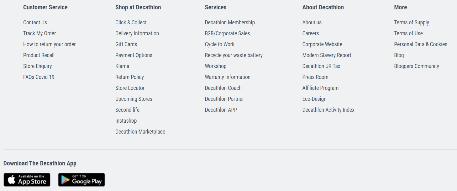
In the same way, the footer of the Decathlon website is very complete and brings additional information to the website.
✔️ In this footer, users can directly accede to the mobile app of the website and go back to the top of the page with the arrow at the bottom right.
❌ It is a refined footer, but it has some blank spaces that make an unfinished impression.

The website of Coca-Cola has a very minimalist footer with legal notice as well as terms and conditions of the website.
✔️ This simple, concise and minimalist footer takes up little space on the page the user is visiting, and doesn’t overlay your content.
❌ This footer doesn’t have any pictures or social media icons, and doesn’t help users browse the website.

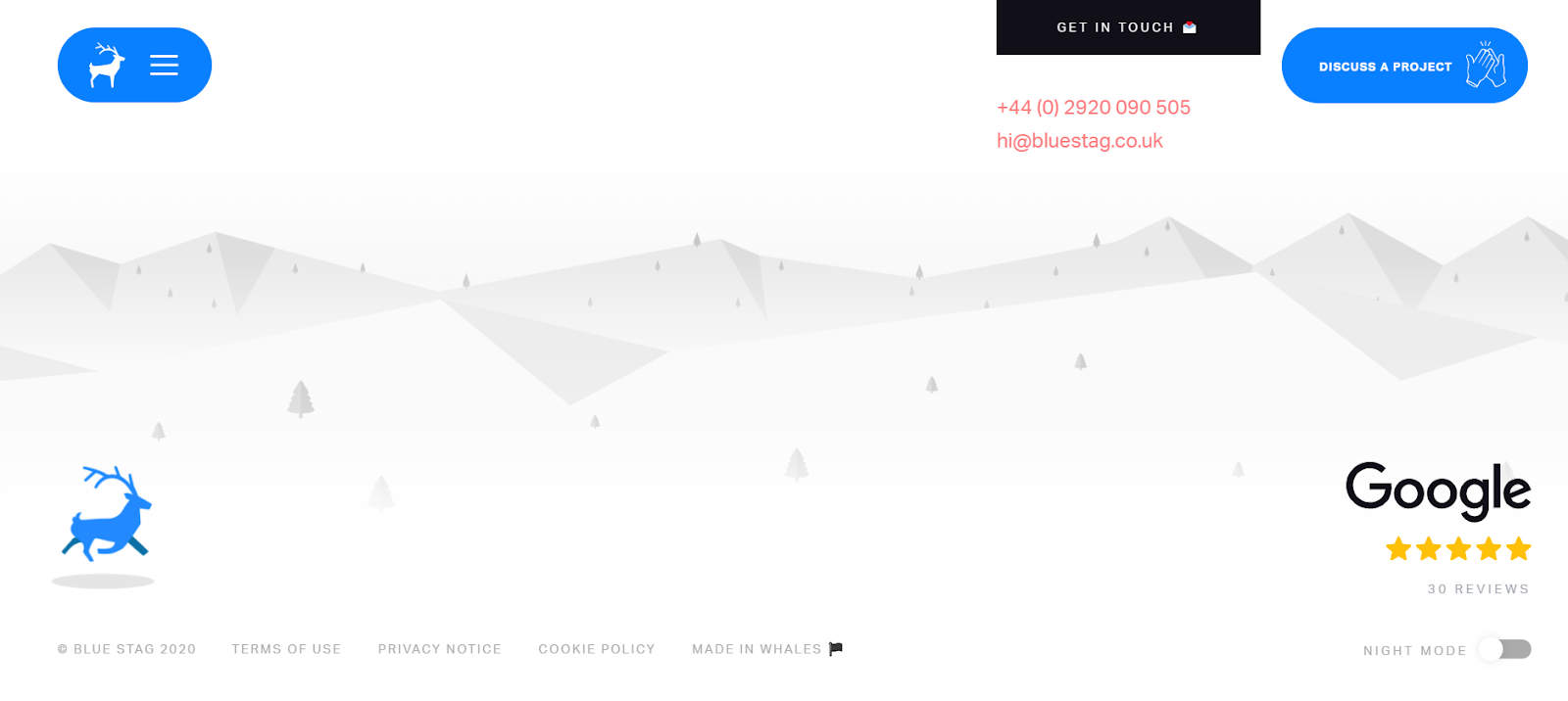
Your footer can have a small animation or a visual element such as the Bluestag agency.
✔️ Adding a visual element or animation to your footer makes it dynamic, original and encourages your users to click.
❌ The creation of an animation requires additional technical skills. You can also add a background photo, provided that your footer is still easy to read.
You can create a multilevel footer such as Asos. Black, white, light-grey and dark-grey backgrounds enable you to sort the information on the footer.

✔️ Using several backgrounds offers a fun and intuitive categorization. You have all the information.
❌ If you don’t respect a visual coherence for your footer, splitting it into several categories, your footer can be unclear, and the user can have difficulty distinguishing the footer from the rest of the website.
💡 You can also add a fixed footer to your website. The fixed footer remains at the bottom of the user’s screen while scrolling the page.
It will mean that you have to create a discreet footer that still makes your content readable.
Now release your creativity, stand out your talent for web design and use our tips to create the most beautiful footer of the internet!

