The importance of a trendy logo for your brand image
The logo of a company is at the center of its visual identity. 💜
It’s one of the pillars of its commercial success.
Keeping up to date with the latest logo design trends is essential for any brand that wants to remain relevant and competitive.
If you want to create a logo for your new company or redesign your current one, you are in the right place.
Knowing the logo trends of 2025 can help you stand out from the crowd and choose the right approach to create a modern design for your website.
Being aware of the evolution of trends enables you to create modern and trendy logos. An old or obsolete design can suggest that a brand is outdated.
However, it’s important to distinguish between current logos that can reinforce the identity of a company and those that weaken it. The solution lies in finding a balance to protect your brand’s authenticity. ⚖️
Discover the latest logo trends for 2025: minimalism always in vogue
Minimalism and simplification forms have been fashionable for several years now…
In 2025, details are optional. The fewer they are, the easier it is to see the logo. Simplified forms create universal, easy to read and remember designs.
Minimalism is not only an aesthetic trend, but it’s also a philosophy. If a brand chooses a simple and clear logo, in general, it becomes more recognizable.
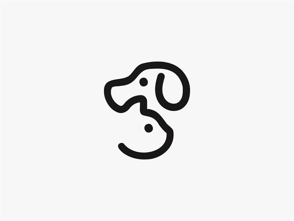
Monochrome palette
One of the minimalist trends is the use of monochromatic palettes.
In 2025, this means that many companies will choose logos in a single colour, giving them a smart and elegant appearance.
Black and white are the most commonly used tones, although neutral shades like grey, kaki, beige, etc. are also popular. ◐

Monochromatic logo - Torrike Uchava
Geometrical composition
In current logo trends, geometrical compositions will be fashionable again.
This involves using shapes as a design basis, enhanced by colours, custom forms, or repeated patterns.
Geometrical designs that convey a sense of movement are particularly appreciated.
The shapes can include triangles, diamonds, or squares, combined with text, lines, and icons to create a cohesive symbol. This type of structural design follows the same philosophy as minimalism: avoiding clutter and keeping only the essentials. 🔺🔵🟩
In 2025, nostalgia for logos
The vintage trend will remain popular for logos in 2025.
Designers are turning to the past by using vintage fonts and old-school elements.
This helps create a feeling of nostalgia and reliability, which are particularly important for brands with a long history.
Use of classic fonts and elements
Classic fonts and vintage typography will continue to be popular in 2025.
On the contrary, they have found their most loyal customers in different industries, such as restaurants, sport brands, and cosmetics brands. 🚴♂️💄

Vintage logo - haszart
Pastel and soft colours
Pastel colours are making a comeback.
They provide logos with a sense of softness and sophistication. These colours are particularly popular among brands focused on women and household products. 👩

Logo with pastel colours - Manuel Corsi
Back to the 70’s
Designers are drawing inspiration from the styles of the 70’s and 80’s, characterised by vibrant colours, bold geometric shapes, and original fonts.
This approach enables us to create eye-catching logos that are memorable.

Nostalgic logo - Kyle Letendre
Pixel art
Pixel art, the visual style typical of past generations, is set to make a major comeback in logo design, drawing on nostalgia with a retro-modern aesthetic.
Once a dominant trend, pixel art became so overused that it lost its appeal, particularly in the technology sector. However, after decades of dormancy, it is set to return with a vengeance in 2025, embraced by a new generation captivated by the ‘low-fi’ aesthetic. 👾

Animated pixel art logo - John Trivelli
What are the trends for brand logos in 2025? Mixing genres
The hybrid style, also known as ‘Mix-and-Match’, involves combining different eras and styles.
It allows designers to experiment and create unique logos that merge elements from various periods and cultures.
Mix of handwritten and digital elements
This approach brings a welcoming and genuine touch that stands out for its individuality. It is particularly suited for brands that want to emphasize their singularity and creativity. ✍️
Designers are experimenting with asymmetry by creating unexpected images. This approach allows logos to stand out from uniform and predictable designs.

Unexpected logo - Conceptic
Cultural merger
With the world now more connected than ever thanks to digitalization, it’s essential for companies to integrate different cultural elements into their visual identity in 2025.

Logos with cultural merger - Ramy Wafaa
The merging of cultural elements in logos can create rich brand identities that tell complex stories. By integrating aspects from different traditions, your company can promote inclusivity and resonate with customers worldwide. 🌍
Symbolic and metaphorical story
To foster engagement, storytelling has become a widely adopted approach.
Brands increasingly aim to convey a powerful message through logos that can communicate their origin.
This may involve using a bold visual element that directly reflects a central aspect of the brand or adopting a more metaphorical approach to represent a particular concept.

Narrative logos - Lea Poisson
The main logo trends in 2025: natural colours and textures
Ecology and protecting the planet are important factors that influence all design sectors. 🌱
That’s why this trend remains relevant in logo design for 2025. The use of natural colours and textures helps create a feeling of closeness to nature and attachment to environmental values.
Patterns and textures inspired by nature
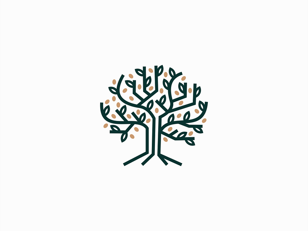
In logos, we often find natural symbols such as leaves, trees, animals, and representations of the planet. These elements help visually emphasize the brand’s interest in ecology and express the idea of unity between nature and humans.
A major importance is also placed on natural patterns and textures, earthy colours, and organic shapes. These design choices resonate with the growing base of consumers who are concerned about the environment. This is a prominent trend that will remain relevant in 2025.

Natural logo - Unom Design
The main logo trends in 2025: multidimensionality
3D elements in logos will still be relevant in 2025.
Companies that work in the information technology or education fields, or that target a young audience, appreciate this type of graphic design.
Use shadows and shading to create depth
Shadows and shading are powerful tools that add depth and realism to your logo. They help create an impression of volume and space, making the design more dynamic and vibrant.

Logos with shadows and shading - Mihai Dolganiuc
Interactive elements
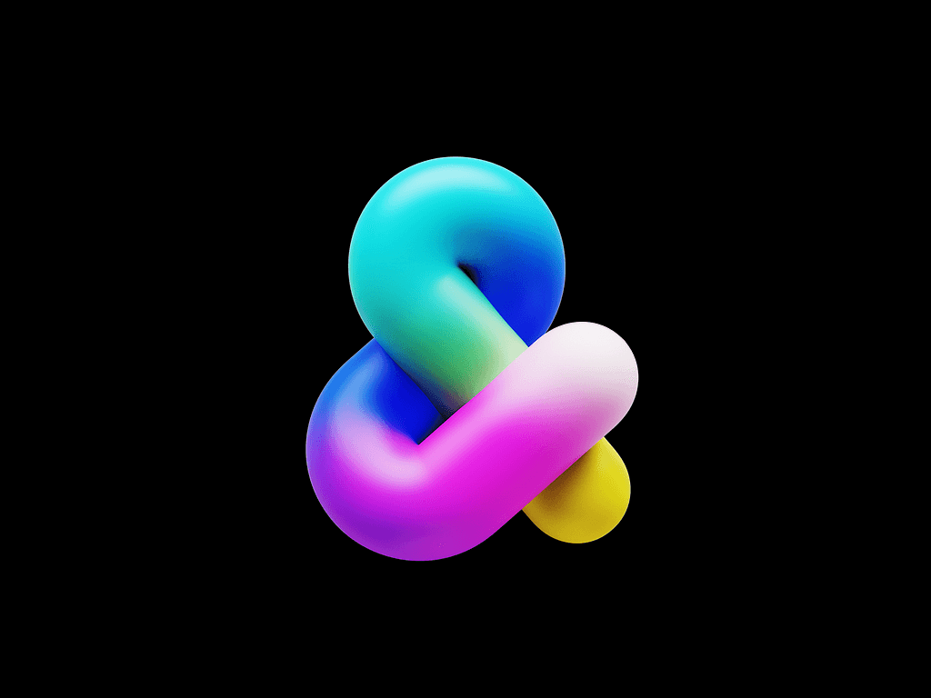
3D graphic designs are continuing to evolve quickly. The shape and colour of these logos can change depending on user interaction, creating a unique and memorable experience.

Interactive logo - Daiana Villalva
Geometric shapes and 3D
Designers are embracing basic geometric shapes such as circles, triangles, and hexagons, which are known for their refined lines and precision. These shapes convey an impression of stability, making them perfect for brands that want to reflect strength and simplicity.
3D makes a comeback in 2025, adding depth, shadows, and textures. This allows brands to create tangible, attractive, and memorable logos. The visual complexity of 3D makes these logos stand out, offering a fresh way to catch attention and leave a lasting impression on consumers.

3D logo - Mihai Dolganiuc
Cut angles
The trend of using cut angles in logos is driven by the desire to create a striking and distinctive visual aesthetic.
By eliminating corners, designers can introduce negative space, creating visual impact with non-traditional angles and sharp contrasts. This trend adds dimension and depth, as it recalls shadows and light on 3D objects, giving an impression of boldness, modernity and avant-gardism.

Logo with cut angles - Caivanean C. Alexandru
Recreate 3D shapes on 2D surfaces
Another logo design trend is the recreation of 3D shapes on 2D surfaces.
Using cubes and extruded shapes in flat logos has become increasingly popular due to their ability to add depth.
In 2025, designers are using these single-colour shapes to enhance visual impact, allowing the design to remain bold and memorable while eliminating distractions caused by complex details.
The main logo design trends: negative space
Negative space is a technique that consists of using the empty areas of a logo to create images or hidden symbols. This approach makes the logo more intriguing.
It allows companies to convey an additional message through their logos. As a result, consumers are encouraged to learn more about the brand.
Contrast and balance
Contrasting colours are essential tools when it comes to negative spaces. They help highlight the important elements of the logo, creating a harmonious and visually pleasing design.
However, it’s important to find a balance between negative and positive space so that the represented image remains readable and recognizable.

Logo with negative space - by Lucian Radu
Animation for logo design will be trendy in 2025
In 2025, dynamic images with changing elements will remain popular for their ability to adapt to different contexts. The form, colour, or elements of these logos can change depending on the situation, creating a vibrant and modern character.
This approach is especially appealing to younger generations who love technology. Among the different animation styles, you can find transformations, rotating elements, 3D animation, and dissimulation techniques.

Example of animated logo - Digital Glorious
This trend is gaining ground because brands recognize the increasing importance of visual storytelling. With animated logos, you can convey emotions, create a memorable experience, and bring your brand identity to life in a unique way.
Experimental fonts will make part of the main waves in 2025
In 2024, we were impressed by the constant use of experimental typography. This trend will continue in 2025.
Text integration in a logo enables you to create a harmonious and holistic image. The writing can be integrated in an organic way in design creation, creating a unified composition.

Logo with integrated word - Wells Collins
Creative fonts
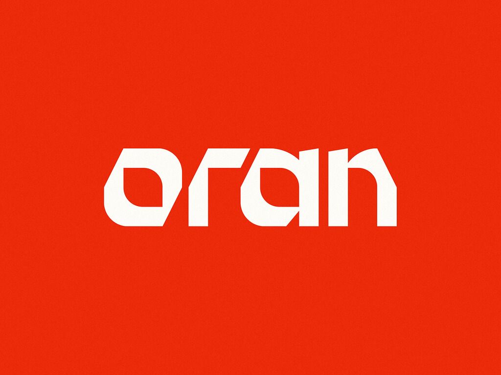
Experimental fonts are a great way to stand out and create a unique visual style. Designers use notches, unusual letterforms, and play with proportions and spacing to create a remarkable logo.
Written calligraphy
Written letters, scribbles, and childlike drawings give a logo a personal and friendly touch. These designs help create an emotional connection with your audience. 🖊️
Brands that want to emphasize their authenticity appreciate this style.

Logo with written fonts - Wells Collins
Custom fonts
This year, adding unique elements to an existing font or creating a comprehensive font from scratch can generate a lasting impression.
The key lies in creating a focal point - a distinctive detail that highlights the name while remaining consistent with the main concept or message of the brand.
Which colours for logo design in 2025?
The choice of colours for logos in 2025 is a personal decision, and there are hardly any universal trends. However, many large brands seem to miss saturated colours.
Bright colours
It’s challenging to work with bright colours. They grab attention, make a bold statement, and tend to overshadow the other elements of the brand.
Shadings and colour transitions
This approach adds depth and dynamism to logos, making them more appealing. Soft transitions between colours give an impression of movement and strength, which is particularly important in digital media.
Neon light shades
Sharp shades are making a comeback, bringing boldness and vibrancy to logos. These colours grab attention and help brands stand out. They are particularly effective in catching younger audiences and creating a modern image.
High contrast
Bold contrasts help 2025 logos stand out. Unusual colour combinations enhance visual perception and readability. This approach is ideal for brands seeking a clear and impactful image.

Contrasting logo - Angie Mathot
Candy colours
Vibrant and saturated shades reminiscent of candies are expected to have a strong impact on logo design in 2025. 🍬
These eye-catching and playful colours refer to a nostalgic feeling, bringing back childhood memories. Shades like bubblegum, baby blue, candyfloss pink, mint green, and orange-red are often seen at higher saturation levels. They convey warmth and joy, making them particularly effective for brands targeting young people or creative sectors.
Designers can combine these colours with whimsical elements to enhance their appeal, creating logos that radiate brightness, optimism, and youthful energy.

Animated colour logo - Manuel Corsi
Customization and conceptual brand image
A unique design for each customer helps you stand out.
Designers face the challenging task of crafting a story through a logo. This story must be coherent and easily understood by consumers. It’s a significant challenge, but when approached with talent, true magic happens.
Scribbles and sketches
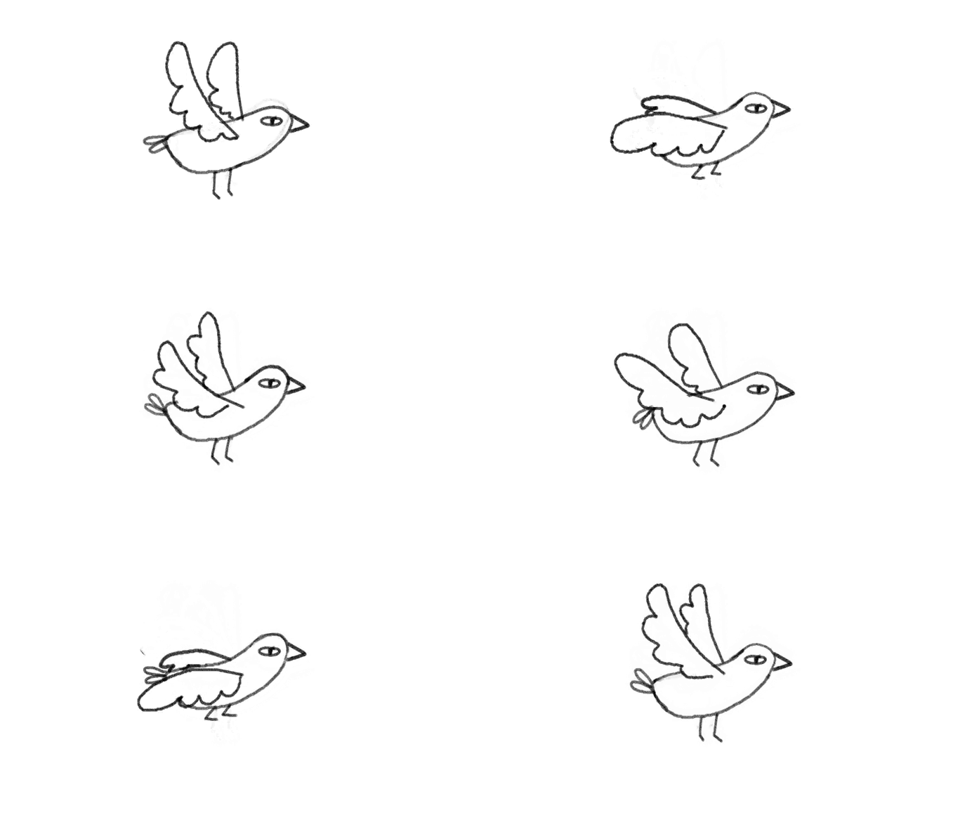
Hand-drawn elements add a human touch to design. This trend highlights authenticity and creativity, making brands more relatable.

Logo in the form of a sketch - John Poh
Drawings can effectively convey a brand’s personality, especially for companies aiming to appear friendly, innovative, or artistic. If you want to forge a strong emotional connection with your audience by delivering a personal and individual touch, this is the trend to follow.
Logo trends in 2025: Happiness above all
Designs focused on people and well-being are another major logo trend in 2025.
Consumers today are under constant stress, and mental health is more important than ever. That’s why people seek comfort in everything, including visual communication.
Soothing, fluid lines, positive image, soft, rounded fonts, warm colour palettes, and natural materials can all be used to embody this trend.

Good vibes logo - Alfrey Davilla
Rethink AI for logo design in 2025
Artificial images generated by “lifeless machines” have recently become uninspiring. Society is increasingly wary of the potential dangers posed by robots. AI needs to be rethought. 🤖
Logo trends in 2025 will emphasize authenticity. Therefore, artificial intelligence will likely be used by designers to handle routine tasks (for example, selecting harmonious colours and fonts), while brand concepts will demand an approach rooted in humanity, uniqueness, and well-being.
Integration of augmented reality
Another key trend in 2025 will be the incorporation of interactive elements into logos using augmented reality (AR) technology. 🥽
The integration of AR in web design unlocks new engagement opportunities for brands, enabling immersive 3D experiences.
This trend is especially significant for future-focused companies, especially those in technology or video game industries, because it positions them as leaders of digital innovation.
Logos in 2025 will continue to reflect minimalism and nostalgia, featuring vibrant colour combinations and bold fonts.
However, remember that no trend is an absolute rule. It’s a source of inspiration.
Designers should avoid confining themselves to trends, preserving their creative authenticity instead. ✨
