Website mockup: what is it?
Before anything else, we think it is important to recall what is a website mock-up. Indeed, it may be confusing: so what is the real definition?
Website prototype: definition
A website mockup is a concise visual representation of your website. It is static, that is to say that it does not show the animations of the website. To make a mockup, a web designer uses the wireframes that have been previously made.
On a website model, we usually find:
-
The content areas
-
The website layout (colors, logo, visuals...)
-
The functionalities of the website
The mock-up of a website is the step that precedes the development of your site, so it is very concrete!
Wireframe and mockup: what's the difference?
Many people tend to confuse wireframe with website mockup, or website structure. However, it is not at all the same thing!
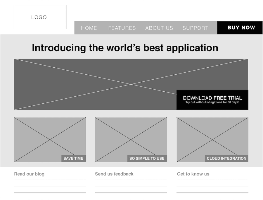
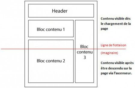
A wireframe, or also called wireframing, consists in roughly sketching the structure of a website. It is done using blocks to show the main content areas and the major lines of your website.

Source: La fabrique du net
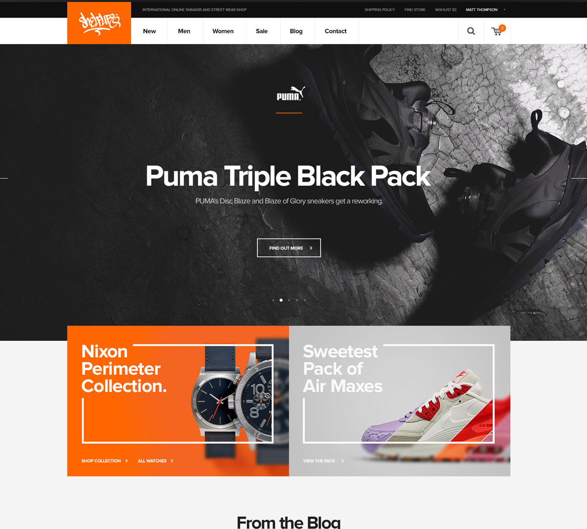
Making a mock-up, on the other hand, is much more precise . In a mock-up, you present each feature in detail, and each graphic element of the website. We can see the contents, logo, colors of the site, etc..
Your website model will allow you to review the choices you made for your site, to determine if they are feasible technically.

Source: Webdesigner Trends
So we can see that wireframe and mockup do not mean the same thing. They are in fact two different steps:
- The wireframe is made first, to define the structure of the site and the different areas.
- The mockup is then made, based on the wireframe. It is used to define the website, its contents and its design. Thanks to it, we can have a good idea of what the site will look like, in other words its visual identity.
Create a website
Why create a website model?
Creating your website mockup may seem like an unnecessary step, especially if you already have ideas in mind. But this is not the case, a mock-up will help you build the structure of your site.
Your website model will allow you to :
-
Detect possible problems: creating your website prototype will allow you to see if there are operational or technical problems. This will allow you to minimize the visual and technical changes on your site once published, which can spare you a lot of time and money.
-
Get a clear idea of what your website will look like: what's worse than a website you don't like once it's published? With a mock-up, you get as close as possible to what your website will look like when it is published.
-
Think about the user path through the website: this step allows you to optimize the user path you set.
-
Save time during the design of your website: even though you have the impression of wasting time by making a prototype for your website, it allows you to save a lot of time later on.
There are many reasons why you should mock-up your website design. This step is crucial to avoid errors and minimize changes related to your site optimization.
In addition, it is possible to make a prototype for your website in only 30 minutes!
How to quickly create a website model?
Is it time-consuming to create a website prototype? How to do it?
We will see together how to make it easily and quickly.
Make a model based on a wireframe
It is important to know that a website mockup is not made out of scratch. The first step is to build a wireframe, which will be the basis of your model: the web designer will be able to rely on it to design the mock-up of your site.
This wireframe will allow you to think about the architecture and the navigation of your website.
Then, you will complete your model thanks to the wireframe. The wireframe is rather related to marketing, whereas mocking up your website is a more creative work.
In order to be able to make your mock-up, it is essential to make a creative brief for the web designer who will take care of the creative part.
Thus, you will need a logo and a graphic charter, to convey your brand identity and the image you want to project.
But let's see the graphic elements in more details...
The graphic elements of a website mock-up
In order to create a website model, it is necessary to have certain graphic elements.
Among them:
This is the basis of your visual identity. It is important to develop it in order to define your colors, typography, etc. To learn more about how to create a graphic charter for a website, we have made a dedicated article.
Your logo represents your brand and allows you to define it. It is essential for a website mockup.
The call to action buttons are important elements that must not be neglected. They lead to conversion, so they should be visible and sophisticated.
Before creating the layout of your website, think about all the visuals and graphic elements that your website will need.
This way, you will save time on your mock-up design since you already have all the elements.
Now that you have all the graphic elements, you can begin your website model in itself!
To create your website model, there are a number of tools, both free and paid. These are for beginners as well as for the more advanced users.
Origami
Origami is a free tool, created by the designers of Facebook. This tool allows you to easily design modern interfaces .
👍 Pros: free tool and compatible with Sketch.
👎 Cons: the tool is only available on Mac and IOS.
Sketch
Sketch is a paid tool, which can be a bit difficult to use for beginners. On the other hand, if you are a web designer, it's a great tool.
👍 Pros: lots of resources and very complete.
👎 Cons: not suitable for beginners.
Outils Adobe
Let's move on to several tools in the Adobe suite. Photoshop, Illustrator and Adobe XD are paid tools that can allow you to create your website model.
These tools allow you to customize your layouts as you wish, to make them much more complex.
👍 Pros: very customizable and complete.
👎 Cons: requires time and skills to be able to use them
Moqups
Moqups is a Freemium tool, which means that it has a free offer and paid plans. It is very easy to use and allows you to work in teams and organize your mockups and wireframes.
👍 Pros: free offer and ability to work in teams.
👎 Cons: limited free features.
Mockplus
Mockplus is also a freemium tool. It allows you to create mockups for all devices (desktop, mobile, tablet). It allows you to adopt good design practices for each platform.
👍 Pros: free offer and available for multiple devices.
👎 Cons: price of the tool.
InVision
InVision is a Freemium tool. It l is quite complete and allows you to animate your models. It is compatible with Sketch and allows you to combine mockups.
👍 Pros: complete tool and possibility to animate your prototypes.
👎 Cons: limited free features.
Create a website mockup with SiteW
SiteW can also help you to build your website mockup.
This has two advantages:
You have a responsive mockup, that is to say: adapted for desktop, mobile and tablet
You get familiar with the editor and its features to save time during the actual creation of your website
You just have to login to your SiteW account, and start with a blank design.

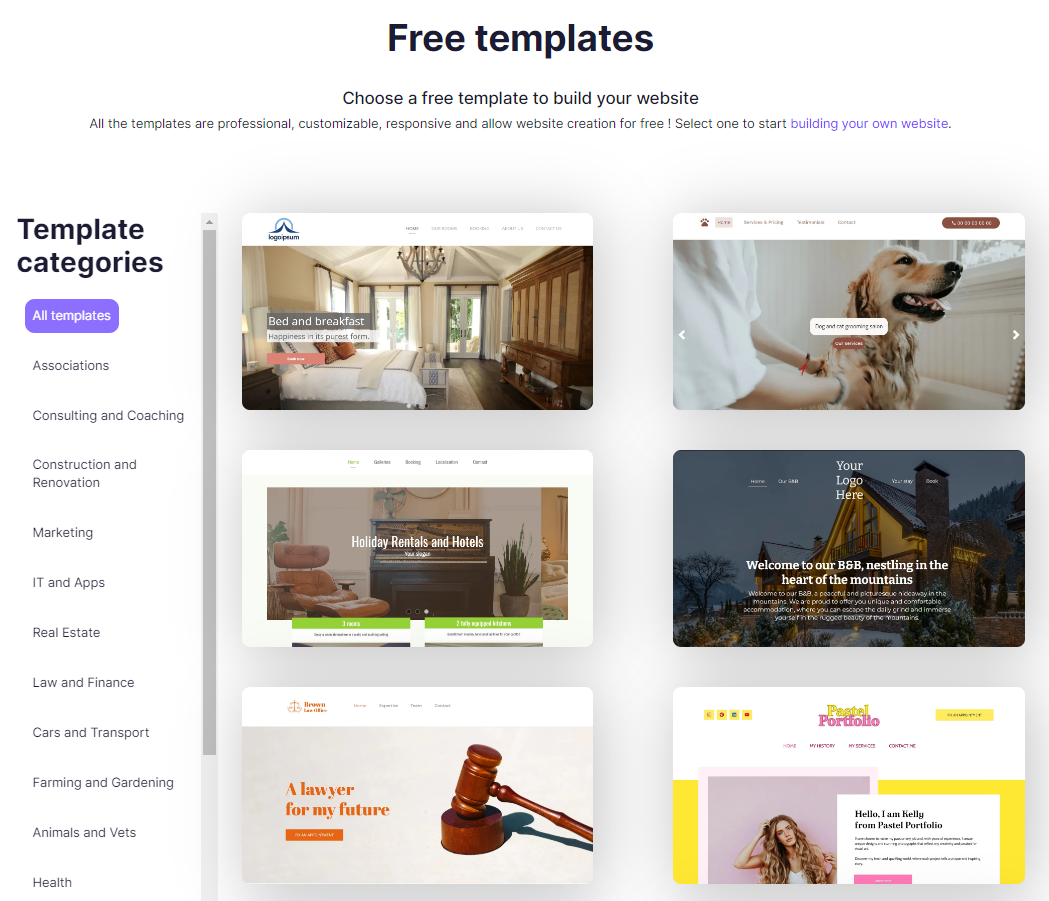
By scrolling down to the bottom of the template page, you will find two types of blank templates: a light one, and a dark one.
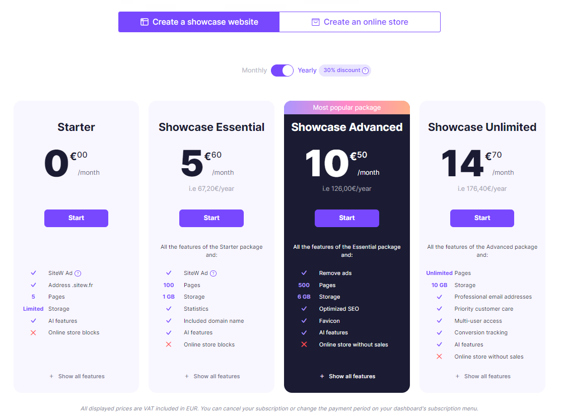
Choose the Starter package, which is totally free, to start creating your mock-up.

To help yourself, you can develop a wireframe beforehand based on those you can find on the internet.
Then, you just have to express your creativity to create your model by adding a logo, illustrations, shapes,... and by creating a graphic charter.
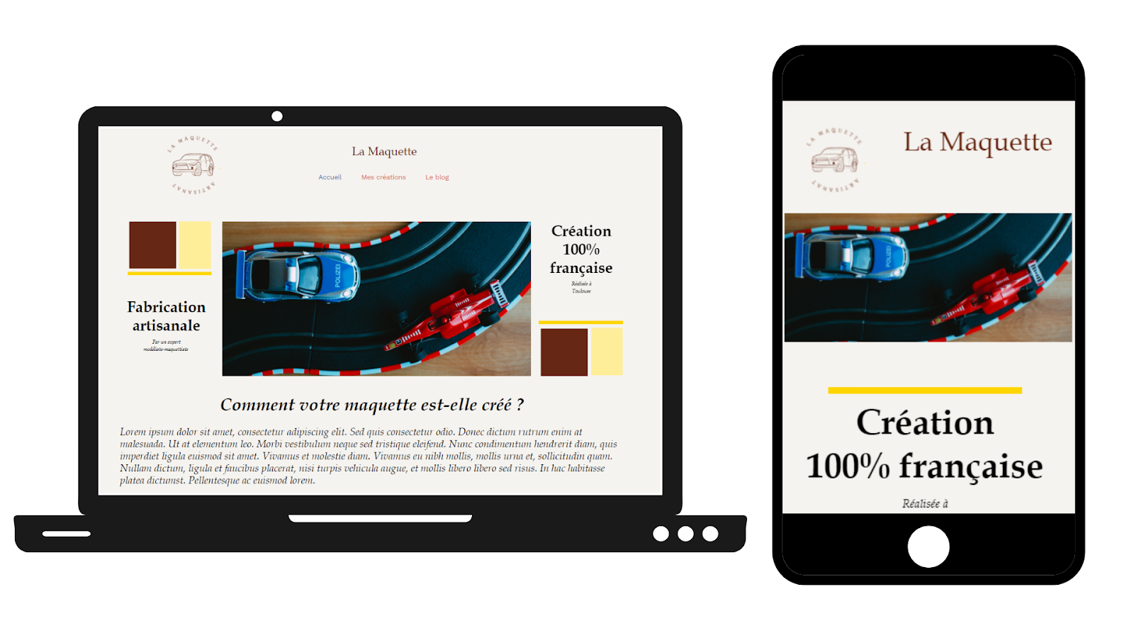
Here is an example of a mock-up created with SiteW for a small craft store.
By creating a model like this, you can become aware of:
-
where the fold (upper part) of your site is,
-
space constraints,
-
how your site will look on phones and desktops,
-
what your graphic charter will look like once your website has been designed...
... All this, in about thirty minutes!
Create a website
Common mistakes when creating web mock-ups
Now that we have seen the tools at your disposal to create website mockups quickly and efficiently, let's see the mistakes to avoid.
Of course, a mockup must contain the important details, as we have seen. However, it is not necessary to overload the page with a lot of details.
This is where it is important to have a graphic charter: a bad choice or an inconsistency of colors will make your website unreadable and inconsistent.
For the user experience, it is important to put all the important content above the fold, making sure that nothing is cut off on the page.

Source: Pinterest
Making a beautiful website is great. But don't forget who your target audience is and what they want from you. Your site should be consistent with your target audience, and their tastes.
A website design should be compatible with all devices (web, mobile, tablet), but also with the different browsers and screen sizes.
Pay attention to the font you choose, but also to the size of the characters and the spacing between lines. An illegible text will scare off your visitors.
Think about the links between your pages: your website should be consistent.
Website mockup: in summary
You now know more about website mockups. Making a website mockup in 30 minutes is an achievable goal with the tools we have presented and a good knowledge of the topic.
In summary, making a website mockup will save you precious time when creating your website. Many tools are at your disposal to create a model quickly and efficiently.
So don't hesitate any longer and start making mock-ups for your website!
