We’re speaking about landing page, but that’s not about flying. However the aim is indeed to make your sales and/or your reputation take off.
Landing page is an Inbound Marketing process which helps to reach two main goals: Make your leads land on a single target page and then, convert them into qualified prospects. We’re going to see together, some examples of landing page content, some tips to create a successful landing page and some inspiring examples of efficient landing pages.
We all know that humans like to be in the spotlight. Make them the topic of conversation, and you will get them on your side entice them, as a result. There will be no exception for your landing page: to write your argument, put yourself in the shoes of your customer, don't speak as a business owner.
Your landing page should provide a value proposition: focus on the experience of the product, more than on its characteristics, to encourage your visitors to imagine and visualize themselves, using your product or service.
Let’s begin with the basics: The structure of your landing page.
Landing Page example: What should we add to a landing page?
Actually, the main principle of a good landing page, is a bit like talking about your visitor, but without forgetting to speak about yourself. Discreetly. Innocently. Subtly... In order to be ever-present, without being invasive, there’s no such thing as the visual identity.
- That’s why, the first element to add to your landing page is, your quintessential ideogram, namely your logo. Put it in a very visible place: On the top left.
- Second element to place discreetly, but in an accessible way, at the top of your landing page: a menu, to let your visitors immediately find their bearings, in relation to the other website pages.
- Finally, one last item not to be forgotten is: a way of contacting your company, as simple as possible. A chatbot, for instance.This system is a way to compensate the lack of human dimension, on the web.
- You’ll then obviously add your value proposition, your argument, your reinsurance elements, if needed.
Creating a landing page: What should it look like?
Your landing page has to be nice: the spitting image of your company, as we already said (it has to be consistent with your visual identity), but it also has to be epic (to say it simply).
To do so, there are several levers:
- Color choices: bright, deep, saturated, sober, pastel...You have a large choice. Your preference will depend on your corporate identity, the values you want to convey, the feelings you want to bring, the atmosphere you want to create...Of course, when you speak about colors, the rules are always the same. It’s about respecting the universal principles of good taste: not too many hues and which blend well...You should know the drill ;-)
- Font style selection: Serif or Sans Serif, possibly decorative, or handwriting, by small touches. As you probably already know, the important thing is to keep, above all, a good readability.
- Visual elements integration: once again, you’re free with your choices. Your guiding principle should be relevance; every new element has to strengthen your words, in one way or the other.
- Use of geometric or organic shapes: Geometric shapes give a sense of dynamism, vitality, and design. On the other side, organic rounded shapes, will evoke more sweetness, friendliness, even a cozy feeling...as usual, you’ll make your choices in full awareness.
-
Addition of animations and videos: a dynamic webpage is often more popular than a static page. However, be careful, animation effects are like all good things: less is more.
Your landing page is almost ready. It’s time to run the last tests before launching it.
Here are our tips, to develop a landing page with a high conversion rate.
Our tips to create an efficient landing page
Exclusively, we present to you our top tips on how to create a really effective landing page, the results of which will astonish you.
How to seduce
- First of all, keep in mind that a landing page has to focus on one single goal. So, it has to deliver only one specific message to your visitors: it can be a file download, a newsletter subscription or a product purchase.
- With this in mind, the landing page principle is almost the same as a cobweb: it’s beautiful, attractive and hypnotic, and it ensnares you! ;-) To this end, you’ll insert very few outbound links, and use all the possible means, to (gently!) bring your visitors to fill in your form, or to click on your “call to action” button. To do so, no holds barred (or so!). ;-)
- Insert images, shapes, drawings, videos… Everything which allows you to catch the fickle eye of visitors.
- In the same way, more than catching the eye of your visitors, you’ll have to channel them, and lead them where you want them to go (button, form); to do this, you can resort to directional indicators as we call them (traditionally arrows, lines, shapes...but it can also be the gaze of a model in a picture, for instance).
- You can also place the most important information at the top of the page, above the scroll (or above the fold).
How to convince
Of course, you’ll also have to convince. And to do so, as we’re smart, we’ll act on two levels: the rational side and the emotional side.
- As always, try to be clear and concise. To achieve that, we know that the writing contents have to be organized, divided and refined to the maximum level.
- Show, as far as possible, the products in use. And add some social proof, easy to understand: visual if possible. (When we talk about social proof, it’s an elegant way to speak about the lemming effect. The herd instinct of humans is really strong and make them naturally imitate others).
- Finally, you can perhaps offer a free try. This often matches the expectations of your visitors, and will help them to make a decision about a purchase more easily.
How to be visible
Lastly, don’t forget to insert your keywords, and to frequently update your landing page, to optimize your SEO.
Some landing page examples among the best ones:
Here are some examples of efficient landing pages, in order to give you a concrete sense of the elements which should be added to a good landing page.
A simple and efficient landing page
Evernote
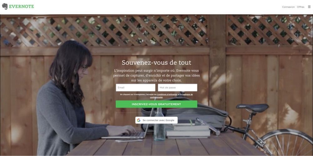
H1 is short, simple and concise, it expresses well the customer benefits. The form is easy to fill (only two fields). We immediately identify ourselves to this hard-working and focused young woman, and we don’t really distinguish her facial features, which increases the feeling of identification.
More information about the product could be needed, because everybody doesn't necessarily know this brand.
Use Humor
Tumblr
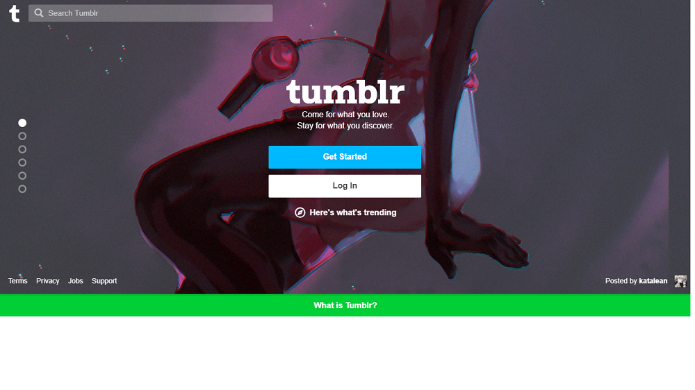
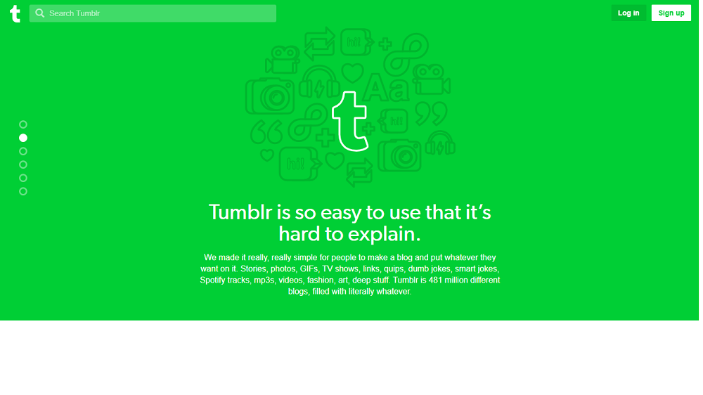

On the Tumblr page, people are fun, with a lot of vitality and humor. Their landing page is simple and straightforward. Everything is said from the baseline: “”Come for what you love. Stay for what you discover”. Nothing is redundant, we have only the essentials. The buttons are clean and centered.
Insert geolocation in your landing page
Air Bnb
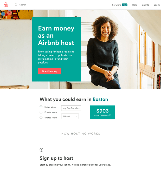
In the Air Bnb page, we can notice two interesting points: geolocation on the form and the eyes of the photo model, which make us look at the central text.
Example of a landing page which relies on argument
Plated
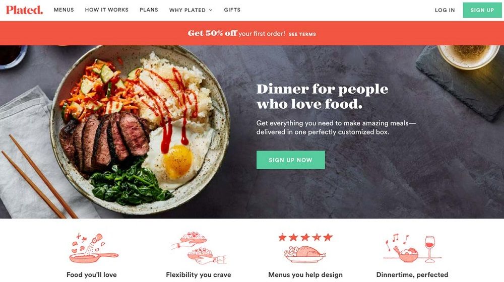
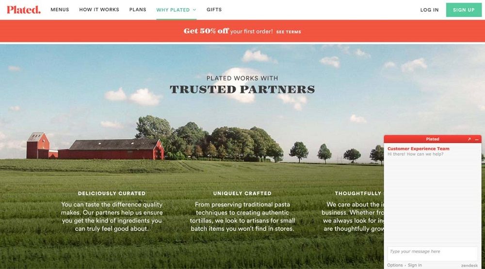 Plated is a brand, which provides the delivery of “recipe kits” to cook at home.
We can see that the graphic charter is refined, from the color choice and the addition of funny small drawings. The sales argument is clear and unambiguous: quality, flexibility, customer involvement, convenience, gain in time, simplicity, serenity...A banner offering a discount is highlighted, and we can also notice a chatbox, which enables us to request more information.
Create a website
The creation of your landing page is an important part of your digital strategy. It will have a positive impact on your reputation, and will allow you to increase your sales. Consequently, you have to take care about it, to make it a major asset.
Create your website, and add an amazing landing page to it.


 Plated is a brand, which provides the delivery of “recipe kits” to cook at home.