Create a responsive website: what are the different steps?
A responsive website means you have a website that:
👉 is correctly displayed on all connected devices, including mobile devices,
👉 meets Google’s SEO requirements,
👉 offers comfortable browsing for users on desktop, laptop, smartphone, or tablet.
Create your responsive website
Start the creation of your responsive website for free.
No payment method is needed, there is no time limit.
Creation of a responsive website: why is it essential?
In 2021, web design goes with responsive web design for two correlated reasons:
👉 Internet users visit websites, using mainly portable connected devices.
👉 Google ranks high responsive websites and ranks mobile versions first, it is mobile first.
Today, having a responsive website is no longer advantageous, but necessary, otherwise you will be penalized.
The question that arises is: how to create a decent, responsive website?
How to create a responsive website?
To create a website optimized for mobiles, smartphones, and tablets, you have different possibilities to choose according to your computer skills and needs.
How to make my website responsive if I know how to code?
If you master HTML and CSS languages, you can use a free open source, and adapted framework on Twitter Bootstrap or Foundations, for example.
A framework is a type of virtual tool box to build a website by creating your layout thanks to a table system with columns where you can add your contents. Moreover, these frameworks enable to add any type of custom elements to your website, such as menus or buttons.
And then, to make your website mobile-friendly, you adapt the layout to the different screen sizes. You should start by the desktop version, you can simplify later to fit smartphones and tablets.
Make a responsive website with a CMS
-
If you have built your website with WordPress, Joomla, or Drupal and you want it to be responsive.
-
Or if you have sound computer skills, and you want to start web design with a CMS.
These types of software leave you a great customization freedom, but be careful! These widely used global tools evolve constantly and require common updates, especially for security. These updates aren’t automatic: you must deal with updates, so be attentive.
Here is how to proceed to create a mobile-friendly website with a specific template on a Content Management System (CMS):
-
You will find a template that suits you on a marketplace such as ThemeForest, for example.
-
Check under which type of licence your template works.
-
Ensure you have chosen a responsive template which is compatible with the version of your CMS.
- Find out about the popularity of the template. A popular template will be more sophisticated: configuration options will be more important and therefore, they will require more time to configure.

If you have already built a website, and you want to make it responsive, it will be possible to migrate your contents to a new template.
By using a CMS, you must entirely deal with your website maintenance by seeking alone indications and answers to your questions on the different forums, or by finding out from other users.
💡 If you are a novice at computing or if you don’t have the time and the will to spend hours seeking information on the Internet, note that there is an easier solution to create a responsive website: website builders like SiteW.
Make a responsive website with a website builder
It is easier with a website builder as you have any doubts. Creating a website means choosing a predefined, responsive and mobile-friendly template before. This template adapts to mobile browsing automatically and is optimized for better Google SEO.
Some platforms like SiteW give you the possibility to:
👉 Create a mobile-friendly website automatically to deal with the most pressing issues and be the most efficient quickly.
👉 Create an individually custom mobile version, for each type of connected device, to get a perfect display.
In this case, you adapt your content element by element. You show / hide, resize, edit, or move blocks according to your needs.
Create a website
Make a responsive website with SiteW easily
Creating a responsive website is easy on SiteW.
Here are the steps to make perfect mobile-friendly websites.
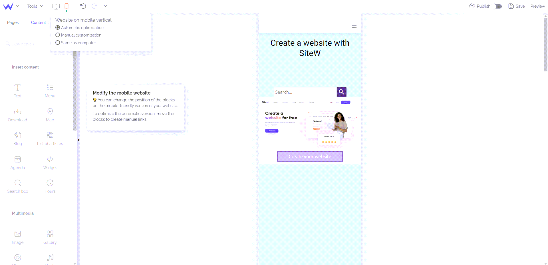
Our tool for web design enables you to customize different views for your website: automatic optimization, manual customization or same as computer. You will have created a custom mobile version in a few simple steps:
-
Enable the Optimized website mode for the view you want to customize, so the new view overlays on your screen.
-
Then, you can move and resize your "blocks" (your page components). Use the multi-select feature if you want to take action on several elements at the same time.
-
Tools to move and place blocks are available if necessary to make your job easier and deal with the most pressing issues.
-
You can hide elements on the mobile view if necessary by clicking on the ad hoc button.
-
On the contrary, you can also add components that are only displayed on portable devices.
- Finally, you can customize the "mobile bar". This specific menu, displayed on the mobile version of your website, enables you to show a series of icons that give access to shortcuts (call, email sending, link to one of your website or others, etc.). You can edit the mobile bar as you think best by customizing the appearance, function, and position of the buttons.

Responsive website creation: how to be really efficient?
You may think that you just need to reduce the size of the original website (the website created for desktop) to create an effective responsive website.
That’s wrong! Mobile browsing has specificities to which you must adapt to ensure the best user experience.
Let’s start with the aspects of mobile browsing.
Responsive website creation: specificities of mobile browsing
Before creating a responsive website, first, you must exactly define the specific characteristics of mobile browsing.
You must take these elements into consideration before starting. This simple analysis will help you have a more adapted display:
-
In general, we visit a website on a smartphone in vertical mode. This reduces at least 3 times the screen width in comparison with a computer.
-
Mobile browsing is touch-sensitive.
-
When we are away from home, we often go on the Internet on our smartphone.
-
It means that we may be in a hurry and uncomfortable.
- When we browse the Internet from a mobile device, we often want to find information quickly (searching an itinerary, a name or a store address, booking an Uber trip…)
What does it involve?
-
Narrower pages, that is to say longer pages.
-
A smaller, but well spaced out (accessible for fingers), clear and easy to read content.
-
Browsing that makes access to information faster.
-
A simplified content to save time.
-
Loading performances of the optimized pages.
Build a responsive website: adapt your content to mobile browsing
Regarding texts, it is better to create a summarized and more concise version of your messages: as pointed out, in general, the mobile Internet user is badly put. They don’t stroll and need concise and quick information.

A drop-down menu like ‘hamburger’ (the three vertical lines) enables to save space, and it is easier to click on the small screens of mobile devices.
Create a website
Reduce load time
It is important to reduce load time on traditional and mobile websites at a minimum.
In general, smartphone users are in a hurry. They don’t have time and patience, and they won’t wait a few long seconds, a slow website to be displayed. They will leave your website, and you will be disappointed.
That’s why, ensure you have light pages and an optimized computer code.

Responsive website building: what about images?
In keeping with the optimization of your website’s load time, make sure you have light images.
Create a responsive website: an adjusted layout
To make touch-sensitive browsing, make simple preparations:
-
Create large and accessible buttons and links.
-
Reduce the size of forms and surveys.
-
Opt for multiple choice quiz instead of free text boxes.
And now, we are proud to present you some nice examples of top level responsive websites, designed on our web design platform…
Examples of successful responsive websites
As we just explained, on SiteW, it is easy to create a responsive website:
👍 either in one click, to get a mobile version quickly,
👍 or manually, customized for each screen type.
Our users are full of talent, and we will show you immediately with these beautiful examples of responsive websites made by us!
Camélopard is a 100% French brand and ethically committed: the products are made in conditions that respect people and the environment, and in a qualitative and sustainable way.
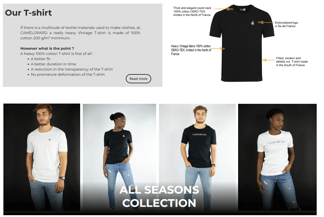
Their superb website is perfectly designed, and has a mobile version allowing a very pleasant user experience, whatever the type of support.


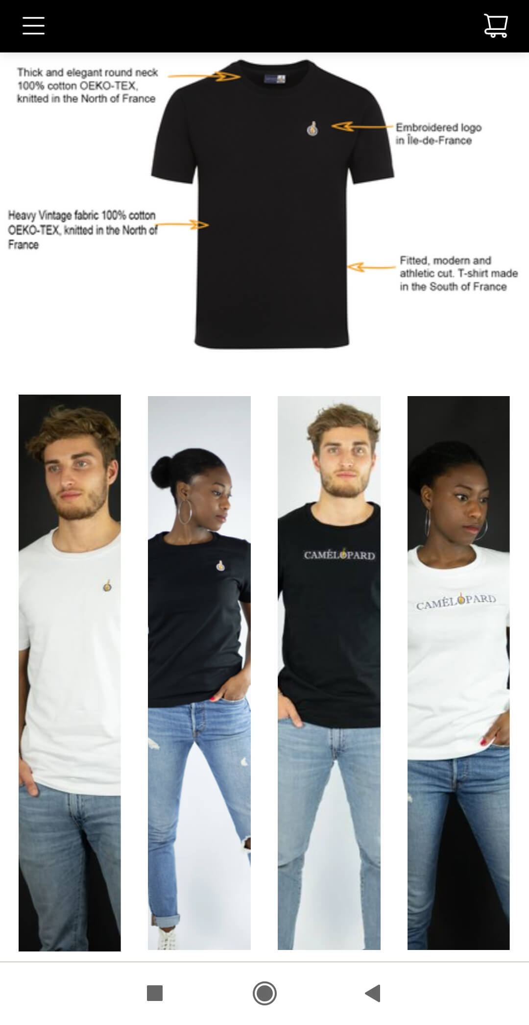
☝️ The Camelopard team has customized its mobile bar, adding an icon-button to access the shopping cart directly. We can notice the perfect adaptation of the page, which includes large photos on the PC version, and photos cut in length for the mobile version.
The smartphone version has also been synthesized, to allow a quick, clear and limpid viewing.
Moreover, a good additional point for them, we can notice that it is a multilingual website, since it has been entirely translated into English.
From the depths of her Occitan countryside, which nourishes and inspires her, Caroline Chinal works as a freelance graphic designer. Her website, created on our platform, is simply a beautiful portfolio, which wonderfully showcases her talents as an illustrator.
And the mobile version of her site is not to be outdone, as you can see. 👇


A mobile hamburger menu has been added to clean up the design and make it easier to navigate.
The Text blocks are centred to add more symmetry and harmony, and the image gallery automatically adjusts, by overlaying the illustrations, to allow for great readability on small screens.

Regarding the footer, we can notice the same phenomenon of vertical alignment of elements, which brings clarity and accessibility in the apprehension of information.
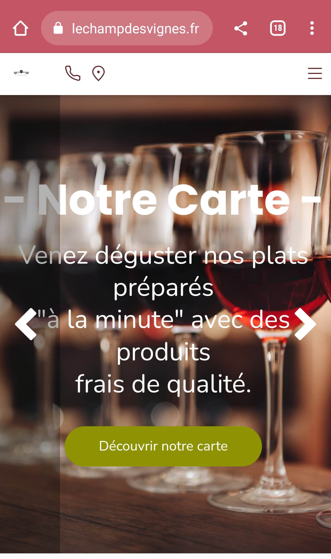
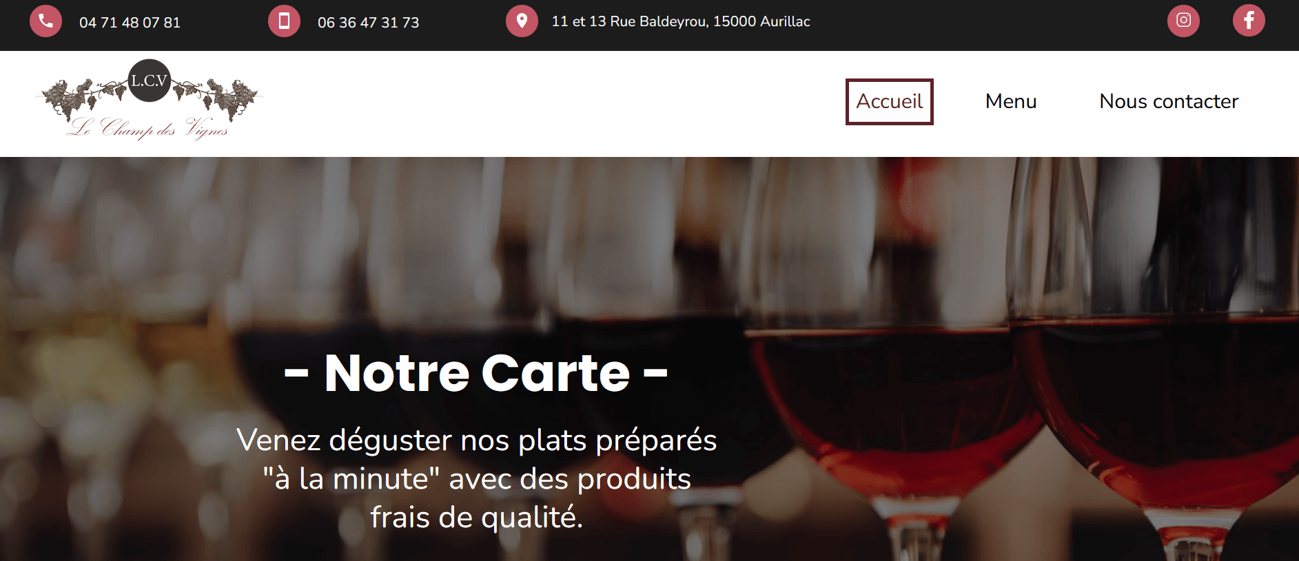
In the heart of Aurillac (a French town), the restaurant Le Champ des Vignes offers you fresh seasonal products, selected and cooked with care.
On request, the chef will even concoct vegetarian or gluten-free dishes for you.
The mobile version of the website has been worked on, in order to offer a comfortable navigation experience to the future customer of the establishment.


The homepage presents all the necessary information in no time, with a direct link to the restaurant's map, immediate access to the phone call and the location on Google Maps.
You won't waste a moment on this site to find what you're looking for!


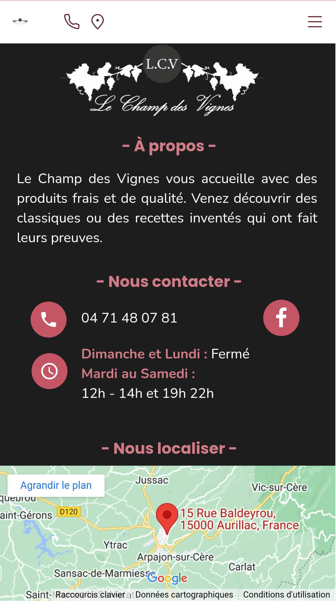
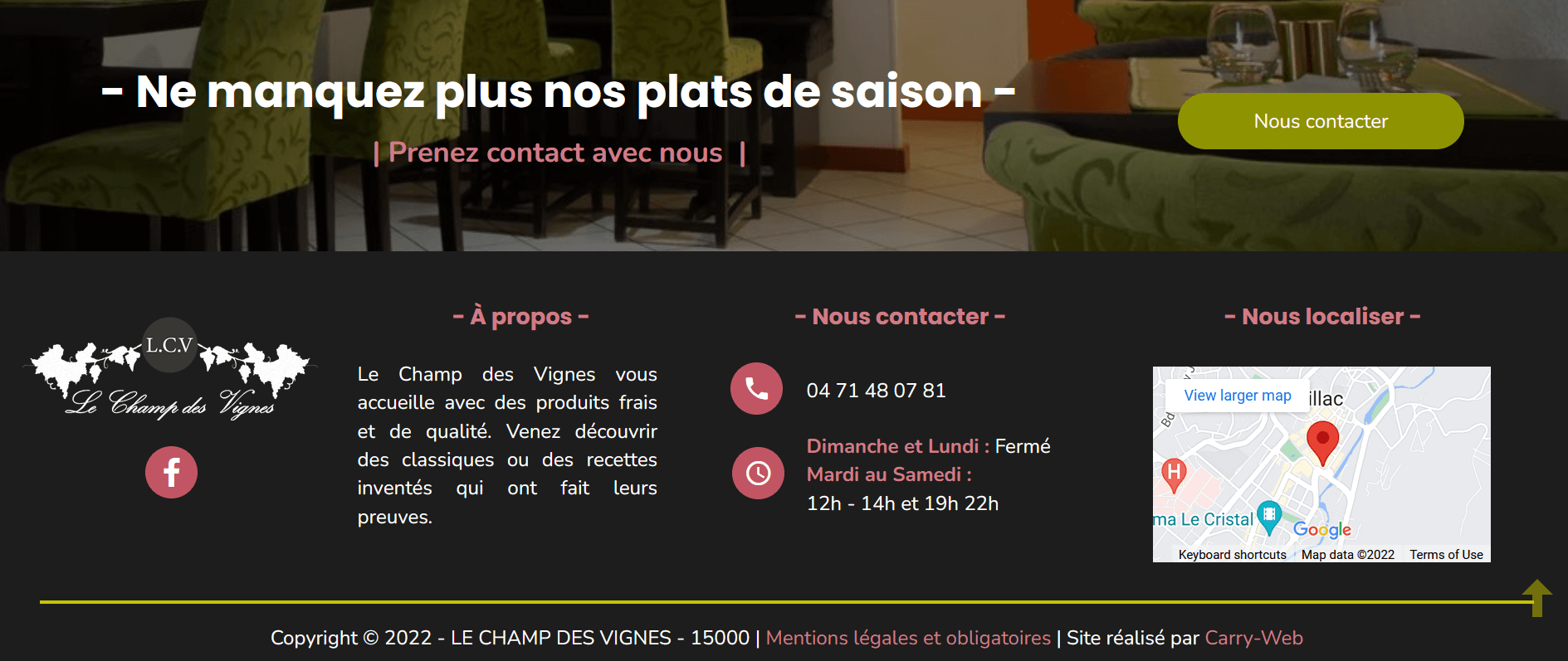
👆 Once again, we find an impeccably composed footer with a reminder, in little space, of all the most important data: address, schedules, phone number to book. We notice again that the mobile version has been summarized, to present only the essential.
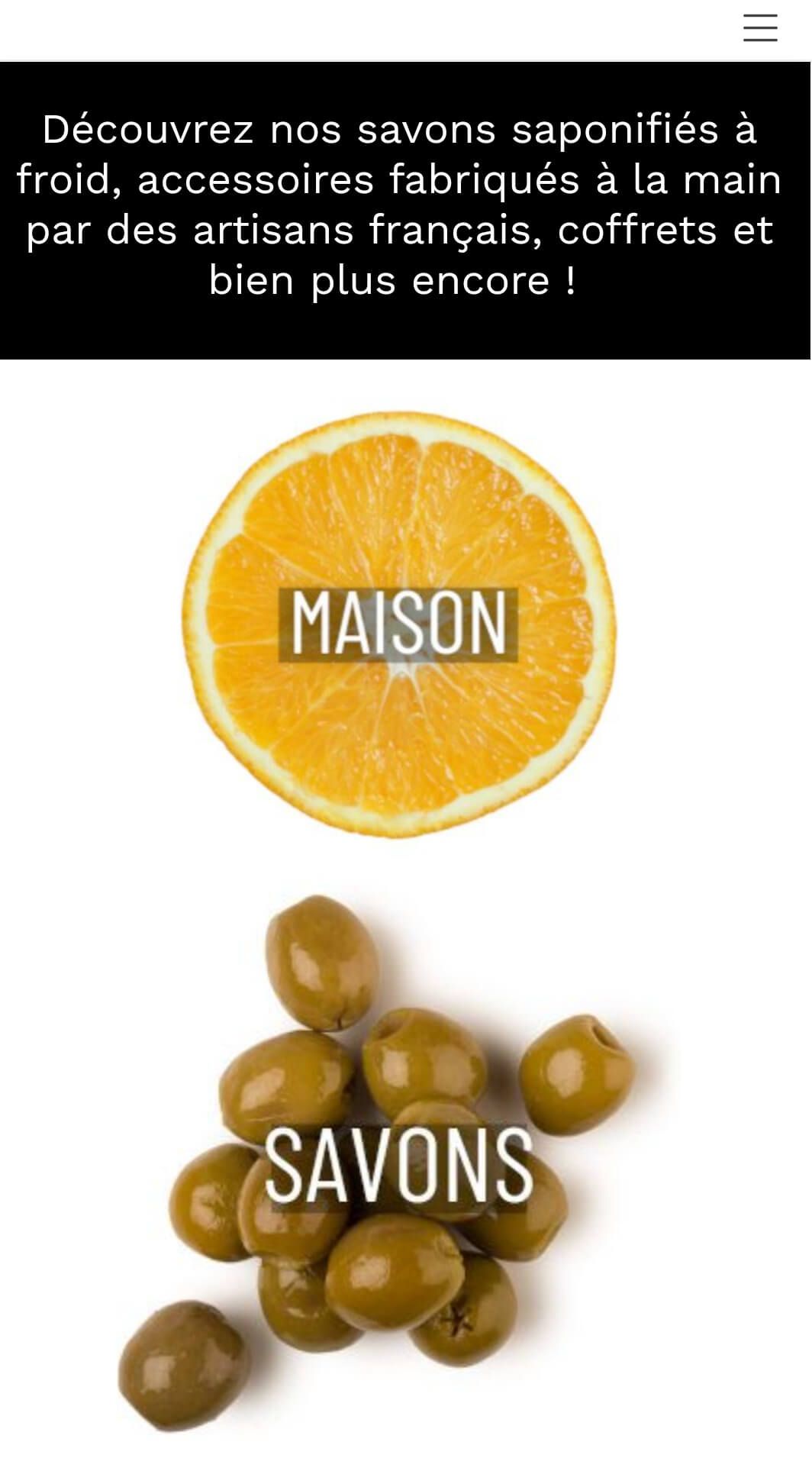
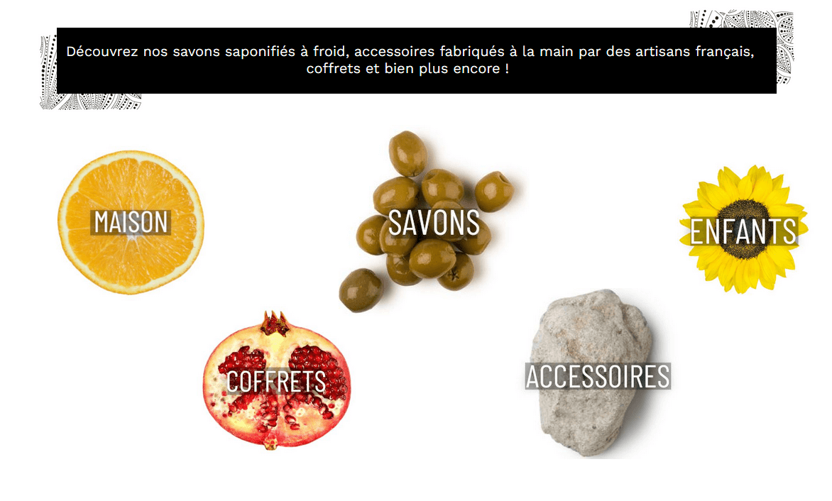
Lisa is originally from English-speaking Canada, and has always been passionate about plants. Upon learning French, the word "coucou" quickly became one of her favourites (because it's easy and fun 🤪).
Based in southwest France, Lisa started making soaps and colouring them with plants, with the goal of aligning with her deepest values: respect for nature and living things.
Look at her beautiful website: the design is clear, clean, and full of pep, with all these beautiful colours, soft and punchy at the same time.
The PC version is very nice, and the mobile version has nothing to envy it! 👇


We notice a mobile bar with a simple hamburger menu, and a reminder of the store menu, with links in the form of evocative images. For maximum dynamism and sobriety at the same time!
Main Office takes care of all your most tedious professional tasks: accounting, commercial, administrative and human resources management, event organization, consulting and support.
By putting yourself in their hands, you can, with complete peace of mind, devote yourself to your core business.
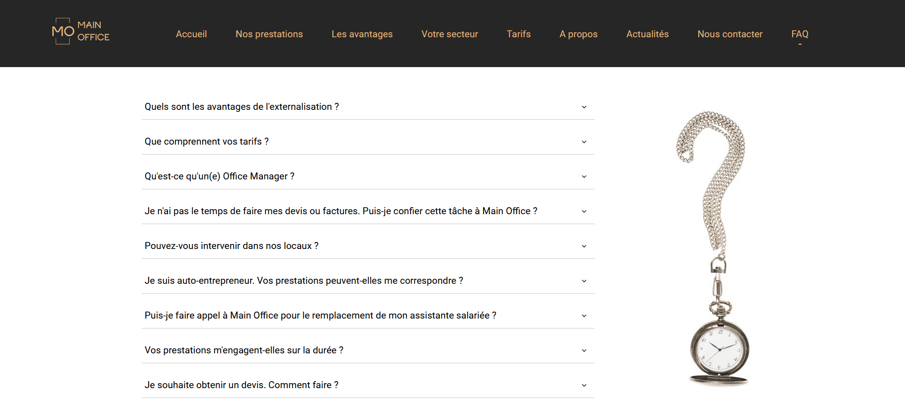
It is a very professional and complete website that the agency Main Office!
The home page announces the colour right away: a rich and detailed menu containing all the necessary information by categories, and a large and beautiful photo, in full screen width, which evokes calm, seriousness, and organization. You get the idea: you can work with Main Office with confidence.
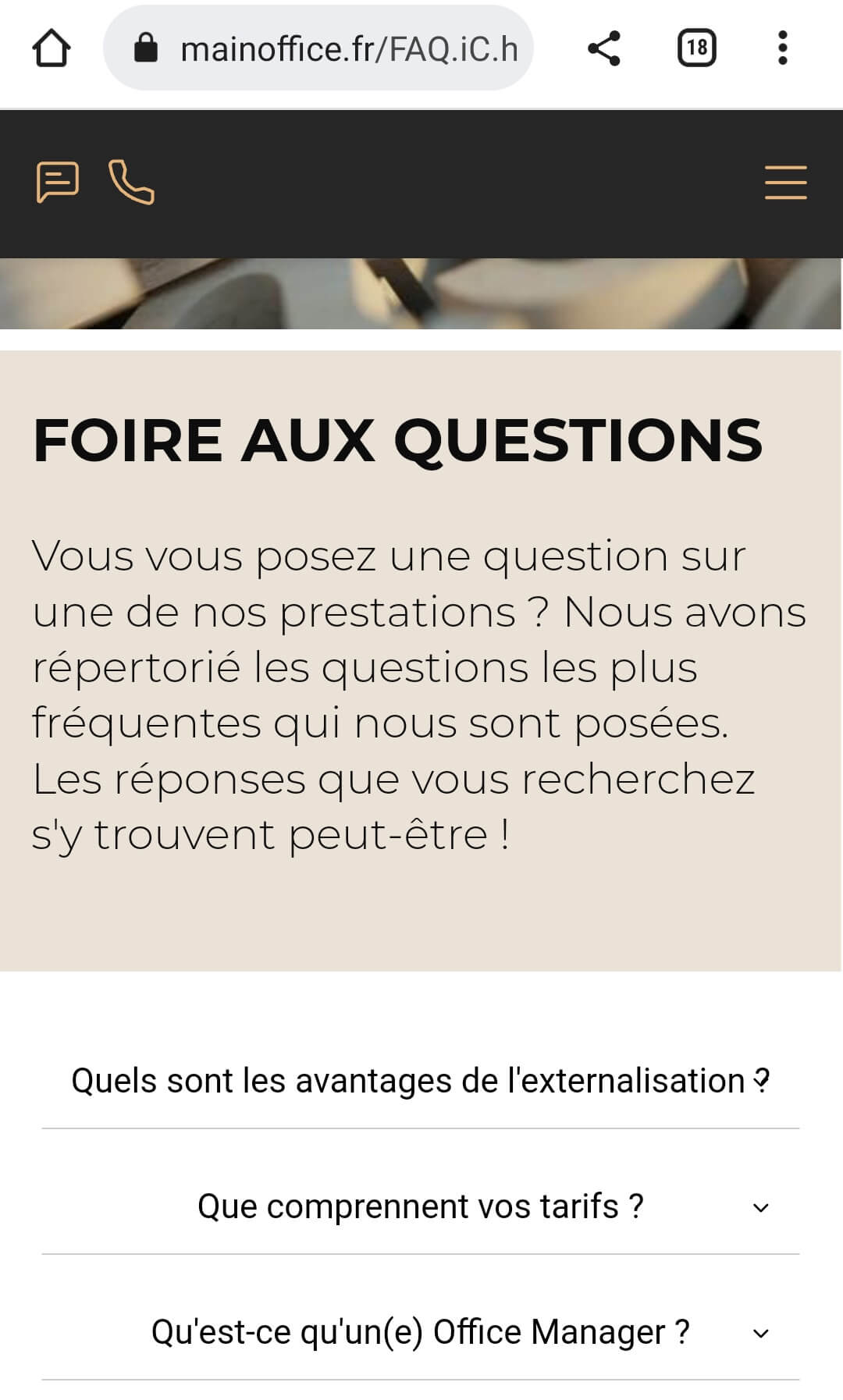
Their mobile site is just as well-crafted as the desktop version. 👇


With a direct link to messaging and phone call, the agency doesn't waste time and gets straight to the point.
The addition of Questions / Answers section is good for the user experience, as it provides efficient and accurate information, but also for SEO, as the page is teeming with targeted and specific keywords.
The smartphone version of the FAQ is clear and sober, with a large enough font size to make it easy to read and click (which displays the answer).
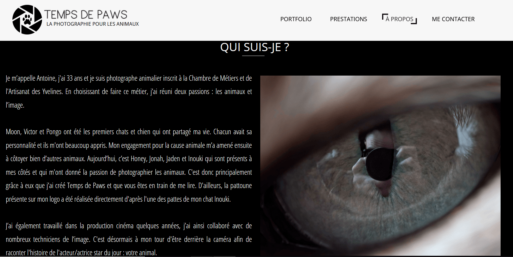
Antoine is a young man in his thirties who decided to combine two of his passions into one: photography and animals.
It is thus quite naturally that he draws the portrait of our small friends with feathers, fur, two, or four legs…
On top of that, Antoine donates 5% of his sales to two partner shelters.
His online portfolio, created, like all the other sites mentioned in this article, with our tool, is simply splendid.
And the mobile version is also a success.


👆 The “About” page is particularly well constructed, both in its PC and smartphone version. Indeed, see how the choice of photos is different, to fit perfectly the small size of handheld devices.


Tips, tricks, a tuto, examples… There you have it!
OK, maybe not everything, but at least enough to make a top-notch responsive website!
With a little dexterity, a bit of creativity and a dash of sagacity, it's sure: you'll make sparks fly and fill all your visitors, whatever their browsing medium!
