Which solution should you choose to create a custom website?
The easiest and most intuitive solution is the website builder to create your website.
However, simplicity is no longer synonymous with professionalism, design, and originality. These solutions indeed enable you to create your custom and high-quality website without technical skills.
But why should you use a website builder for your custom website?
Choose a website builder to create your website
For those who are not used to web design, or those who need help and want to customize their website as they want, a website builder is the best option.
There are many reasons for which you should choose a website builder to create your website.
Here are 4 reasons to convince you:
These solutions for web design enable users to create a website without skills in this field.
Your company deals with web development, maintenance, the functioning of features or secure protocols. The website builder manages domain names and ensures the good functioning of all the chosen options. You just need to build your custom website.

Website builders are like construction sets. They are ready to use solutions to create custom websites by using templates and blocks to add to your pages.
Each element you need to add is designed and thought to be effective, whatever its position on your page.
Moreover, you have access to wide colour palettes, and you can enter an RVB code to get the right colours for your graphic charter. Finally, there are many original and readable fonts. To summarize, all the necessary elements for the creation of a custom website are available, and you just need to place them.
Speaking of position, website builders use a drag and drop system. Your mouse is your single tool to create your website. Click on an element, and press to drag and drop it where you want. Your feature is now set up.
💡 Some website builders offer experts the possibility to add a custom code.
As you’ll have understood, the website builder insists on ease of use and professional result.
In this way, web design is quick as the technical aspect is ready. A web agency takes several months to create a website, contrary to a website builder that just takes a few hours.
Other key element: you can change your design easily and quickly.
Each solution for website creation has several offers: free or cheap, basic packages and professional packages.
For example, SiteW offers you a basic Essential package for €6.60 per month. Professionals can enjoy a complete and advanced package for €57.50 per month.
By the way, speaking of SiteW...
Why should you use SiteW?
SiteW is a French solution with all the advantages of a website builder mentioned above. You have the same autonomy and degree of freedom, but you are accompanied. The service deals with technical updates, and you enjoy different online resources.
You have direct access to:
-
an empathic and professional technical support
-
a FAQ section to answer your most frequent questions
-
a specialist blog to give you advice and tips
-
templates designed by our professionals
-
blocks to make your website more dynamic and make your life easier
Then you just need to choose a monthly, yearly or two-year subscription, and your package: a package to create a blog or a professional website.
Now you know the website builder tool, which is perfect for creating a custom website easily. However, even if these solutions are easy to use and intuitive, you must have knowledge of design and user experience optimization.
But don’t worry! Here are all the keys to web design, the basic elements you absolutely need to know to release your creativity without losing users.
Create a custom website
Three keys for an effective and custom website
Building a custom website indeed is equal to create an effective website.
Here are our three keys to create an effective and custom website:
1 - Make your navigation clear and intuitive
Creating a custom website doesn’t mean doing “too much”. A custom website isn’t a whimsical or messy website.
First, your website must optimize and improve user experience. Your visitors should easily find their way, without having doubts or wanting to leave the page because the needed information is difficult to reach.
You should design your website, trying to figure out the many ways your visitors will browse your pages.
With this in mind, you must take care about:
Go further
The best place for your logo is in the top left corner of the page.
Therefore, create a custom website, which is useful and intuitive for users to be more effective.
2 - Adapt your design to content
Design must serve content, and not the contrary.
Of course, a beautiful design is essential to stand out on the internet. Therefore, it is important to create a custom and fashionable website, but keep in mind that the main goal of your website is to highlight your work, information, or products.
Consequently, you must design your website according to the messages you want to convey, and your web objectives.
For example, if you choose neutral and light colours to create a soft and sleek atmosphere, you are building a modern and custom website. However, you should be careful that these colours don’t ruin the readability of your contents and articles.
3 - Build your design for your target audience
Your website is the place where you can express yourself. Therefore, your website must reflect your personality and your tastes, as well as your company and your brand.
But you must design it by respecting your public’s characteristics, because they will determine whether you succeed or fail on the internet.
If your target audience doesn't like your website design, even if it is sophisticated and professional, you may not achieve the expected results.
However, you will notice that it is easy to create a custom website that matches your target audience if you know them perfectly.
To help you in this task, you can create buyer personas, or analyse other websites with the same public.
As you’ll have understood, creating a custom website is essential to stand out from many websites that already exist. Remember that your website must be effective for you and enjoyable for your visitors.
Adapt your template to your design
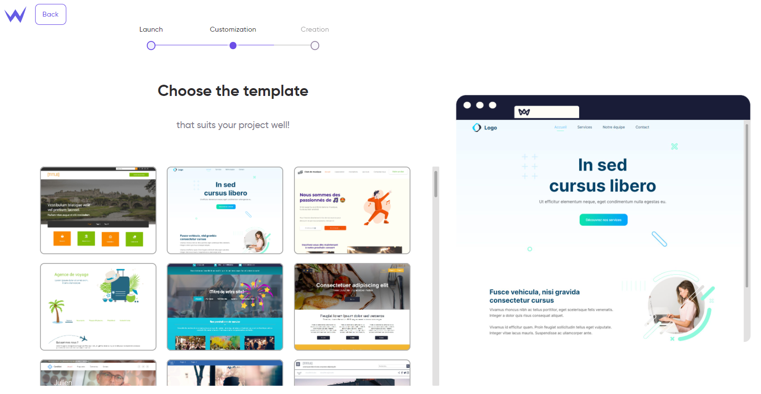
If you choose a website builder like SiteW, you will have different templates, designed for you, that adapt to your website.

First, choose the template for your website on our web design platform.
In general, online software offer a wide variety of templates, created by professional web designers, with different styles for all types of business sectors.
You can find templates with different styles for online stores, portfolios, or blogs. These templates adapt to your website or business sector, while being stylish, effective, and responsive.
Therefore, choosing your template is the first important step during your website creation.
In this way, you enjoy the features you need directly. For example, with a blog, you could need a form to subscribe to a newsletter, or a comment section to communicate with your community easily.
Customize your website according to the current trends
As said earlier, to create a custom website, there is no magic formula. It will depend on your tastes, brand, content, and goals.
You can be inspired by the current web design trends, but don’t forget to add your identity to these aesthetically preferences.
You know that trends quickly become obsolete, whereas style never does, even in the web design field.
In any case, you must use the right elements sparingly and correctly to achieve success. However, to create a custom website, you have to know the current trends.
To give you some ideas and inform you about the current trends, here is a list of the elements you can customize on your website:
It’s advantageous to customize your website background. You have many options:
👉 video
👉 plain colour
👉 gallery or fixed image…
Whatever your option, don’t let your background overlay your content. A right background is a background that accompanies and suits your website, while remaining discreet and highlighting your content.
For example, a background video can be perfect if you still read the title.
Don’t hesitate to soften your colours by playing with saturation. You can even change your background to black and white, if necessary, as long as it fits your brand.
🚀 The current trend: the current trend is towards minimalism, with a simple and sleek design and an inclination for asymmetry and contrast.
Designing a good footer is essential. The header and footer of your website are important landmarks for your visitors and must have some information.
They are strategic places where you must be precise and effective: they are very small spaces, where visitors must find what they need easily and quickly.
In general, the header has the title, logo, navigation menu, and possibly access to the customer area or contact page.
The footer can seem less useful. However, it is the perfect place to add your legal notice, sitemap, a link to your company’s history or other contact form.
Users usually scroll to the end of the page, and look for information in the footer. Therefore, don’t neglect the style of these elements!
🚀 The current trend: Today, there are a lot of different footers and headers. It is better to create simple headers and footers with a minimalist, animated and dynamic graphic design.
Create a custom website
Colours can be double-edged: you can choose whatever colours you want, but their interpretation is quite subjective.
To sum up, choosing colours is both difficult and exciting. Choose up to five colours.
You can choose contrasting and complementary colours to boost your page and highlight the important elements. You can also use neutral colours for your texts.
To help you choose your colours, you can also look for colour meaning, so that you can indirectly convey your values to your audience.
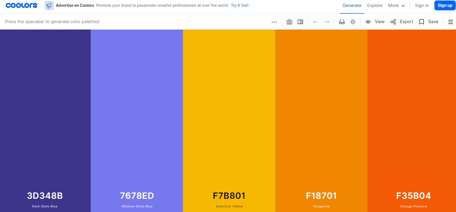
Several tools can help you ensure you have chosen relevant colours, or just get new ideas.
For example, Coolors enables you to generate original palettes, by just pressing the space bar, and see the trendiest palettes.

🚀 The current trend: colour trends lean towards bright colours with light and soft shades.
Such as for colours, you may be tempted to use a lot of whimsical fonts. There are many fonts, but you can create your font, and this can be dizzying.
But a custom website must not confuse your visitor.
Fonts convey your identity: a well-chosen font can help you stand out from your competitors. Therefore, choose a font that perfectly reflects you.
However, choose a simpler font so that your website content is easy to read.
Moreover, ensure your fonts are attractive and readable, once they are presented (bold, italic, underlined, smaller, bigger, etc.).
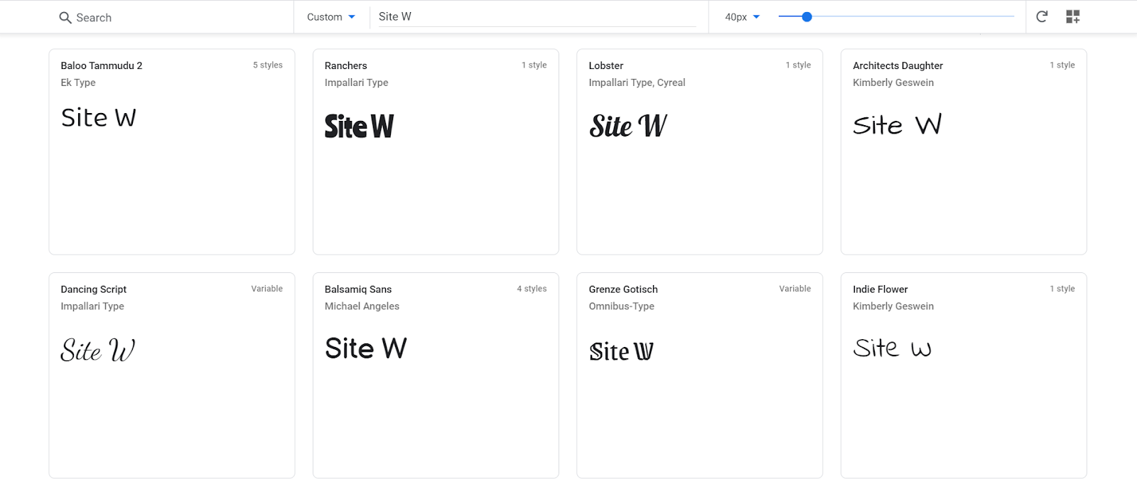
If you want to preview some fonts, you can use a software that generates fonts like Google Fonts.

🚀 The current trend: high fonts are trendy and enable you to affirm your brand automatically.
Links, menus, and buttons enable your visitors to browse your website easily.
Navigation is important in your digital strategy. Therefore, these elements must occupy a special place in your web design creation.
Links and buttons must be easy to accede, visible, and responsive.
Moreover, they must be graphically consistent with each other: they must have the same look through the whole website, so that they can be immediately identified as navigation elements, and stand out from the rest of the content.
Your call-to-action buttons must be highly visible, and highlighted with a contrasting colour as well as a strategic place. They must be immediately noticed by the users who want to contract your services, see your offers, etc.
Menus must be placed in expected locations like the top or the side of the page and, above all, menus must look like menus, and must not take up too much space when dropped.
Your goal is not to lose your visitors, but accompany and guide them.
To do so, your menus must be structured and clear, without being too detailed or specific, and while being graphically consistent with your design.
🚀 The current trend: Navigation elements tend to be simple and elegant, and fully functional both on desktop and mobile.

Your visual contents will serve your goals, whether they are:
Note that visual elements are the elements users notice first. Your website must contain some relevant icons and harmonious shapes that reflect your identity and suit your custom website.
You can find nice icons for your website on “The Noun Project”, if you want. For images and videos, it is better to create them by yourself.
However, if you don’t have enough time to do it, or if you just don’t want to, you can consult our favourite, free and high-quality image banks.
🚀 The current trend: Dynamic visuals, with scroll reveal animations, are often used today. However, it is essential that it be consistent with your brand identity, and it should be used sparingly to be effective.
Now you know very well all the challenges related to the creation of a custom website, and you have all the tips and trends to make it effective.
Whether you want to follow the current trends or make up your trends, make sure your design always serves your content, and never the contrary.
Now we wish you the best adventures on the web! 🎨
