What is a home page used for?
Before starting the creation of a home page, it’s useful to ask yourself this first question: what is it for?
A home page has two essential functions:
👉 Presenting and highlighting your activity clearly
👉 Orienting the traffic of visitors who get to your website
Present your value proposition
To present your company immediately and effectively, your home page will show your value proposition.
The value proposition of a company isn’t exactly a slogan. It’s a wording that summarizes both:
Here is how to do to formulate this crucial sentence:
Then, write your value proposition. It must be simple, easy to understand and remember. It must also be illustrated with a striking visual. This proposition must be striking, and everybody must understand it. Don’t hesitate to ask your relations to read your value proposition to get objective and relevant opinions.
Create a website
Encourage your visitors to learn more about you
As seen previously, your homepage is a crossroads, a central element for your website structure. It will often be its main front door, a necessary crossing point, or at least an essential landmark.
Regarding technical aspects, your home page will be in the middle of your page structure, and all your website will be built on it.
This means that your home page must display a well-designed, well-structured and well-visible navigation menu. Your home page will lead your visitors to the rest of your website, and it might be the first contact with the users of your platform.
All your website sections must be visible and enable your visitors to understand the following elements immediately:
In short, it’s probably the page of your website that will require the most attention.
Create a home page that boost your SEO
Of course, your homepage also plays a part in SEO.
As seen above, the home page is an essential element of your structure. It must have a strong SEO basis to convey its authority to other sections of your website.
Regarding the keywords, your homepage will have your brand name and the main search terms related to your business.
In short, your company must rank on the first result pages when internet users enter its name on Google.
Watch out
Your home page is an integral part of your
linking strategy. Don’t add too many links, but choose them methodically.
Moreover, to boost your SEO, your home page not only must convey its authority to other pages, but also it must be shared and present on other articles. To that end, you can add a link with the name of your business to your home page. You can also add your social networks in order that your visitors can easily share your pages.
Now we know the use of your home page, but in concrete terms, how to create a home page?

Create an effective home page in 4 steps
To enjoy an effective and attractive home page, it must fulfil all the objectives mentioned above.
However, if you aren’t a web developer or if you don’t master these technics, the creation of a professional home page might be time-consuming, except if you use a website builder like SiteW. 👋
This solution enables you to create the home page of your website easily.
SiteW offers you a playful and professional interface to get a quality result without technical knowledge.
Combine the ease of use with these steps to get an impressive home page.
Step 1: Anticipate the conceptualization of your home page
The conceptualization is the previous step before the creation of a home page. It’s when you will define all the main components of your home page and, above all, know how to place them to achieve your marketing goals.
Here are some tips that will enable you to conceptualize your home page more easily:
-
Define your website structure and determine your editorial line before creating your home page. Thus, you will know all the ins and outs of your website creation and make your homepage part of your overall digital strategy.
-
It might be useful to create your home page from bottom to top: once you know what you will talk about in the page body, it will be easier for you to write the tag line and choose the title.
The top of the page indeed is the first element that will grab users’ attention. So, it might be well-reflected and well-studied to encourage users to scroll down and discover your value proposition. When you start your creation by your footer, you have a concise version of the best when you arrive at the top of the page.
When you build the mock-ups of your future home page, you avoid loosing time. It enables you to understand what it’s possible to do or not, and take all the graphical and technical constraints into account. It might also enable you to get new ideas by working on a creative support.
Build a web page
Step 2: Choose your template
How to proceed to create a mock-up of a home page online?
Thanks to a website builder like SiteW, it’s easy to create your home page mock-up.
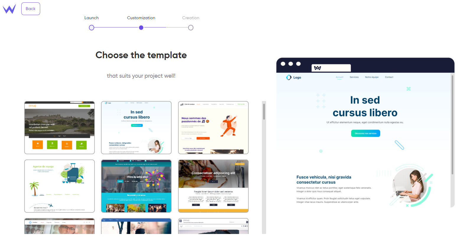
Once you have created your account, you can choose your template among many functional and customizable ones.

They have the latest technologies and current constraints to meet Google’s requirements and users’ needs.
These templates are:
-
quality and well-designed
-
responsive, that is to say they adapt to each screen (desktop, smartphone)
-
behind secure and optimized websites
For the most creative users, you can choose a blank template to create a custom home page on a website.
Do you have the perfect design for your home page and website?
Let’s move on to the next step: the content.
Step 3: Add content to your home page
You have the basis. Now let’s move on to the content.
In broad terms, your home page splits into 3 main areas: the header, the body, and the footer.
Let’s detail each area to know its organization, content, and how to make them effective with SiteW.
The header or identification field
At the top of the home page, there is the identification field or header where you must show:
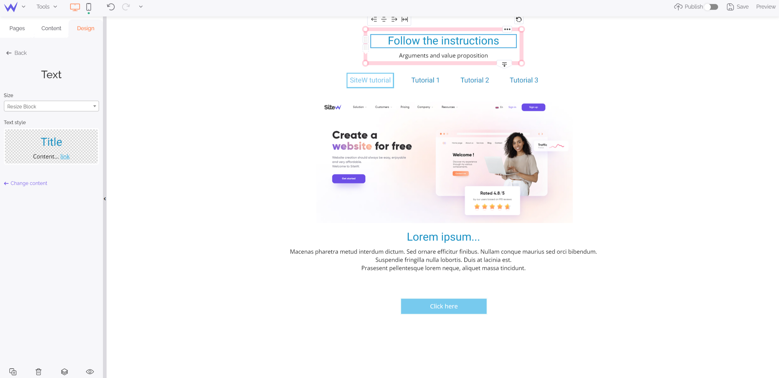
To that end, you can use the Text block of SiteW to add a title, subtitle, or any type of textual content wherever you want.

As you can see, you can customize the style of your titles and texts as you want.
You can customize the size, colour, fonts, and style of your header.
To get a coherent menu, ensure it is precise without being too long. On SiteW, your menu and buttons are directly displayed and have the same name as your pages.

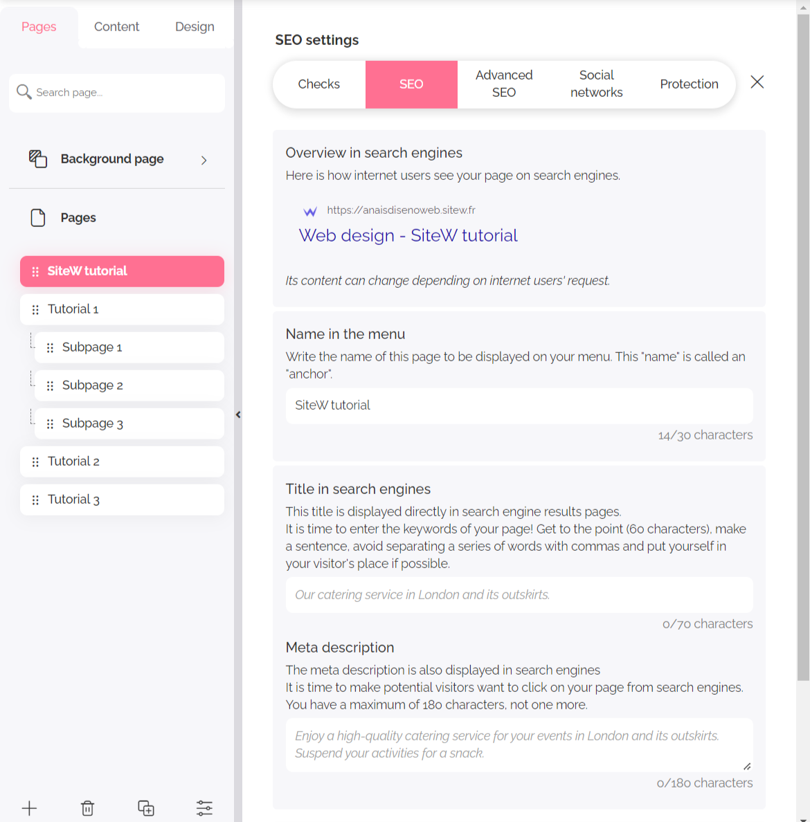
In the Pages tab, you can also add descriptions and metadata for Google to optimize your home page SEO.
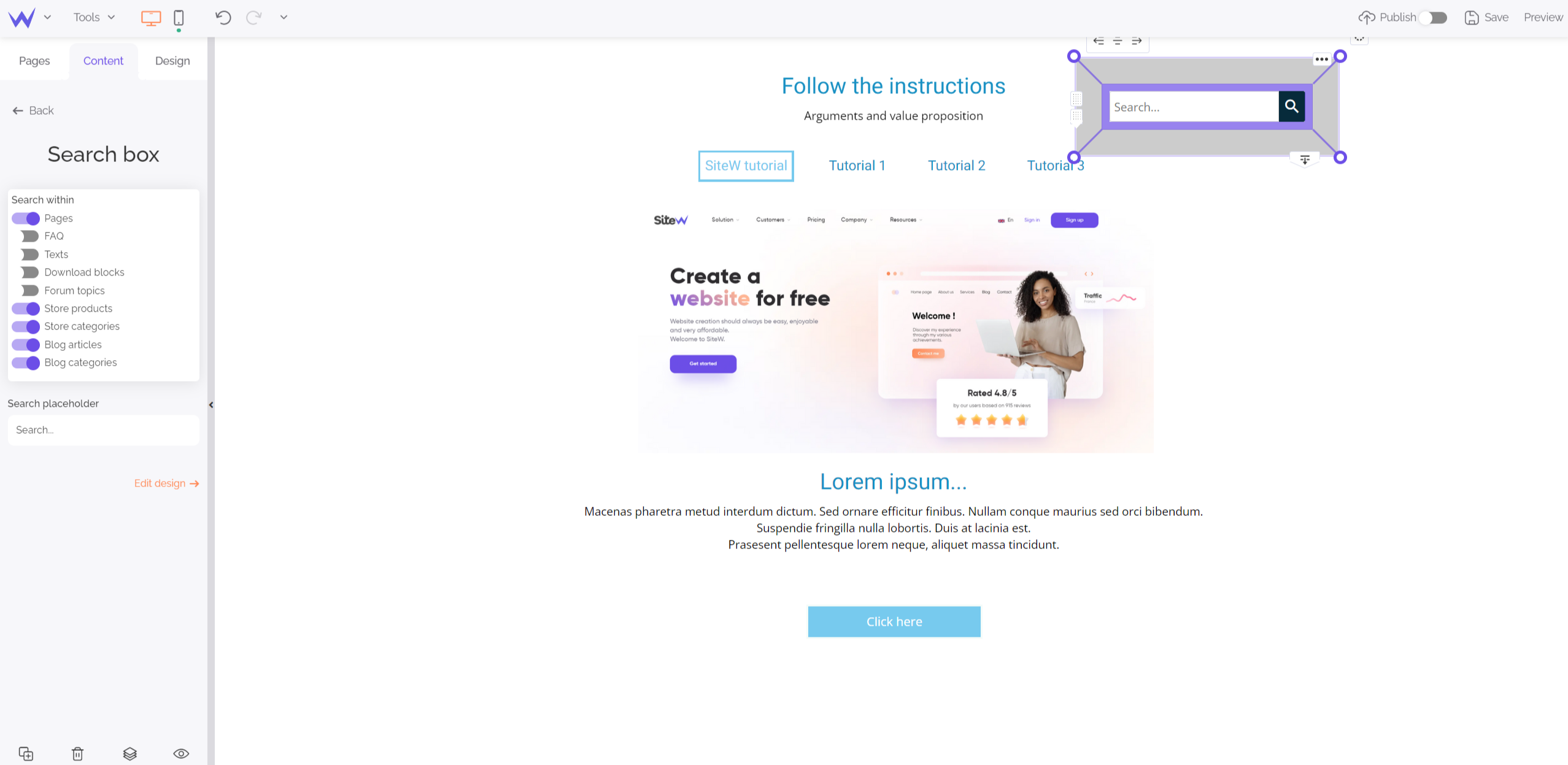
Adding these elements is also easy thanks to specific blocks designed to add a search bar and a form quickly.
Go to the Content section and choose the Search block. You can customize this bar and then add it to your home page to improve your user experience.

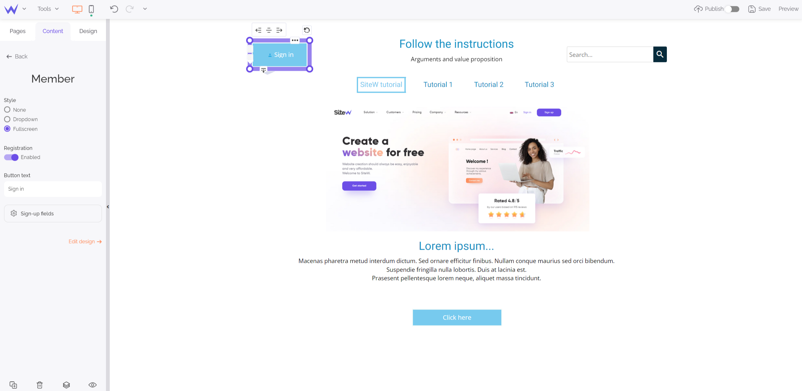
To enable the most faithful visitors to sign in directly to their account, you just need to add the Member block, which is in the Content section.

Once again, you can customize your sign-in button to create a coherent ensemble.
The page body or editorial
Your visitors want to see the rest of your website thanks to your header, bravo!
Discover how to optimize your body to enjoy a complete home page.
In the body (or editorial), you can add these elements:
They will complete the value proposition.
To that end, you can use the Text block to highlight all the reasons why your visitors should consult your website.

If you add illustrations and colours, you will immediately grab visitors’ attention.
Psst… Don’t worry! We will talk about illustrations and graphic elements later. 🤫
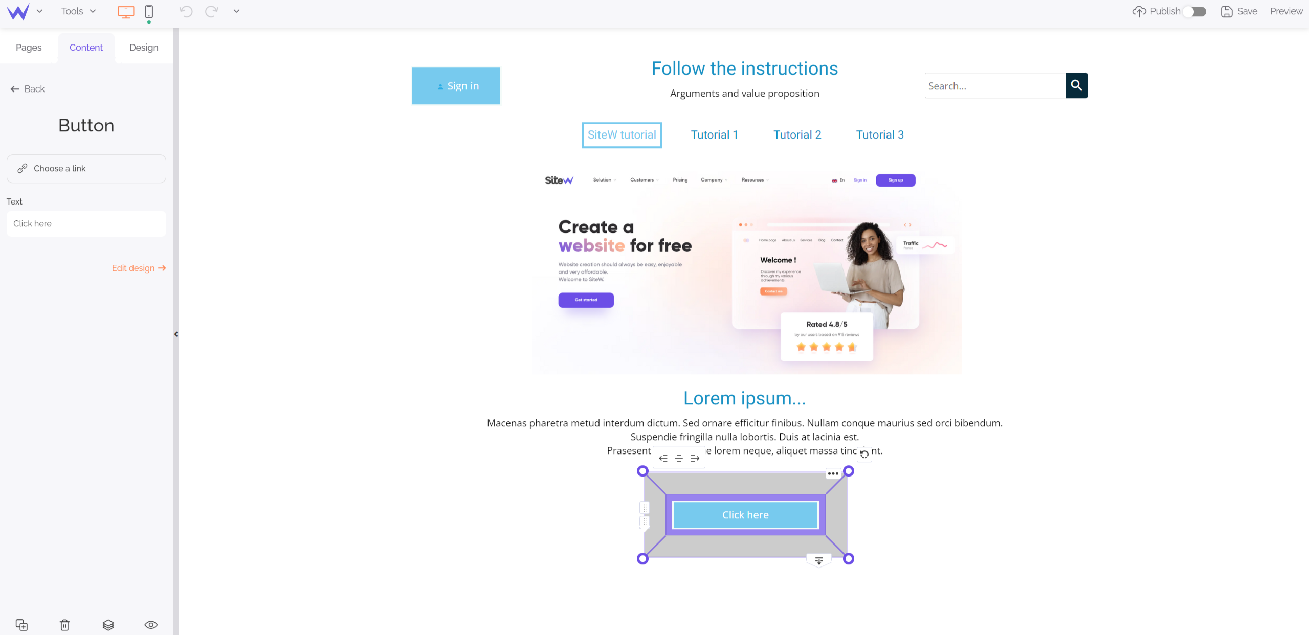
They are link buttons that lead to other pages of your website (online store, blog, etc.) or to other websites.
They must be highly visible and strategically placed because one of the main objectives of your home page is to guide your visitors towards these call-to-action buttons.
To add these buttons, use the Store block of the Content section.

They’ are essential for any corporate website, especially for online stores. Any visitor who is about to buy must be reassured before. So, the security guarantees such as SSL certificate, secure payment, customer testimonials, customer service details, “satisfied or your money back” guarantee, etc. must be shown right from the home page.
At the bottom of your home page, there is the footer of your website. Although it takes up a thankless place, this informative part is essential and deserves attention.
Internet users are used to scrolling down a page to access specific information.
In general, within a footer, you can find the following elements:
The footer is the favourite place to add contact details. You can display your phone number, physical address, email address, or a contact form.
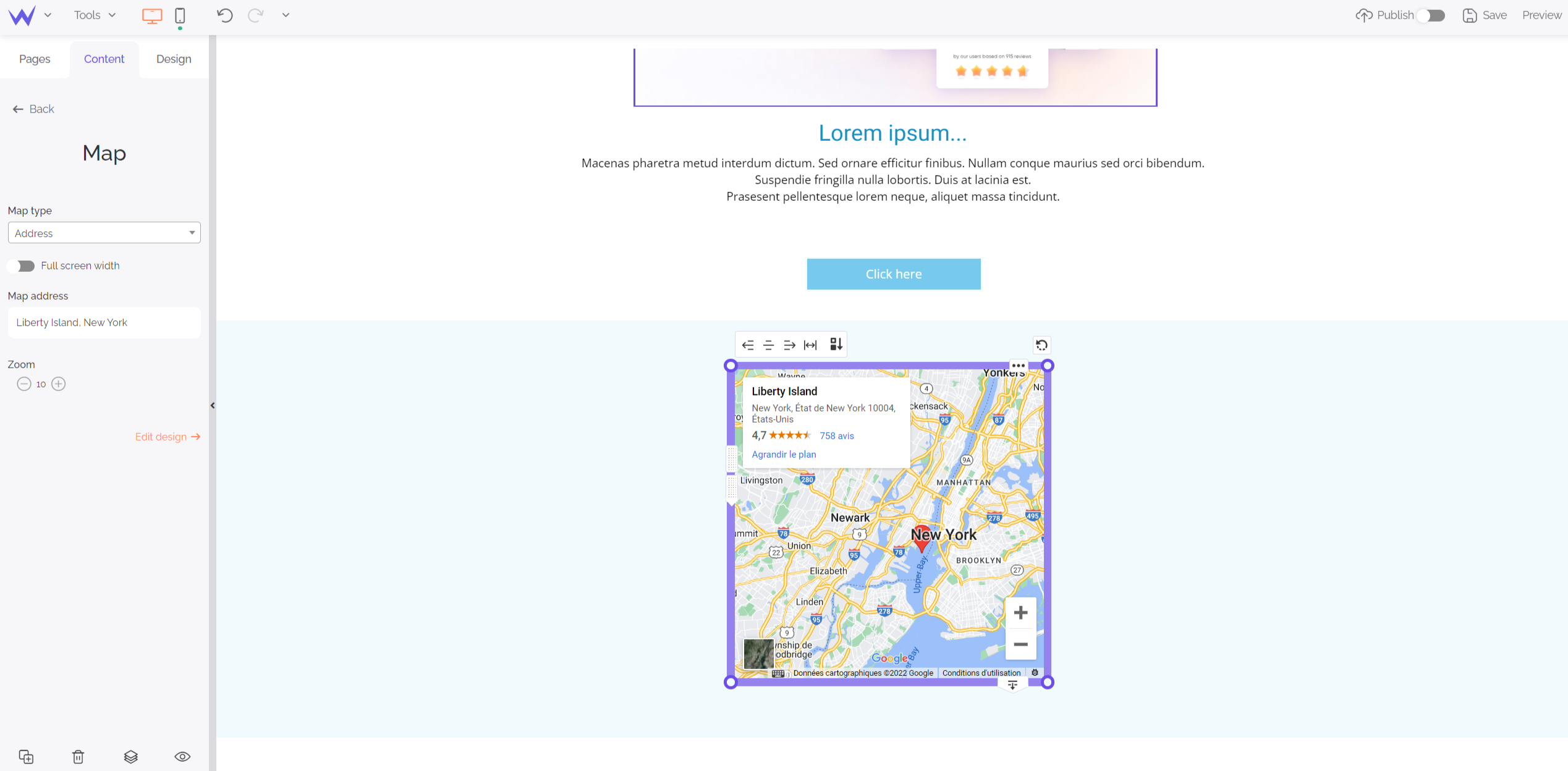
For example, for your physical address, it is more playful to add a map. Thanks to the Map block, you can easily indicate your address to the visitors who want to meet you.

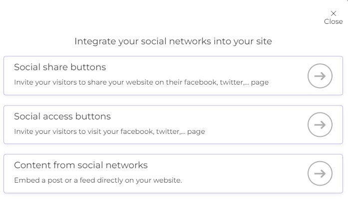
They are essential for your SEO and the dedicated buttons can be added to the footer.
Go to the Content section and choose the Social block to add your platforms rapidly.

Moreover, you can choose the style of your buttons to enhance your aesthetics in detail.
The footer is also the favourite place to add the obligatory terms and conditions. They don’t disturb reading and the visual aspect of your website. Everybody can access and read them easily.
Once you have designed your home page, you have to continue to work on it and animate it.
Now you have a clear idea of the objectives, content, and maintenance of a home page.
Here is the final step to keep grabbing users’ attention…
Step 4: Illustrate your home page
Because a picture is worth a thousand words, use graphic elements to get an effective and modern home page.
However, you might be beginner photographers or graphic designers.
Fortunately, there are many solutions to enable you to illustrate your home page like a professional web designer:
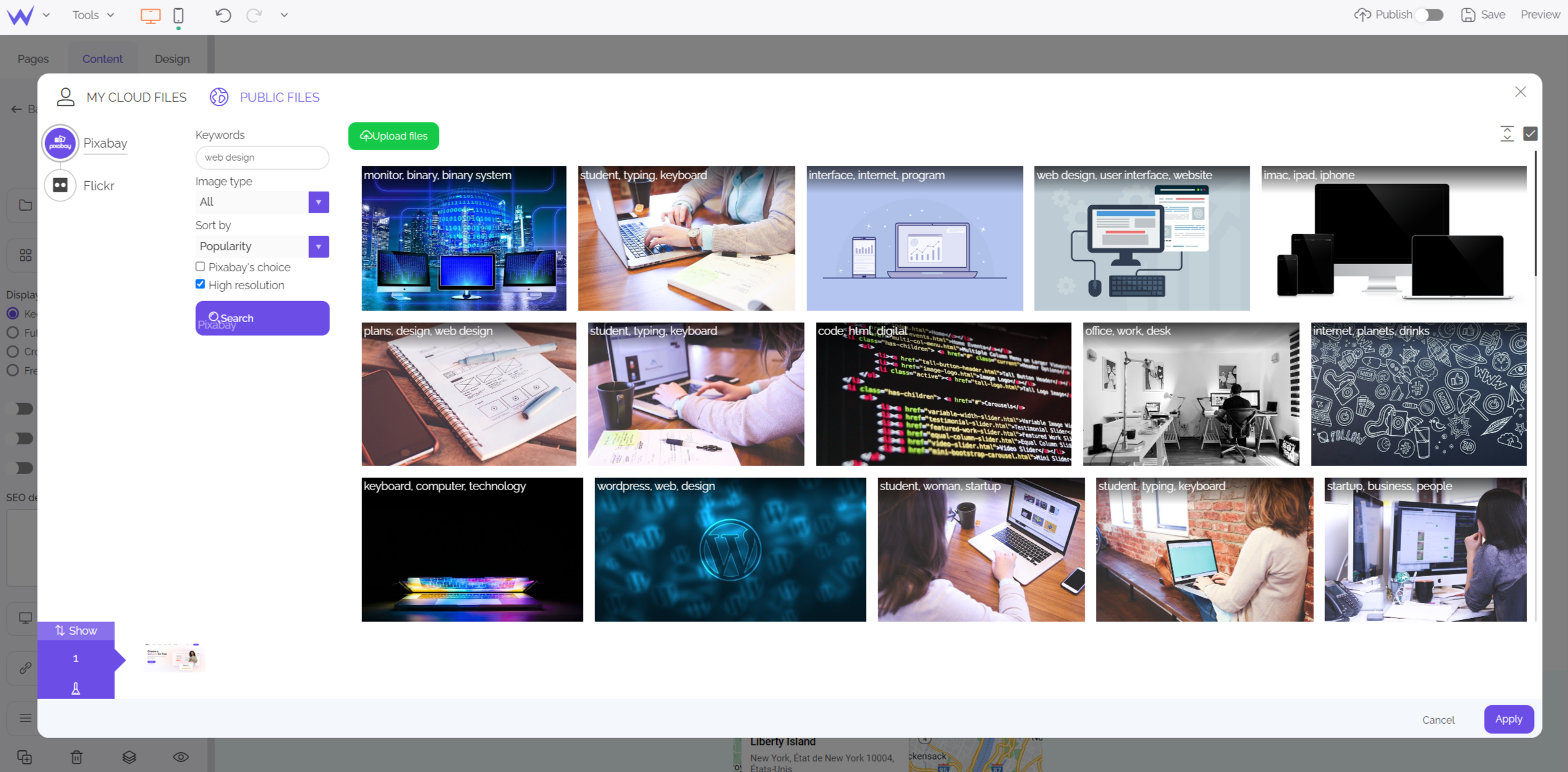
Thanks to the SiteW’s Image block, which is in the Content section, you can directly access royalty-free images.
You just need to search the most relevant keyword for your image, and you will directly find many contents which are related to your request.

Search your keyword, select and place it where you want on your home page.
You can also import your images in your storage space of SiteW.
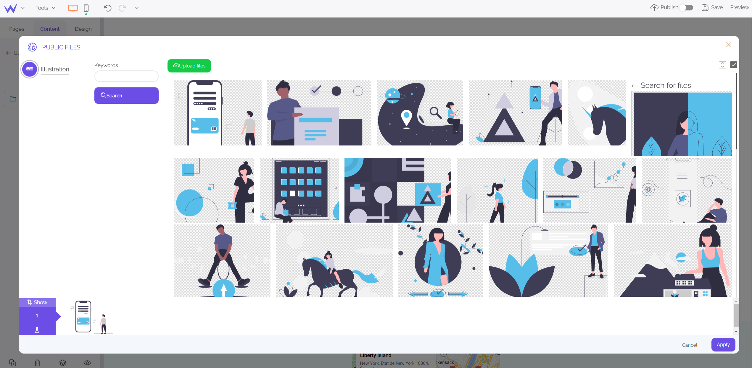
If you want to illustrate your home page without using images, use the Illustration block of SiteW.
You will find many illustrations about different topics. You can customize their colours as desired to get a modern and original website.

Whatever your favourite option, pay attention to the choice of your illustrations: they must serve and showcase your content without being omnipresent or invasive.
Before concluding, let’s discover how to avoid common mistakes related to the creation of a homepage.
Tips to create your home page
Now you know everything to create an effective home page.
Let’s discover some mistakes you need to avoid for the creation of the best home page:
Get to the point
Creating a home page that is either too long or too large might be a handicap.
It is better not to let your visitors spend too much time on your home page. Its main role is to lead your visitors to your other pages of your website. Customize it by adding transition effects between the pages, for example (without disturbing readability).
In short, stay clear and get to the point to keep your visitors’ attention and avoid them thinking you have a one-page website without other content.
The home page as a gateway to your website
You must add several points of entry to the main pages of your website (online store, customers’ opinions…). The home page is a showcase that encourages internet users to visit your website and learn more about it.
Therefore, avoid ads as well as backlinks. These elements distract your visitors and might encourage them to visit another website.
Have expertise in eye tracking
It’s interesting to get information about the general trends in terms of eye tracking on a website.
In general, the eyes fix in the top left-hand corner and then go down to the middle of the page: this is where you must place your strategic information that are for catching attention.
That’s why logos are generally displayed at the top left of websites.
If you learn more about the methods of users to obtain information, you will enjoy a home page even more effective.
Animate your homepage
For the user experience of your website as well as visitor retention or SEO, it’s important to regularly liven your home page up and make it a lively and dynamic place.
Even if you start creating a home page for your potential customers to make your brand known and convince new customers, your home page is also addressed to your regular visitors.
They need to notice that you have a dynamic website that is livened up and nice to visit.
So, your home page must be regularly updated.
To that end, you can implement these actions:
-
Present your news, new products or services and special offers
-
Adapt your topic to the season or events
-
Modify your texts to respect your current tone and meet users’ needs
There are many methods to update your home page.
This method is useful for your page, website, and public.
Create a website
Made it! You know more about the creation of a home page, from its content to what you must avoid. Now it’s your turn!
Start creating your home page with SiteW. 🚀


