Why are images important on a website?
The visuals on your website have a huge effect on the overall look of your site. After all, the human brain processes images 60,000 times faster than text.
That's why when you're creating a website, illustrations are simply essential.
👉 Making a good first impression
Visuals are the first things that can impress a visitor as soon as they land on the site.
They are decisive when it comes to a first-time visitor, and will make the difference when they decide to stay or leave your site.
👉 Making boring text more engaging
Pages with a lot of writing (or long texts) can be a bit difficult to read, and bore your visitors. So they may leave without reading your content.
Nice images, on the contrary, are attractive, and can brighten up a text to make it much more pleasant to read.
👉 Simply convincing
On a commercial site, images can help highlight your products and services, and convince your visitors of the quality of your brand.
How to choose images for your website? Our solid gold tips
Here is a list of our best tips, to help you choose the right images for your website…
Choosing images for a website: first, the practical tips
👉 An adapted format
Choose the right size for your images depending on the location you want to place them. For example, a banner image will not have the same dimensions as an image for an article, or a background image.
Most of the time, it is recommended to use the horizontal format for the web.
👉 A high quality resolution – without weighing down your page
Above all, keep in mind that quality matters.
On a website, photos that are grainy or poorly reproduced can be an immediate turn-off for many people.
Select only high-resolution images, while keeping the file size small. Do not try to enlarge a low-quality image to avoid distortion. Instead, use a bg remover to refine and improve the quality of your images without compromising their integrity.
Before finalizing your website, look at it on a large screen to make sure the images are not pixelated or blurry.
But don't use too large files, because it may slow down your website: 72 dpi is sufficient. Be careful because the speed of your website will be taken into account by search engines.
Compress the images as much as possible, while still maintaining high quality. For this, you can, for example, use tools such as ShortPixel.
To go further
There are many differing opinions about image size /image compression, but it is always a trade-off between image quality and site speed:
-
full screen width images: 1920 pixels
-
Images for a gallery: 1200 pixels
-
Images on a page or blog: 1080 pixels (because that's the limit of most computer monitors)
👉 Check the licences
Be careful when collecting images from the internet. Not all of them are royalty-free, and it's illegal to use copyrighted photos, especially for commercial purposes.
⚠️ Using images on your website without permission is not only discourteous to the photograph: you could also be sued.
To find free royalty-free images, you can use image banks:
Unsplash, Negative Space, kaboompics, picjumbo, Stokpic, Fancycrave, StockSnap.io, Pixabay, Pexels, Pikwizard Background Designs, Shutterstock, Getty Images…
Just to name a few!
👉 Choosing the right file type
In terms of file format, you can choose:
-
The PNG format for graphics (logos, graphic designs or infographics) especially those that have large colored areas, or for visuals with text, but also for transparent backgrounds.
If you can, save your PNG in “24-bit” format for better quality and for a richer color display.
-
The JPEG format for photographs, because it handles better colors while keeping the file size small, which will reduce image loading time.
-
The new WebP format (which Google is starting to favour).
-
On the other hand, avoid the Bitmap (.bmp) format, which is generally heavier.
Choose visuals for your website: select images that engage your audience's emotions
To have images that encourage your visitors to stay on your site, be sure to take into account the following points…
👉 Focus on the color palette 🎨
Avoid using images with colors that don’t go well with each other, and more largely, limit the number of shades used.
Yes, a beautiful website is often a simple website – which doesn't mean that it's necessarily easy to build a simple site!
It can be tempting to use images with many colors. Only select images whose main colors match your brand’s colors.
Too frequently, websites use images that don't relate to their purpose.
Don't just pick them because you think they're pretty!
Ask yourself first if they will help your visitors better understand who you are and what you stand for.
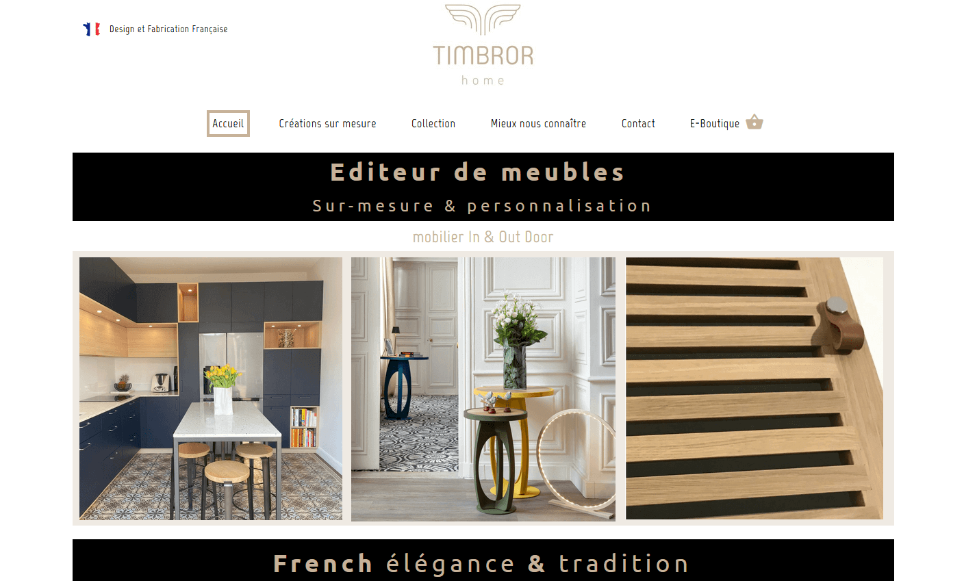
For example, if you are a cabinetmaker and if you sell custom furniture, your images should reflect the elegance of your products.

☝️ This is quite the case with Timbror, a talented art craftsman, who made his website on our platform 😍
👉 Play with depth of field and texture
But to make your site interesting, don't rely on color alone.
Use different depths of field and textures, so you can create contrasts.
Combine dark images with light ones.
Use conceptual images with materials such as fabric, concrete, grass, clouds, or blur effects, to add drama.
👉 Look for originality
There are a huge amount of images on the web. This means that users are potentially able to recognize a stock image, when they see one.
This does not mean that stock photos can’t be used on a website. But using cliché images gives an impression of ordinariness – and often has no emotional impact on the visitor.
You know, these overly perfect images, where you see artificial smiles and insincere emotions…

Finding the right (qualitative and unexpected) stock photos will probably cost you a little more, but will always be more effective.
💡 Don't be afraid to get personal! A custom, self-created visual (or a professionally done photo) is always more attractive than generic images.
👉 Edit your images
Don't forget that you can also customize your photos, and improve them, by editing them manually.
For this, you can use free online tools. Don't hesitate to consult our guide: How to edit images online?
Cropping your images will allow you to create a better impact.
Many “perfect” photos can be further improved by careful cropping. There is often a lot of wasted space at the edges of a photo. By removing this empty space, you draw the eye to where you want it.
💡 Our website builder tool integrates a filter and cropping feature for your pictures. Don't hesitate to make use of it!
Choose the visuals for your website: highlight your brand
Yes, your images can participate in your sales pitch! Here's how…
👉 Respect your graphic charter
Your images should match your website's overall design, and more globally, remain consistent with your brand image.
Each company has its own style, and generates specific emotions related to the brand. The images selected for your website must be in line with this guideline.
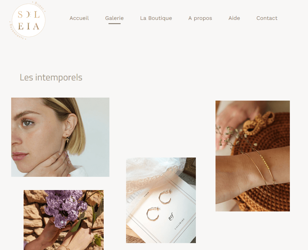
A jeweller, for example, will choose images that evoke luxury and grace.

☝️ Successful bet for the brand “Soleia Bijoux” which designed a nice little website on our online service! ✨
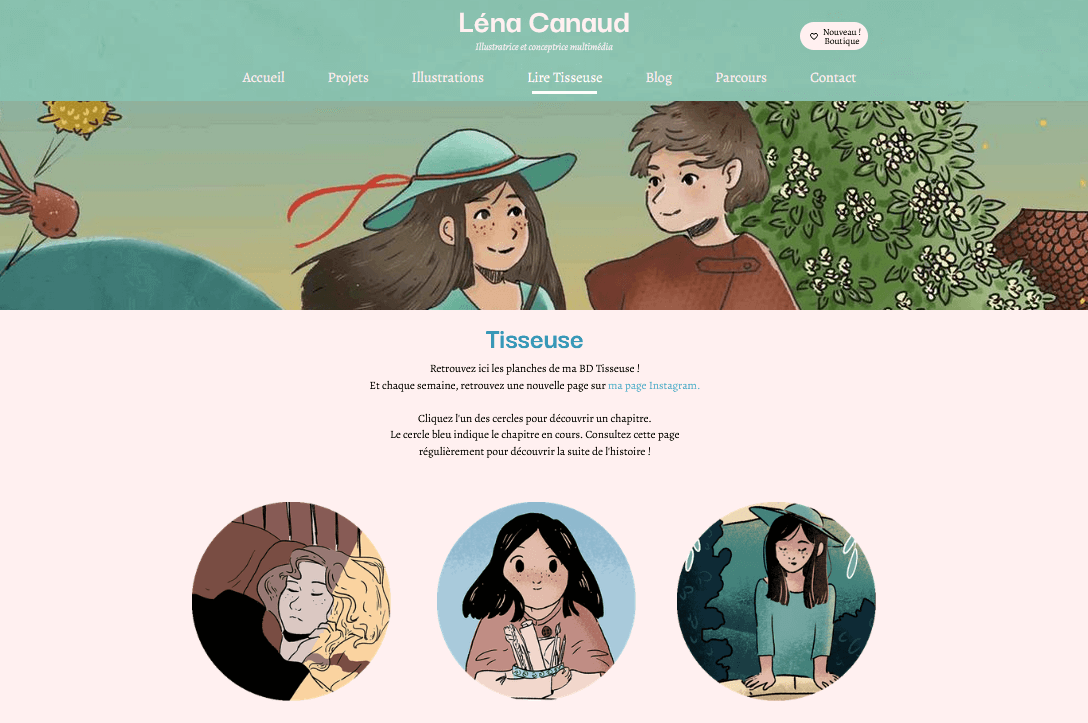
Collectively, all the images on your website should tell a story. Colors, cropping, filters, format, style…. Everything must be taken into consideration.
For example, you can use cartoonish images or only black and white photos: the important thing is to create a unity between images.

☝️ That's what Léna Canaud (who is part of our community) did for her illustrator website, which she fully decorated with her adorable drawings. 🤩
👉 Elicit an emotional response
Emotion often plays a role in the buying process.
A well-chosen image can push visitors to action.
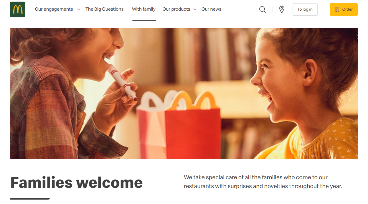
For example, think of a photo of a person who seems happy to use a product or service. This reinforces the customer's desire to identify with the product or service and project themselves into the purchase.

☝️ This image of children laughing with their happy meal is a good example of a positive, encouraging image, dedicated to families. 🍔🍟
👉 Feature people who look like your target audience
Of course, if you feature people in your images, always think about your target audience.
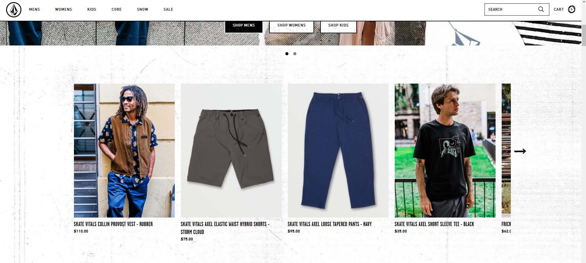
A website that specializes in skateboarding and caters to teenagers will have no interest in using images of babies or elderly people.

☝️ And the Volcom brand has understood it correctly! 🛹
👉 Use authentic images of your team
The more your visitors feel like they “know” your company, the more likely they will be to buy your product or service.
A good way to create a bond with your audience is to share behind the scene photos of your team, in action at their workplace, or participating in an event (seminar, public relations…).
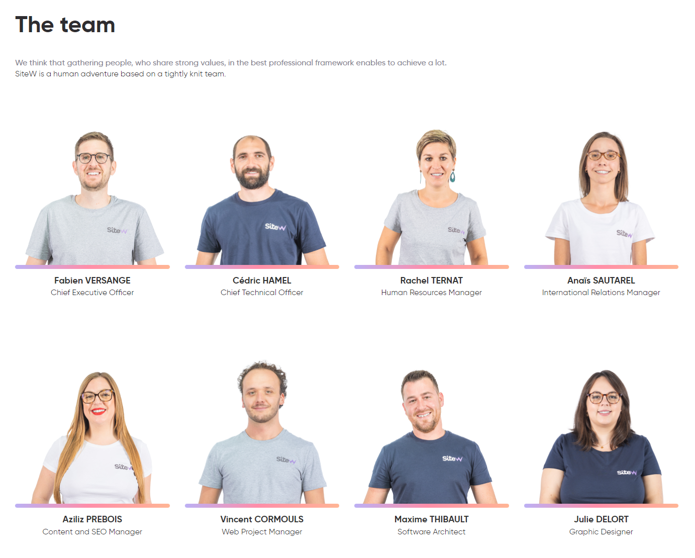
Also, don't forget to include portraits of your team on your “About” page.

☝️ Here is a part of our team! 👍
Don't worry if your team photos aren't as “clean” as the stock photo models: that's just what your customers want, to see the real faces of your company.
⚠️ Don't let your employees provide their own photos for your website. You'll end up with images with a random assortment of styles, often taken with phones, with people in the background, of poor quality or unprofessional.
So you should try to get a professional photographer to take a set of photos specifically for your website, to make sure they have a consistent style and composition. This way, your site will look professional and consistent.
To go further
In addition to your staff, you can also take “detail” photos, such as your office, workspace, or tools.
👉 Images of your products
If you make a physical product, having photos of your product is a no-brainer.
Yet many shops don't offer them.
If you create (or have made) some beautiful images of your products, you'll give your website a boost – even if you can't afford to have every product professionally shot.
If you don't sell a physical product (web design, for example), make mock-ups of your finished projects.
👉 Contextual photos
Contextual images are images that showcase your products in use.
They help tell the story of your product and help potential customers visualize themselves using your product.

☝️ Examples of contextual images, showing rare specimens of “homo sitewus” in their daily living environment 😉
What about user-generated content?
It's great, when your customers love your products so much, that they send pictures of themselves using them… But it is better to save these amateur photos for social media or customer review.
Finding beautiful images for your website: more tips…
👉 Offer several options for the same photo
Sometimes a picture you think is good doesn't match your website's look.
If you select 2 or 3 options, you can easily see which one works best. You can do this by creating a Pinterest board or moodboard with images you like.
You may be surprised to see which one wins in the end.
👉 Consider hiring a photographer
If you can't find the right images, sometimes the best solution is to hire a professional photographer.
If you're working on photos for your website, it's definitely worth investing in a photo shoot with your staff, in your office.
👉 Smiles sell
Focus on human subjects, as your visitors will relate to them more easily.
Also known in the marketing world as the smile appeal, smiling faces creates the feeling that a product or service makes people happy
And emotions are contagious, even if it's just in a photo!
👉 Choose images with a call to action
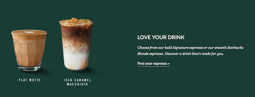
Want your visitors to do something specific? Add calls to action to your images.
Brands in the food industry often do this. For example, Starbucks, whose menu is constantly changing, makes it easy for you to decide which espresso to order the next time you want your daily dose of caffeine.

👉 Make the image speak
Hook your site visitors with an attractive image.
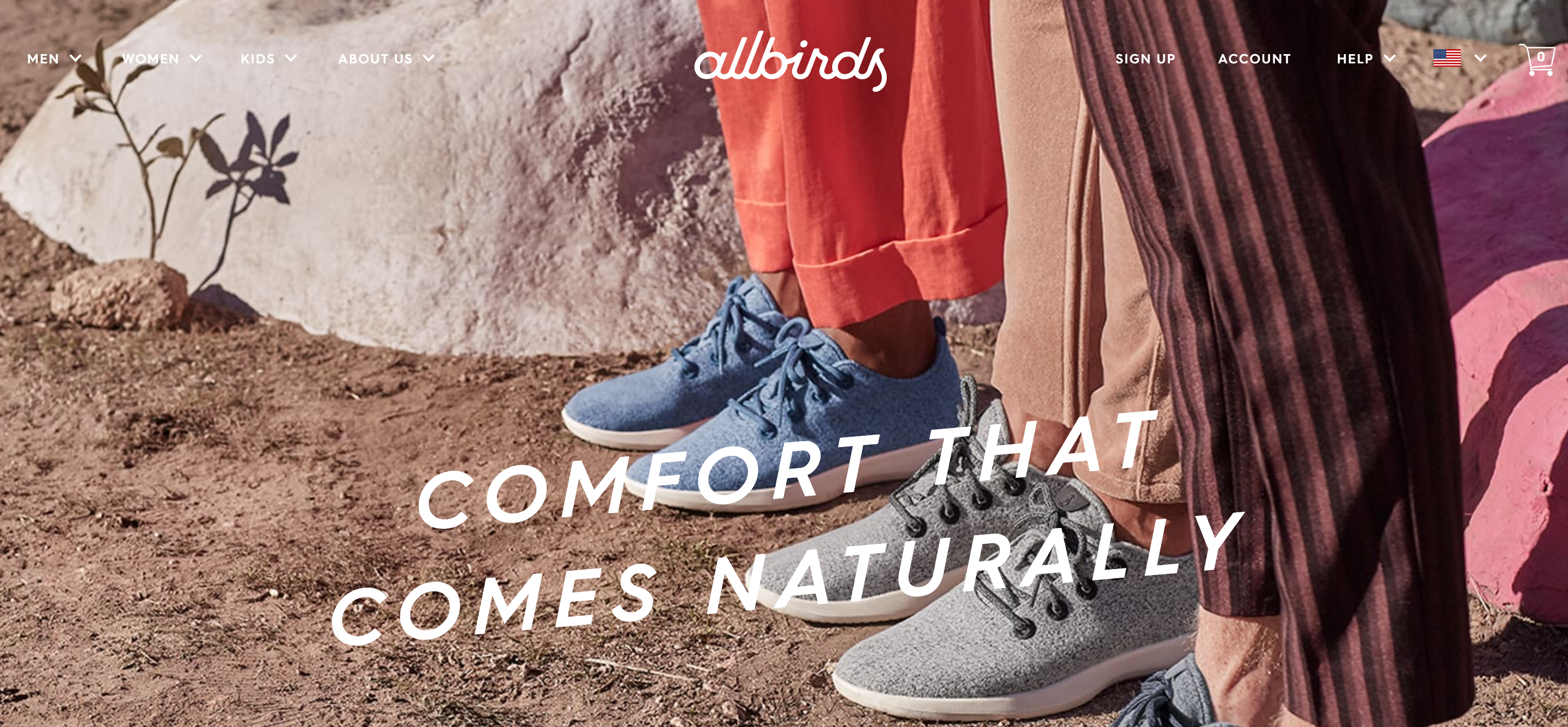
Instead of loading your website with a lot of text, choose an image that gets the point across without a word. Even if the text is interesting, your visitors won't take the time to read it, or even be interested in it.
For example, this homepage tells you, without a word, that their products are natural and comfortable, without going into detail about the materials used or the brand's history.

👉 Update your images
Don't forget to refresh your site, to show that it is alive and regularly maintained.
👉 Choose dynamic images
Choose visuals that convey energy, or a positive message.
👉 Not too much is enough…
Don't add too many images though. When adding images to your website, always follow the adage “Less is more”.
People don't want to be bombarded with images when they visit a site; this experience is confusing, disorienting and gives a negative impression.
So try to find a harmonious balance between text and illustrations.
Continue to focus on textual content, and keep in mind that the addition of images should be relevant, and bring value to your site.
Choosing beautiful images for your site: how to do it on SiteW?
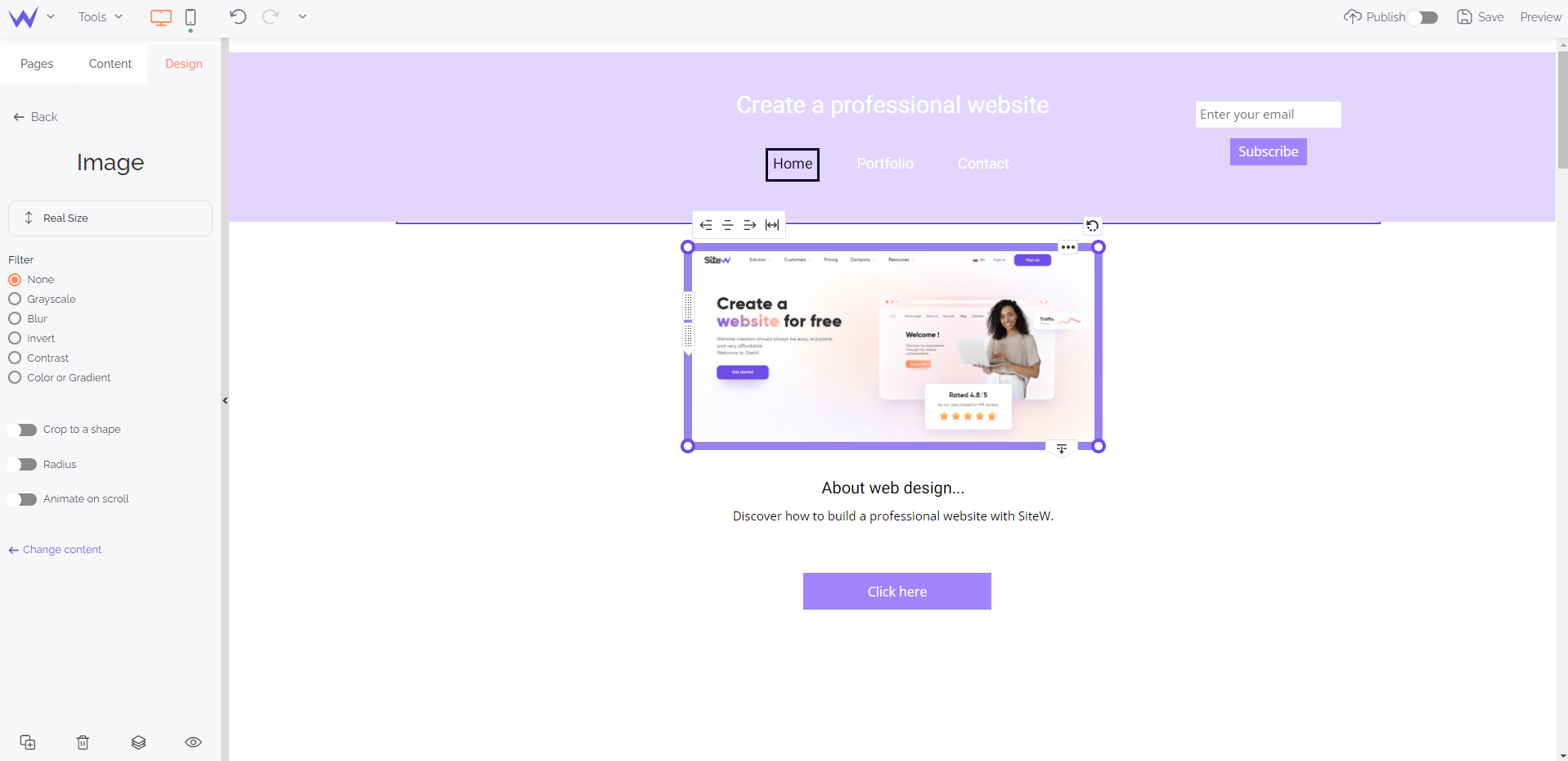
On SiteW, adding an image is done in a few clicks, with the mouse, by using the Image block.
Simply drag it from the panel on the left side of the screen and place it wherever you want on the page.

You can configure the block according to your needs:
-
Full screen on click
-
Display in full screen width
-
Add a link
-
Show an image or a menu on mouse over
-
Image editing options: filters or cropping.
Your featured images: organization and display
Bombarding visitors with hundreds of photos in a haphazard fashion is frankly not a good idea.
However, when using images to market products, it's better to use a separate photo for each product, rather than grouping them all together in one.
The same goes for promoting a service, you also need a lot of images.
These must be presented in a logical and organized way, in order to facilitate the understanding.
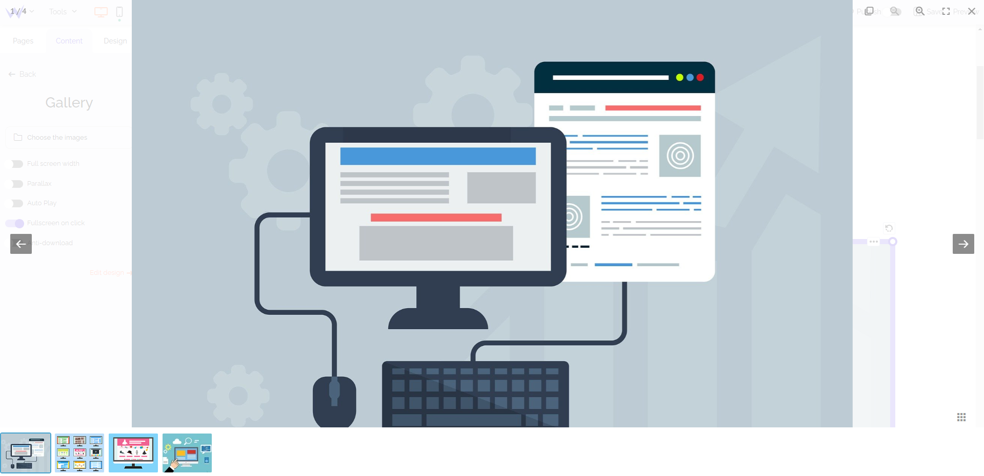
To do this, on our platform, you can use our Gallery block.

Proceed by drag and drop, as for all blocks, to add a gallery to your site.
You can then choose a style for your gallery, and customize it with different options (size and spacing of images, transition effects, navigation arrows, full screen width, animations on hover, full screen on click, parallax…).
Store your images
Our website creation packages (from $6.60 / month for a yearly subscription) give you between 1 and 10 Gb of storage, according to the chosen plan.
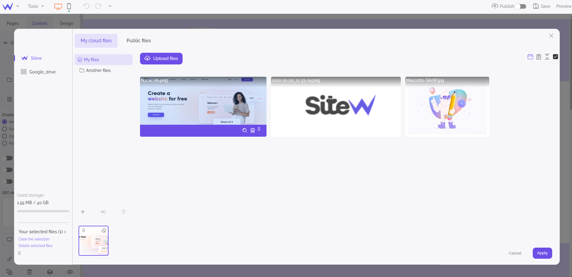
The file manager allows quick access to your personal images, and to image banks, to choose your illustrations, directly from the site editor.
It will then be easy for you to manage all your files (classify them, order them, name them, delete them…).

Optimize your images for SEO
Have you ever saved an image as “Photo1.jpg” or “2021-02-12”?
That's a big “no” when it comes to your website images!
Indeed, images matter for SEO.
When naming them, try to be consistent, and don't use punctuation or spaces. It is also preferable to use hyphens, rather than underscores.
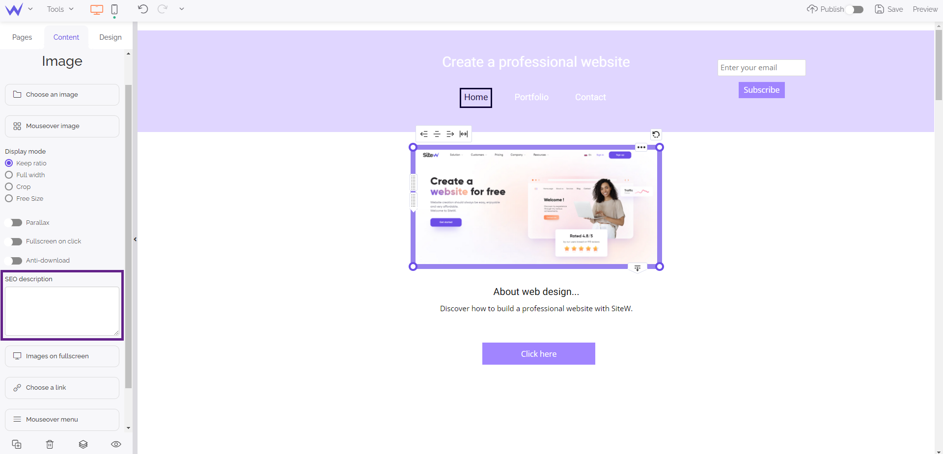
Also remember to fill in Alt attributes, and add titles and captions to your images.
This Alt text is a short description, usually 100 characters, of what the image shows.
Although it is not visible to visitors, it gives search engines an idea of what the image is about. This text will also help visually impaired visitors browse your website using audio software.
On SiteW, you can fill in this metadata field:
-
On the content panel, after selecting your image,
-
Or within your file manager (by clicking on the magnifying glass icon, on the image hover).

Now you know how to choose beautiful photos for your website or blog: it might be the right time for an update! 🚀

