Once we have redesigned the SiteW editor, it was time to improve your dashboard.
Simplicity, user-friendliness, and readability are the 3 keywords in mind when we redesigned totally your dashboard.
Your dashboard changes for the better, but its content is still the same.
Remark
For the moment, it’s a
first redesign. Other changes are yet to come, especially on specific sections. 😔
This project achieves different objectives:
-
Simplifying and modernizing our interface
-
Improving the usability of the dashboard and reorganizing the information
-
Lightening contents and mastering sections
-
Making our different features and sections accessible
Let’s discover the most important changes during this redesign. Let’s go! 👇
At the heart of the project, a global redesign
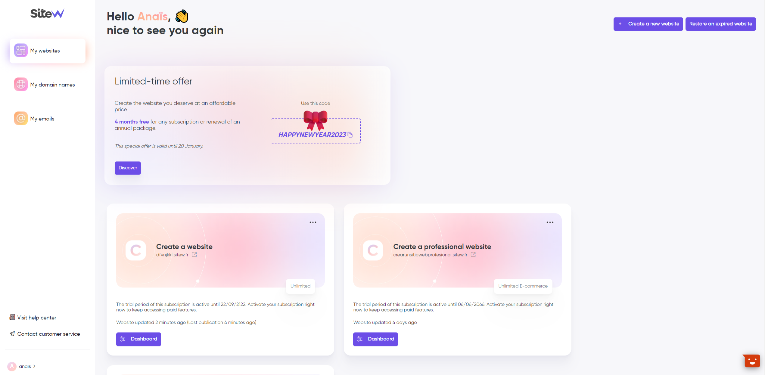
We wanted to offer a faster, clearer, and more modern dashboard. It’s done today. The entire website has been redesigned to make it easier for you to get your bearings.
For more readability, the menu has been moved to the left. In addition to the menu, you can see adapted icons so that you can find your way around at a glance.
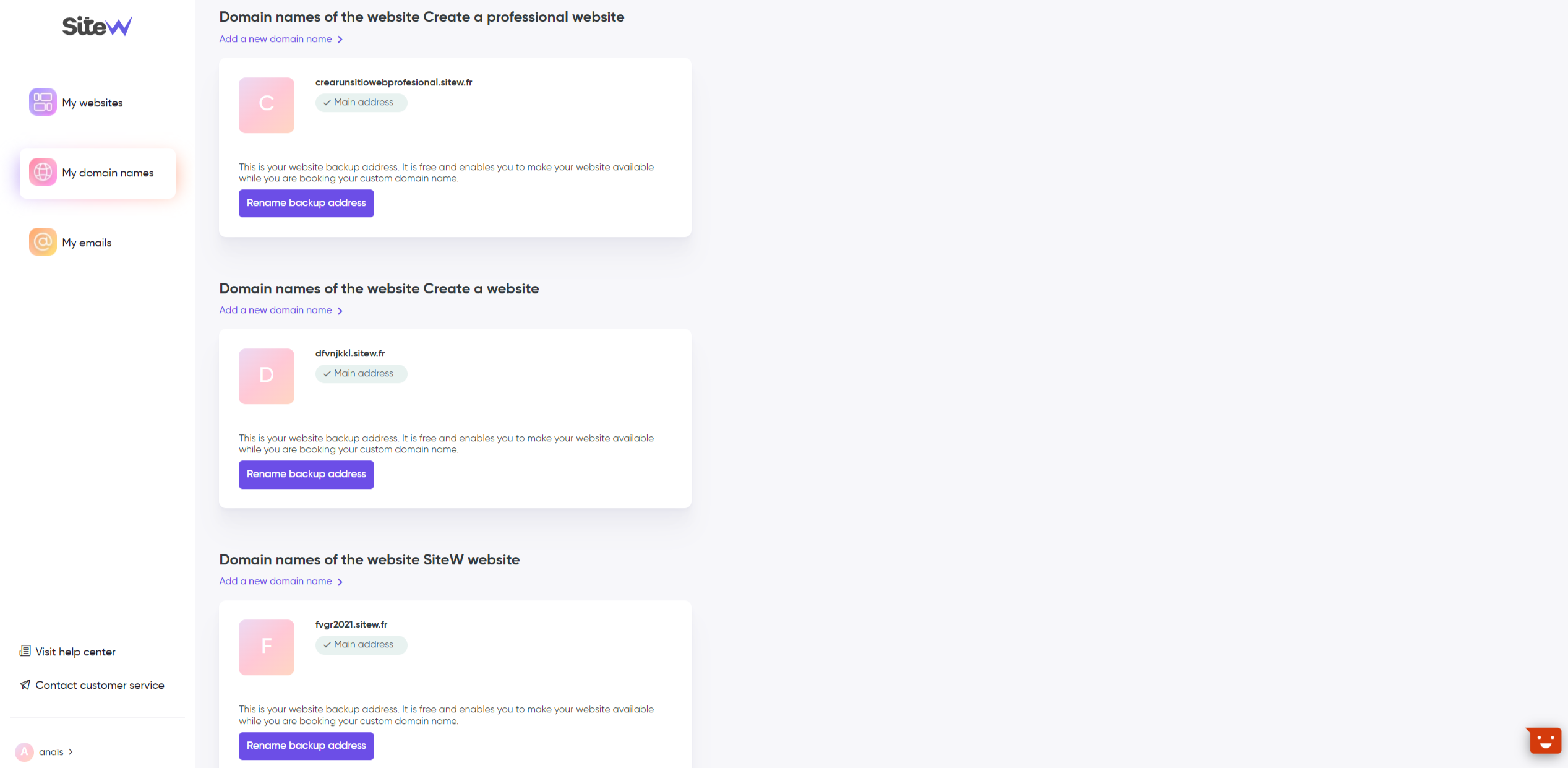
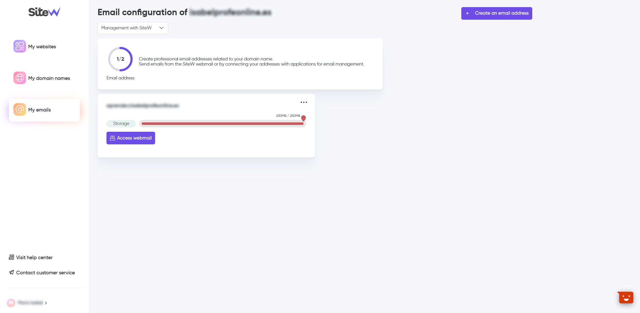
Your dashboard is still divided into 3 parts, which are more intuitive:


Moreover, some of your sections have changed to facilitate and simplify everything. It’s the case with the Marketing and Settings sections. Other sections still have the former design, but they will be soon redesigned (Store, Legal notice, Community sections…).
Until now, do you understand? Let’s continue…
The evolution with a dashboard
Let’s go back to the dashboard of your websites. As mentioned before, now, you can individually manage each website on a dedicated page and that’s much easier!
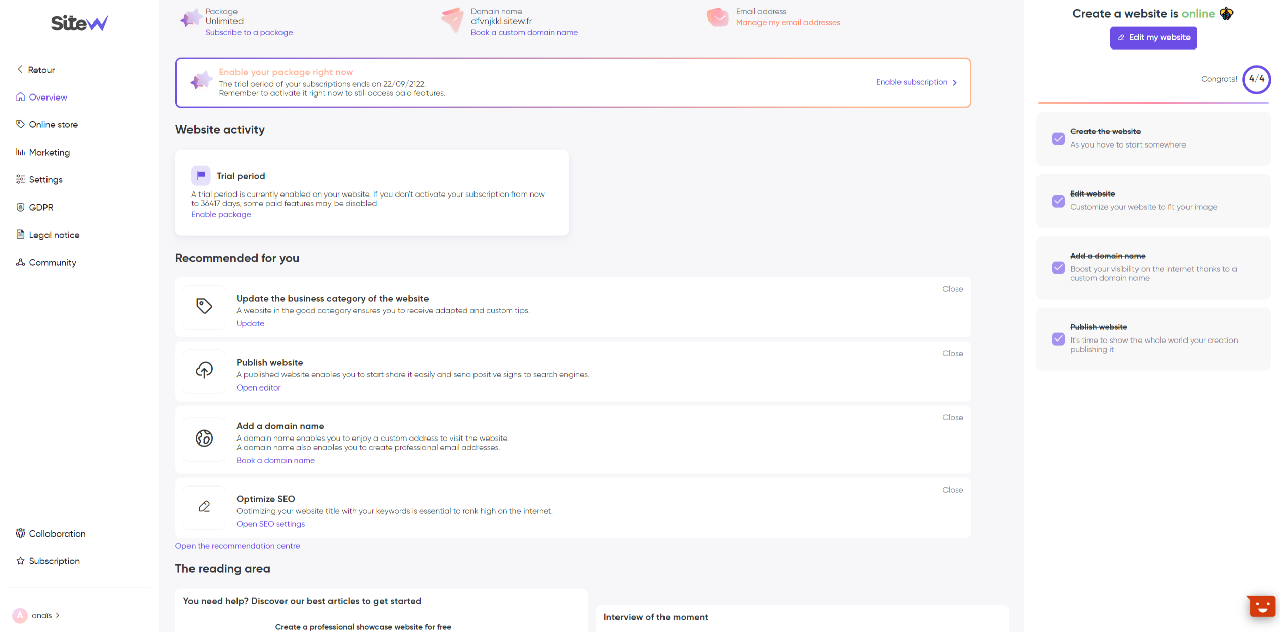
Once you are on your dashboard, you are on the Overview section by default, where you have all the essential information related to the website in question.

You will access information and sections to develop your website in a few clicks:
You will find alerts related to your domain name (transfer, current DNS propagation…) and for online stores, alerts on paid orders, orders in progress, pending payment…
Follow the custom steps and develop your website quickly!
-
The reading area: As its name suggests, you will find a range of specialized contents for your business. You will also find our customers’ testimonials (will you be next?).
-
The checklist (to the right of your page): It enables to follow the progress of the website publication. It’s a list with a few objectives to reach before publishing your website.
New features will be soon released. 🤫 On the program: highlighting and monitoring of your website health, new notification system, among others…
A more fluent browsing
With this new dashboard, we wanted to offer a more fluent, pleasant and easier browsing. Going from a section to another is easier and the information is better organized.
Now you have a single menu on the left with “submenus” called Sections. These sections have changed:
- SEO: Find tips related to the good SEO of your website, manage your domain name, enable HTTPS security, and manage your redirections.
- Analytics: Configure and synchronize your different Google accounts on your website (Google Analytics, Google Tag Manager, Google Tools code).
- Statistics: Consult your statistics at a glance about your website traffic (traffic sources, visited pages, keywords, visitors’ demographic data).
- Google Search Console: Enable your Google Search Console account in a few minutes and monitor your website performances.
- Emailing: Manage all your current emails and campaigns.
-
The Settings section just has a new, refined and clear design with the same options. You can send a logo, add a favicon, manage your website category and see your storage capacity and its use.
Regarding responsive design, we are happy to tell you that the new features of your dashboard are totally compatible with all the available supports (mobile, tablet…). 🙌
And then…
Did you like the first changes? Wait and see. ☕ Our team is at the forefront to keep surprising and offering you the features you deserve.
-
The Online store section was requested a lot. It will be soon redesigned with a clearer, simpler and responsive interface.
-
The Legal notice, Community and GDPR sections will soon have a new design for more fluidity.
To sum up, we keep working on your dashboard to release all of this as soon as possible.
So, what do you think about this new dashboard? Write use! We look forward to having your feedbacks. 👀

