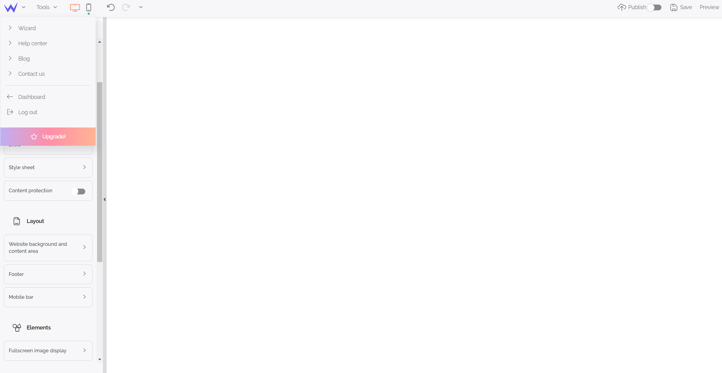
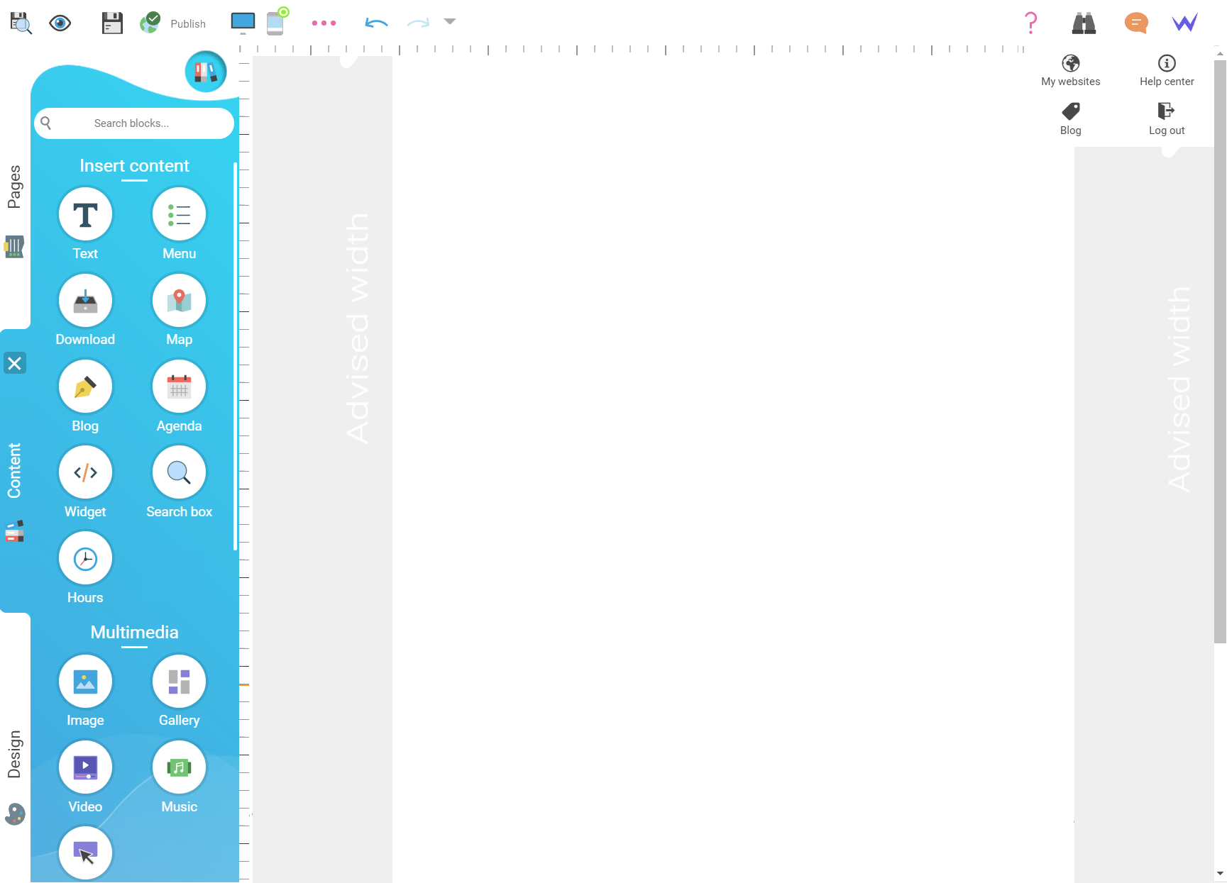
Here is the new SiteW editor: its form has changed, but its content is still the same. Concretely, the design of our historic editor changes, but it has the same features.
Tip
For the moment, it’s the
first redesign of our editor. The project will have other phases to enjoy an editor which is even more user-friendly.
Here are our objectives. The interface is:
-
Easier to use
-
More user-friendly
-
More modern
-
Easier to understand
And we did it without changing its features.
So, things are right? Now, we will discover the more important changes for your website management. Let’s go! 👇
The top bar
The first step of the redesign of our editor was to improve the top bar, especially its practicality.
Generally, the new bar has fewer elements which are directly visible. It is easier and more logical than the previous one.
Now the bar at the top of the editor is divided into 2 different sections:
-
In the top right-hand corner: the “future” actions, where you will find buttons for the publication, preview, and upgrade of your website.
-
In the top left-hand corner: the “current” or “last” actions, you will be able to manage responsive design, a toolbox, and the back-to-top button.
-
The SiteW menu (W icon) enables you to access our additional resources, get in touch with us, back to your dashboard or just leave the editor. The guided tour was directly added to this bar for more coherence.
-
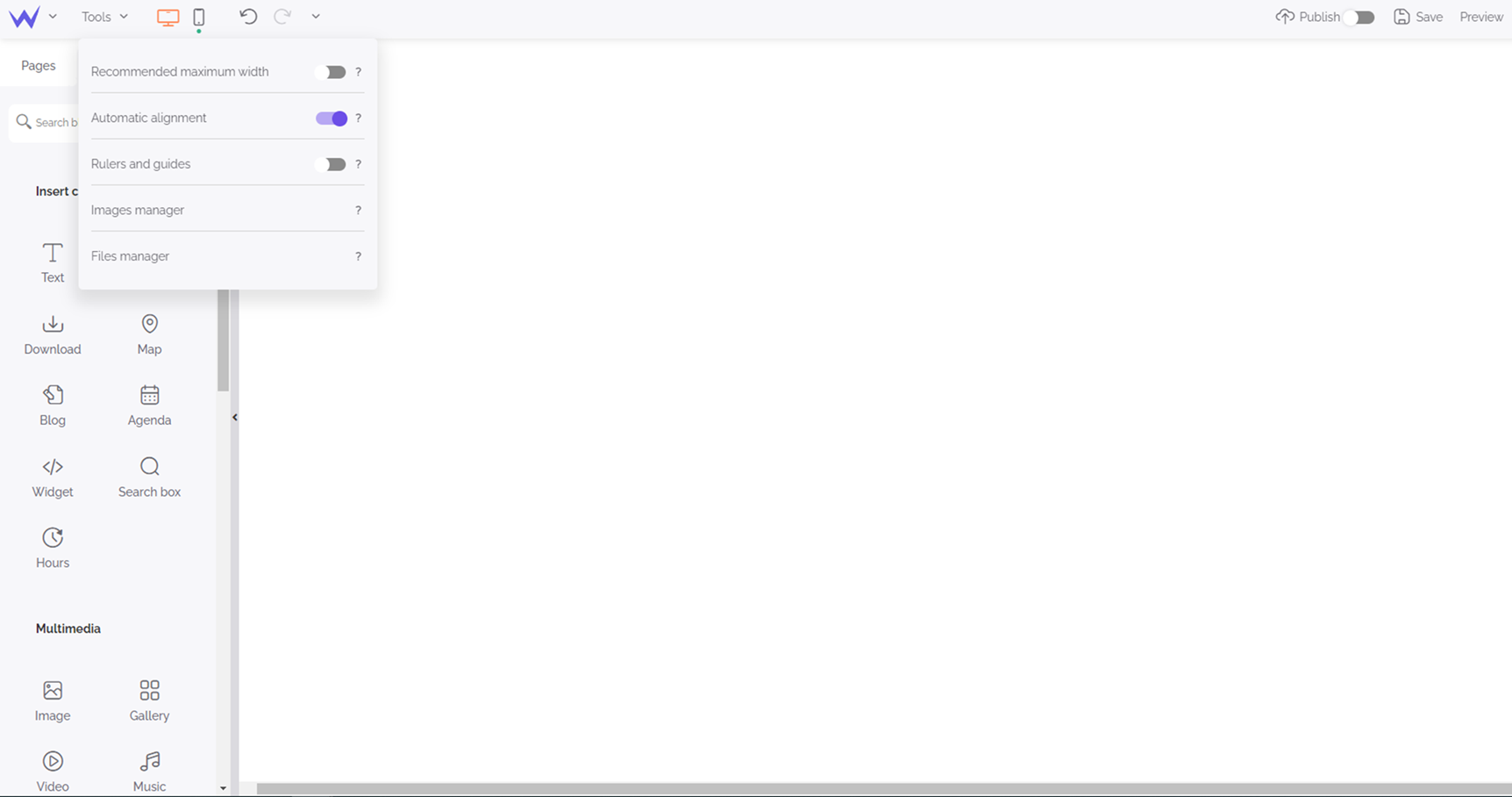
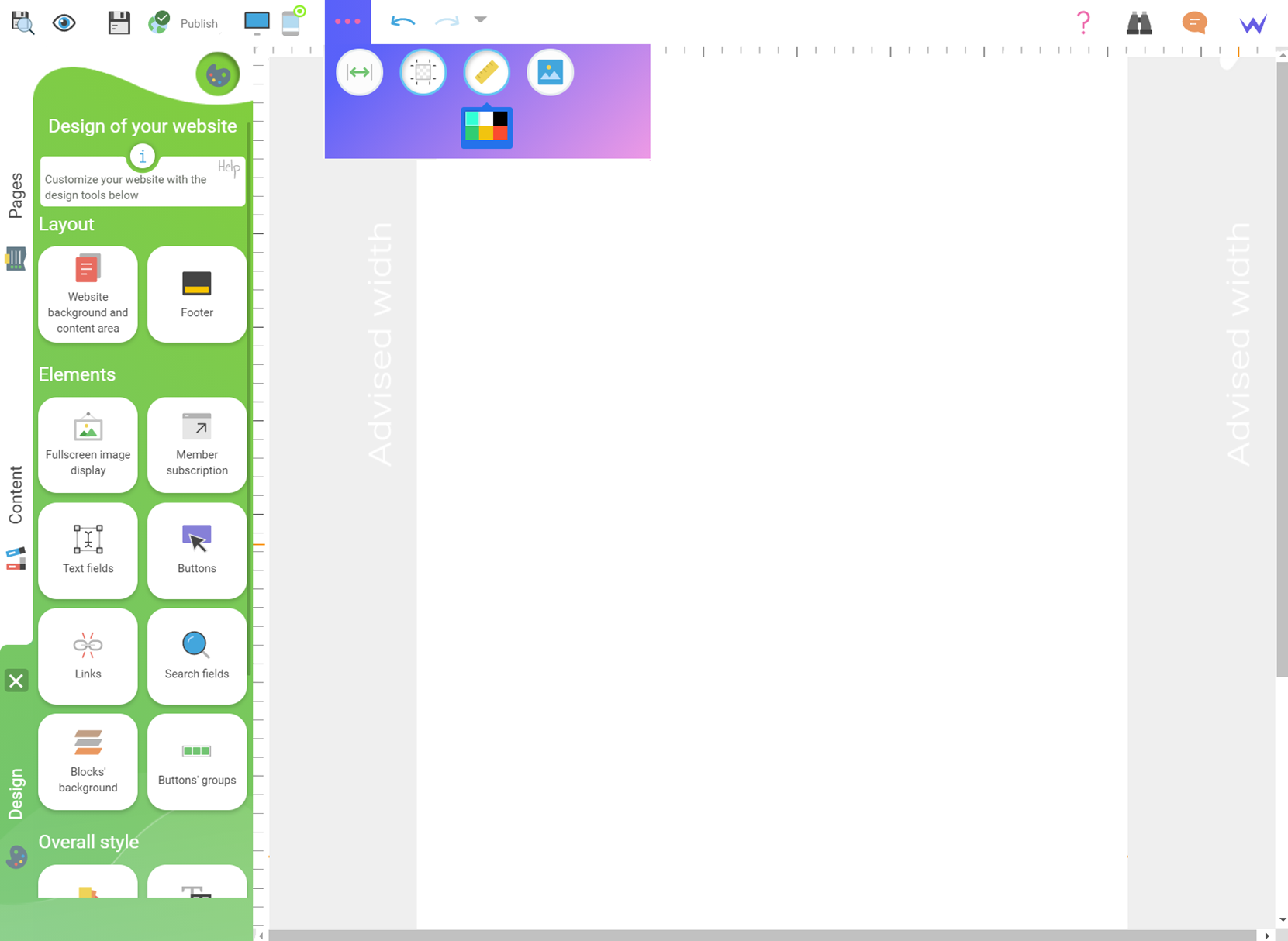
The toolbox has no more icons, but beautiful purple buttons which are easier, more understandable and intuitive. Knowing that a feature is enabled will never be easier. You know immediately if the feature is enabled, or you can enable it quickly.
New editor

Former editor

The different tabs
Now you know our brand-new bar, let’s move on to the redesign of the different tabs.
Historically, the tabs were vertical. After a retrospective, this seemed no longer user-friendly or understandable.
Now the tabs are horizontal and displayed on the top of the Pages, Content and Design panels.
The Pages panel
Let’s move on to the different management panels. Let’s start with the Pages panel that enables you to manage your pages, as its name suggests.
You will enjoy a tab which is even more readable and useful.
-
New tip: the search engine of the pages now is always displayed, whether you have 2 or 70 pages.
-
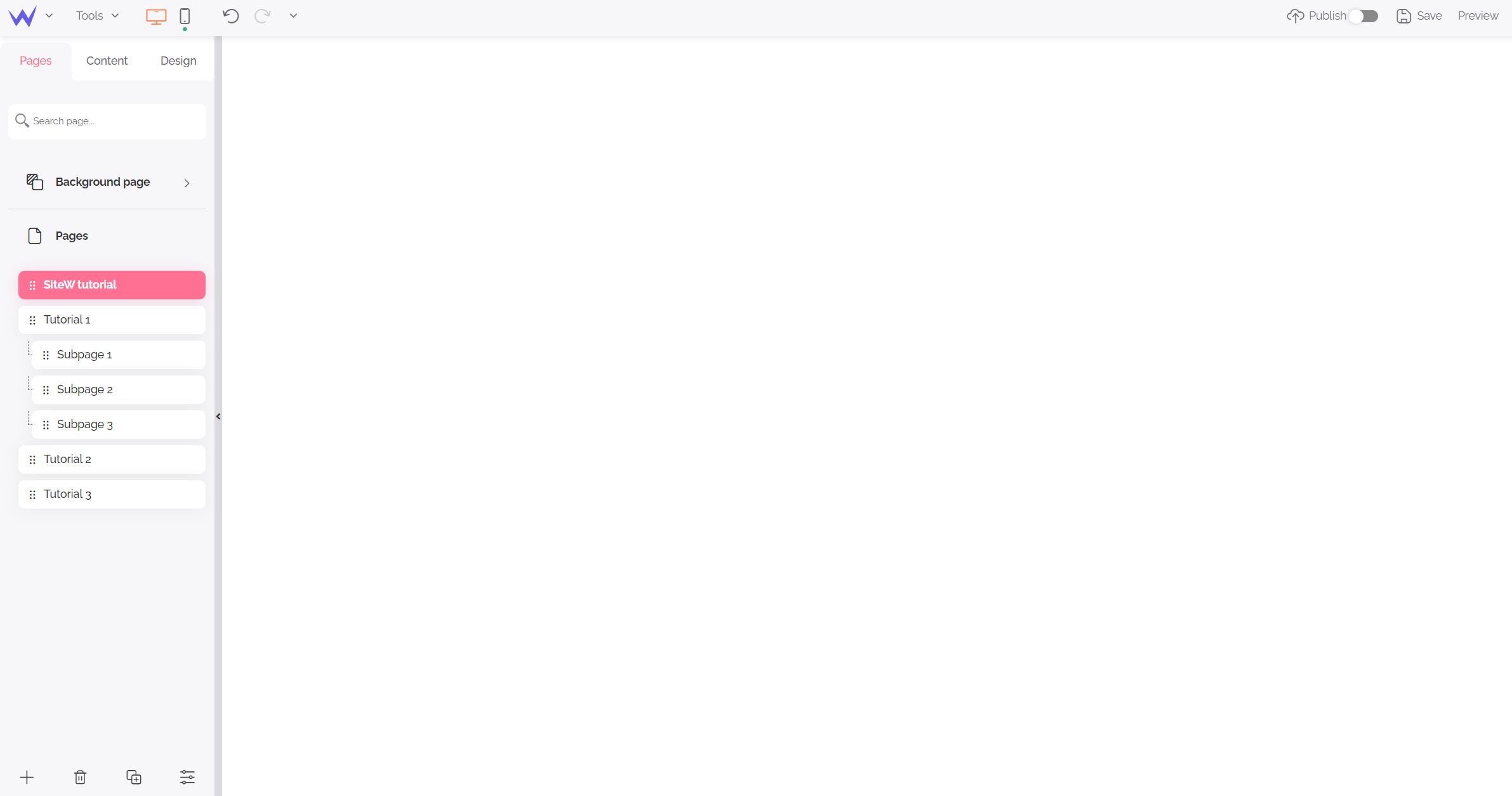
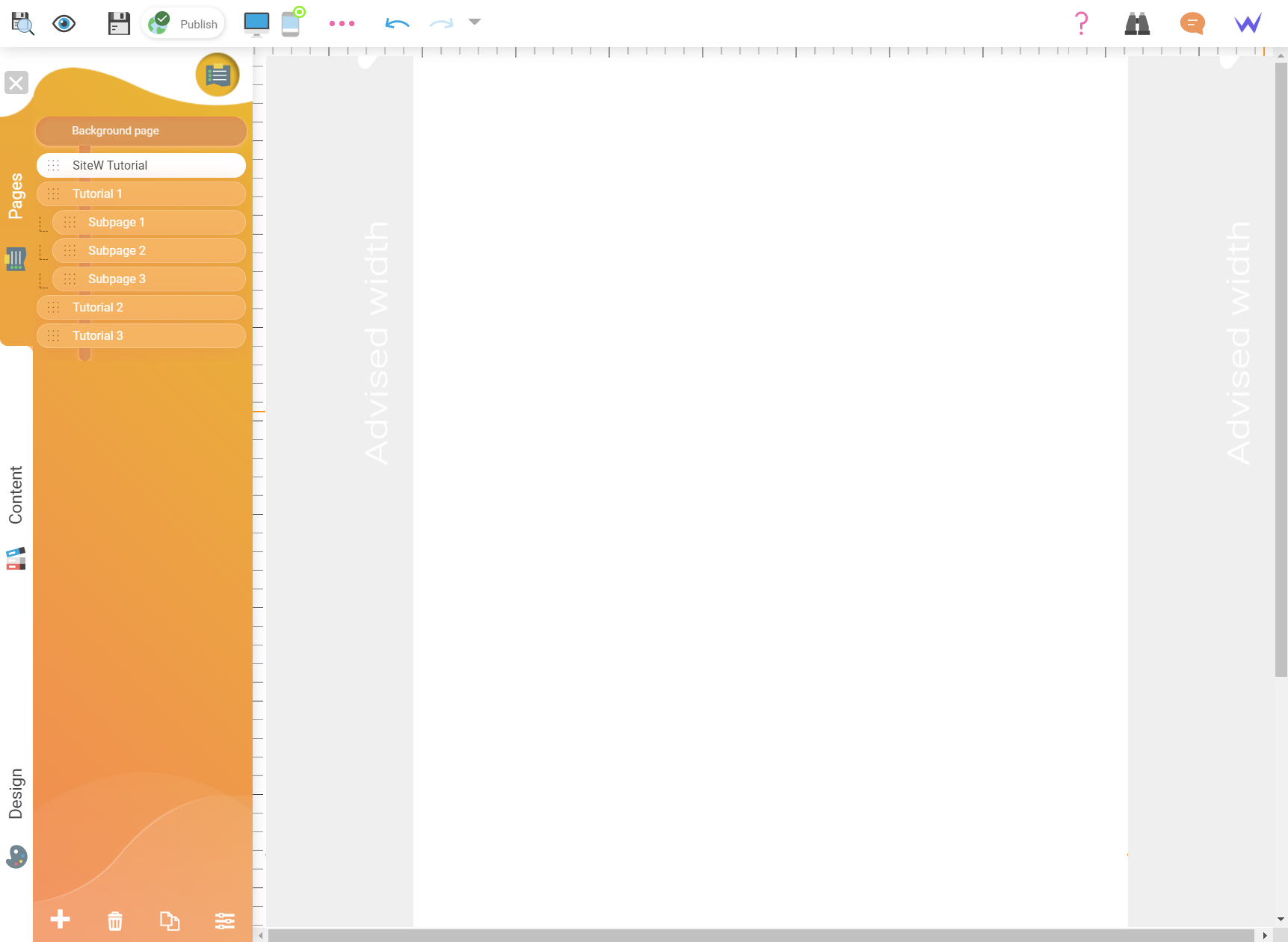
The identification of the background page and the pages has been improved. The background is clearly separated and identified. The pages have a header called “Pages”.
New Pages panel

Former Pages panel

The Content panel
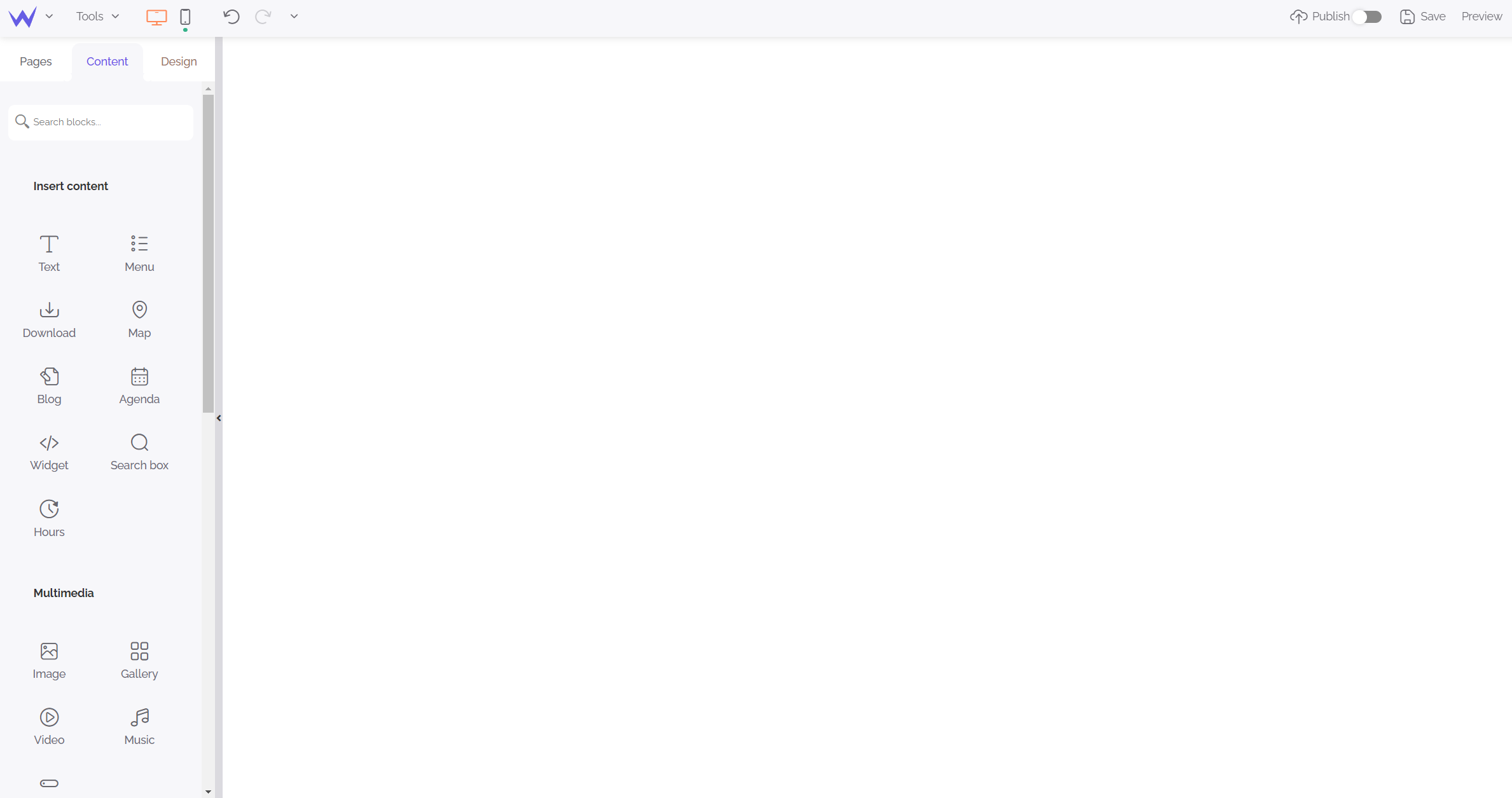
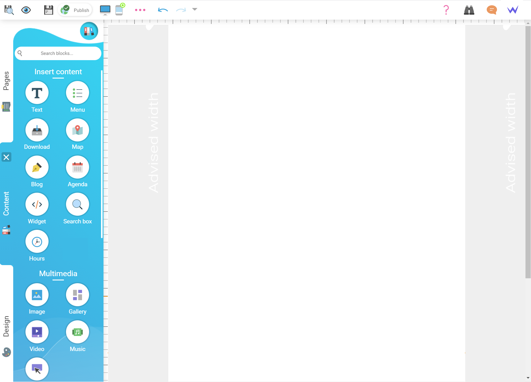
We worked hard to enhance the design of our icons. Now the icons are clearer, easier to read and understand. Just their form has changed, not their content.
💡 The search bar is still available to find your block in just one click.
New Content panel

Former Content panel

The Design panel
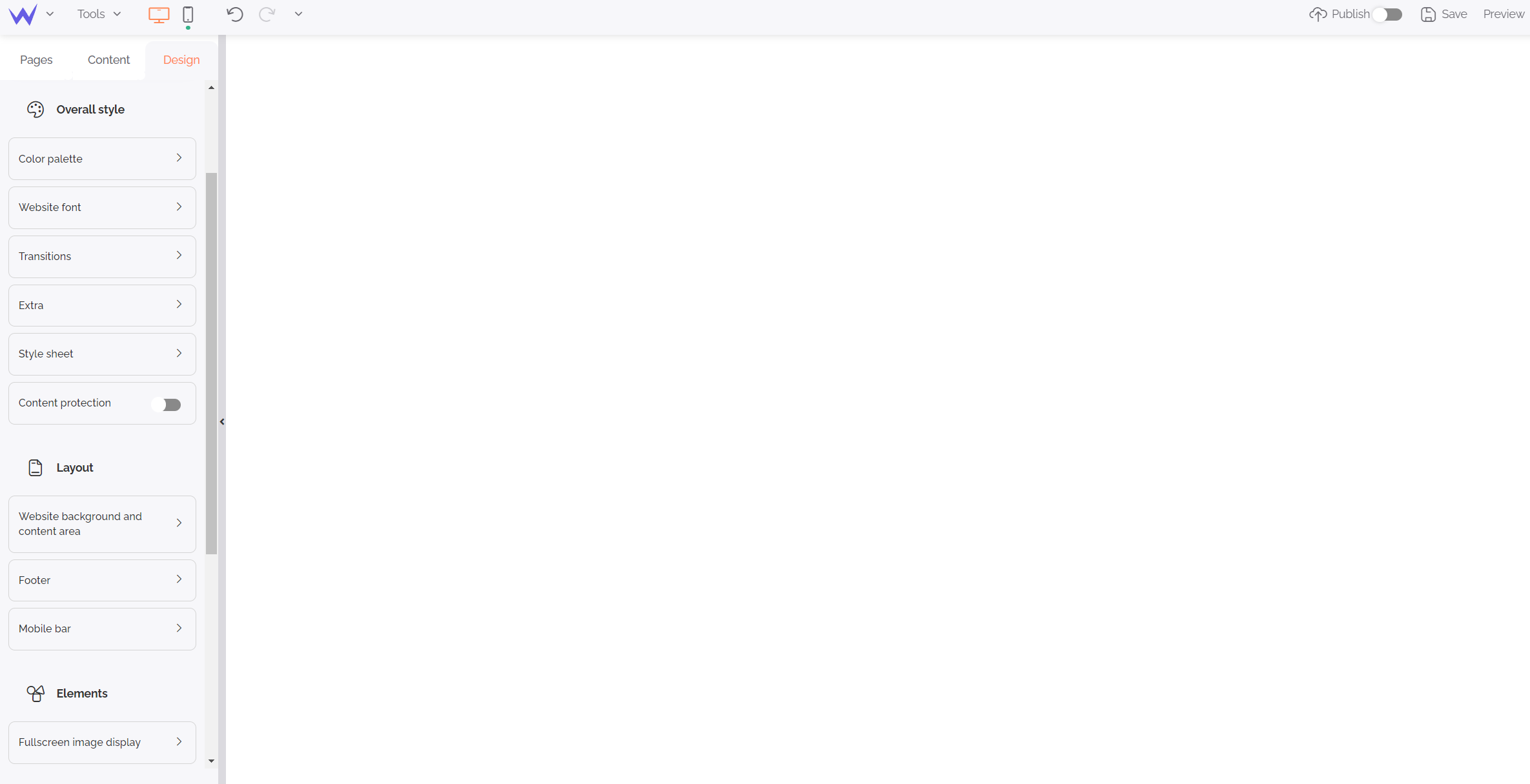
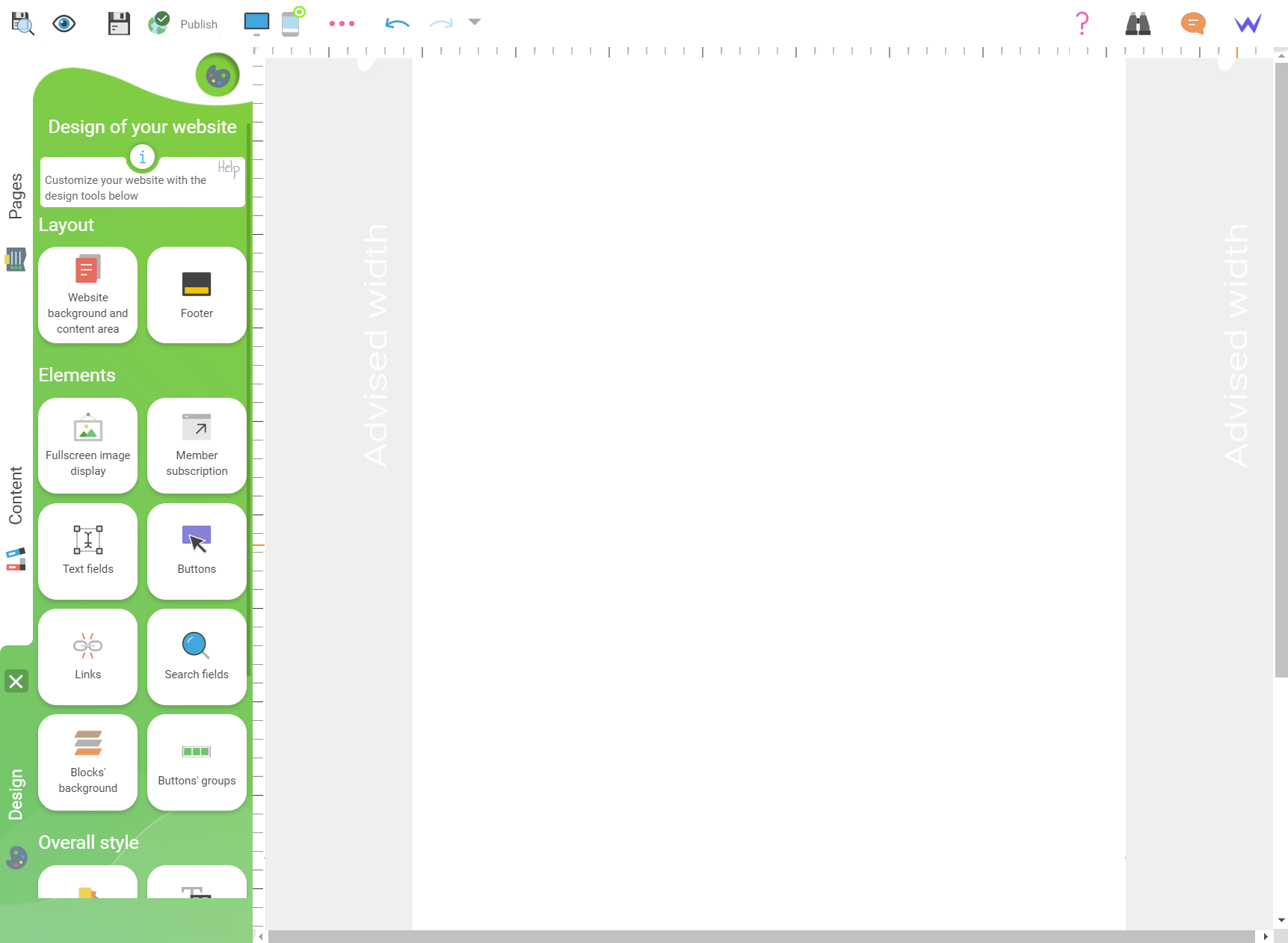
Let’s discover our latest panel, the panel that enables you to manage and optimize perfectly the design of your website.
New Design panel

Former Design panel

Made it! You know all the changes of the new editor… We couldn’t wait to present our redesign. We hope you like it, and makes web design easier.
Now the editor is more modern, easier and the information is easier to understand.
Redesign of the SiteW editor

SiteW editor before redesign

Don’t hesitate to give feedbacks about the brand-new editor. 😉

