Creating a responsive website, adapted to all devices (computers, tablets, smartphones and even television) has been a necessary step for years.
Users should be able to navigate through their computer as well as through their smartphone.
At SiteW, all the websites we create are fully mobile friendly.
To go even further, our team of developers provides a mobile menu for your website.
Mobile menu: what is it for?
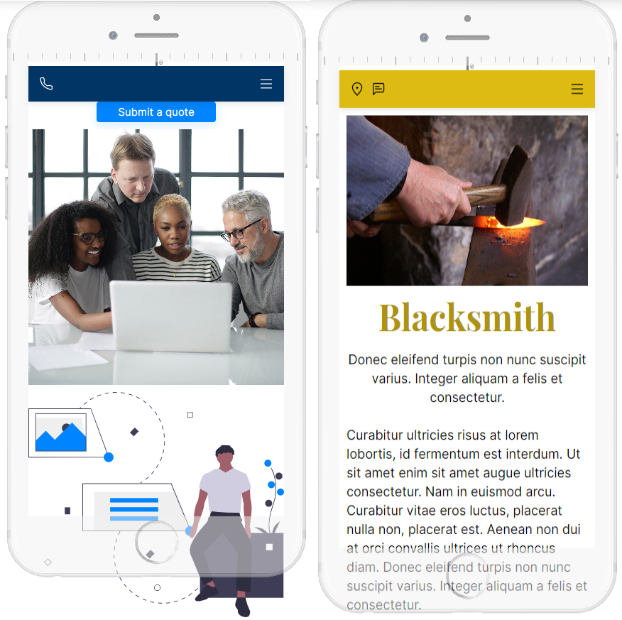
The mobile menu allows you to display a responsive menu on smartphones, tablets ... The mobile menu is customizable, you can choose everything: your site, your style.
Features available for all packages
No more excuses: go and configure a responsive website that suits you.
Configure your mobile menu
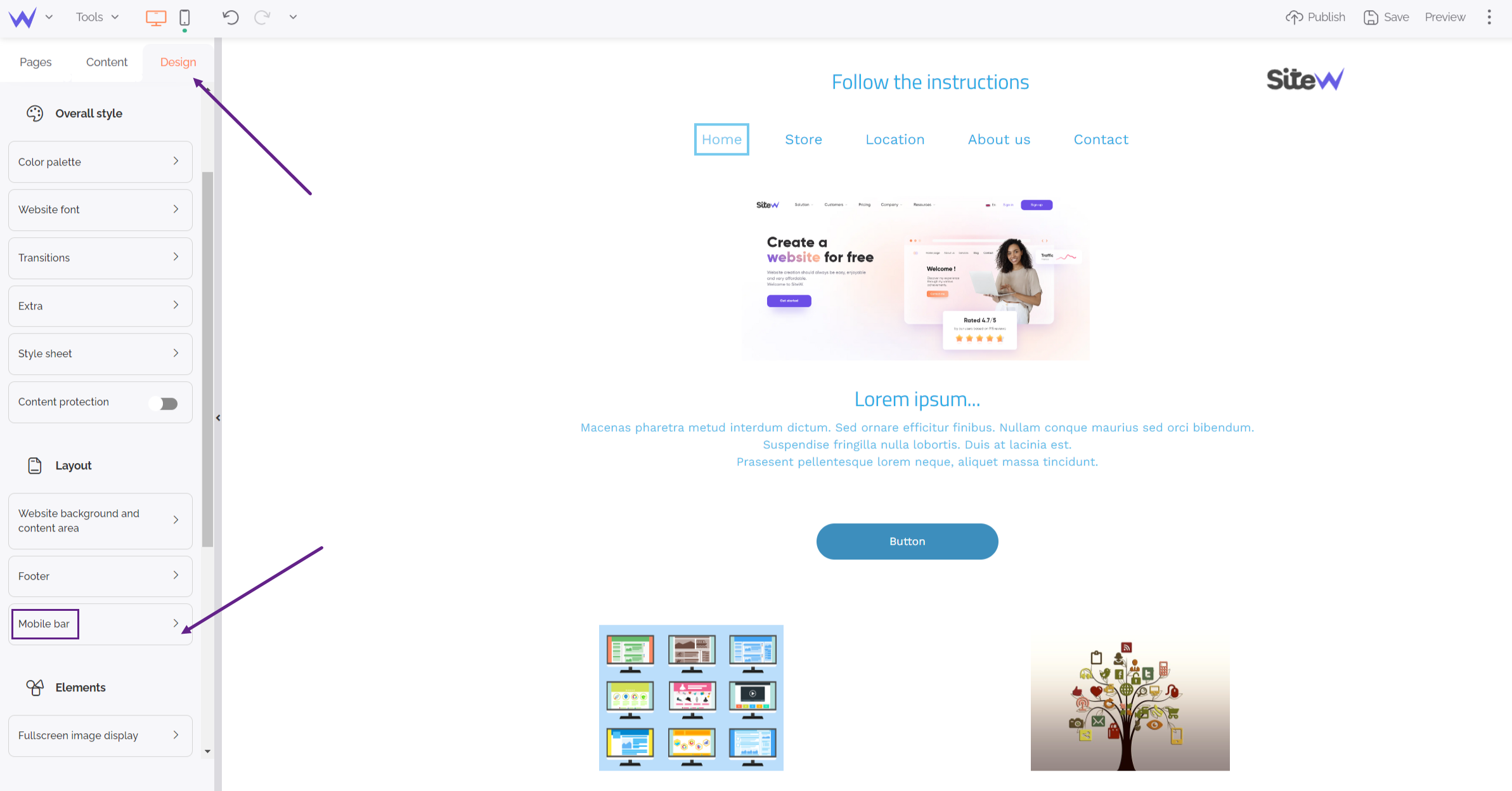
To configure your mobile menu, you have two possibilities:
- Select the mobile menu on the mobile version in the editor
- Click on "Mobile menu" on the Design panel.
To go further
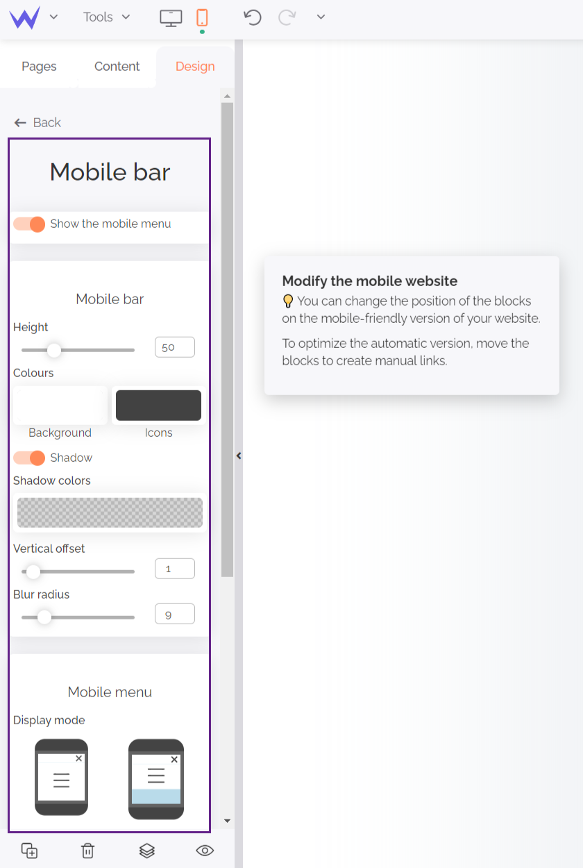
The mobile menu is checked by default so that you can customize the design of your mobile menu. If you want to disable it, simply uncheck "Show the mobile menu".

Customize your mobile menu
Focus on design
The entire content of your mobile menu is customizable, down to the smallest detail.

Then you can set the height of your menu, modify the background color as well as the color of the icons.
💡 You can change the height of the menu by using the slider in the design panel, or by resizing it with your mouse.
If you want, you can customize the shading by clicking on "Shadow". Then all you have to do is set the color, spacing and blur intensity.
Regarding the display style, you have the choice between two solutions:
-
Display the menu on the full height of the screen (default mode)
-
Display the menu according to the height of the content.
Regarding the colors, you can change the background of your menu, but also the color of the text displayed.
You now know how to customize your mobile menu design. But we won't stop there. You can also add as many icons as you want to your mobile menu (Hourray! 🙌).
Add icons to your mobile menu
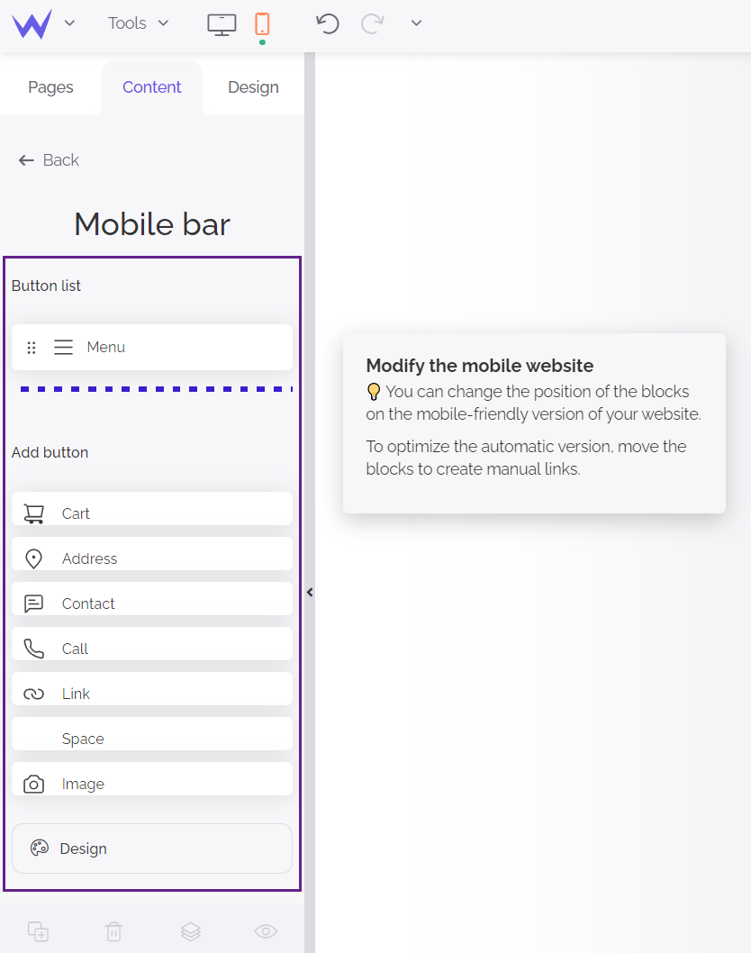
Choose the icons you want to display on your mobile menu and customize them.
Quick overview of the available buttons:
-
Shopping cart: allows users to go directly to the shopping cart.
-
Address: opens the map application and allows you to add a GPS to your mobile menu.
-
Contact: redirects the visitor to an application to contact you.
-
Call: opens a phone application that allows the visitor to call you with the phone number provided.
-
Link: allows you to add a link to a specific page of your site, an external site, a document or an image.
-
Space: Allows you to separate the icons. The spacing is automatically defined according to the size of the icons.
-
Image: add an image (or even a logo) with a link.
💡 For each icon, you have the possibility to use the predefined icon or to choose one in our icon gallery.
You can also make the icon visible on vertical and horizontal screens or, only on one of them. To do this, click on the button ("Shopping Cart", for example) and choose the visibility you want. If the icon is blue, then it is visible on the selected device.

Manage your mobile site
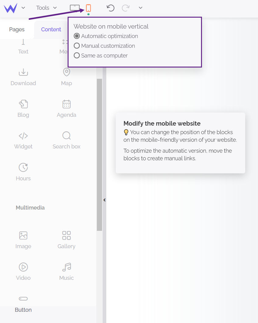
To manage your mobile site, several options are available to you:

You now have one more tool to create a site optimized for mobile devices, smartphones and tablets, let’s go! 🏎💨


