Design your SiteW website from A to Z
Once you have created a website, the SiteW editor enables you to customize your website from scratch to save time.
You can define settings, according to your needs, that will be new styles applied by default to the new elements embedded in your website.
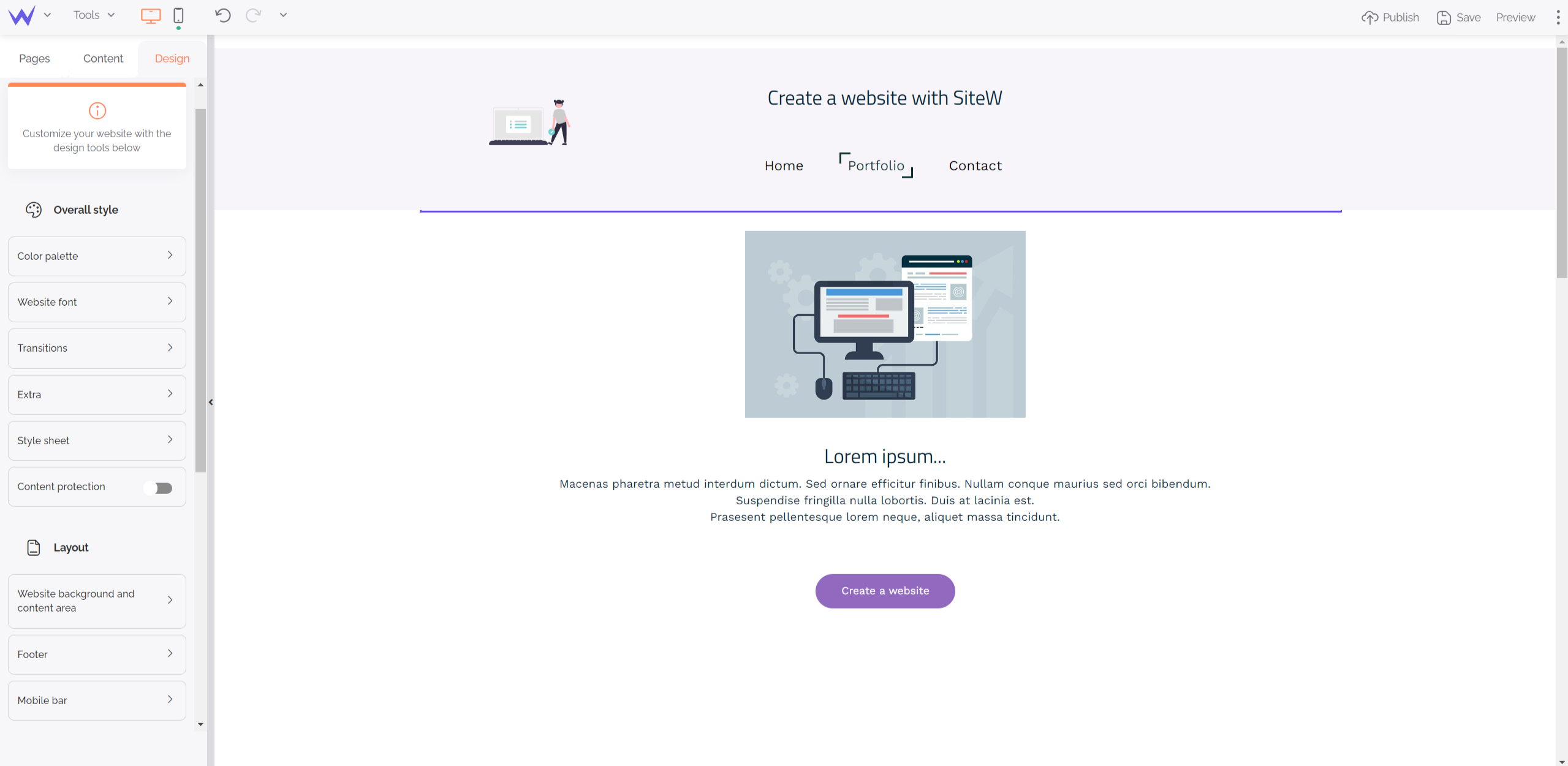
To that end, go to the Design section of the editor in the bottom left-hand corner.

Let’s discover some possibilities offered by the SiteW editor for creating a custom website easily.
Website structure
The Layout category enables you to modify some elements that will be displayed on each page, such as:
-
the background behind your content,
-
the background of one or several pages,
-
your footer.
If you define settings for these different elements, you will be able to add content without taking care of your graphic coherence.
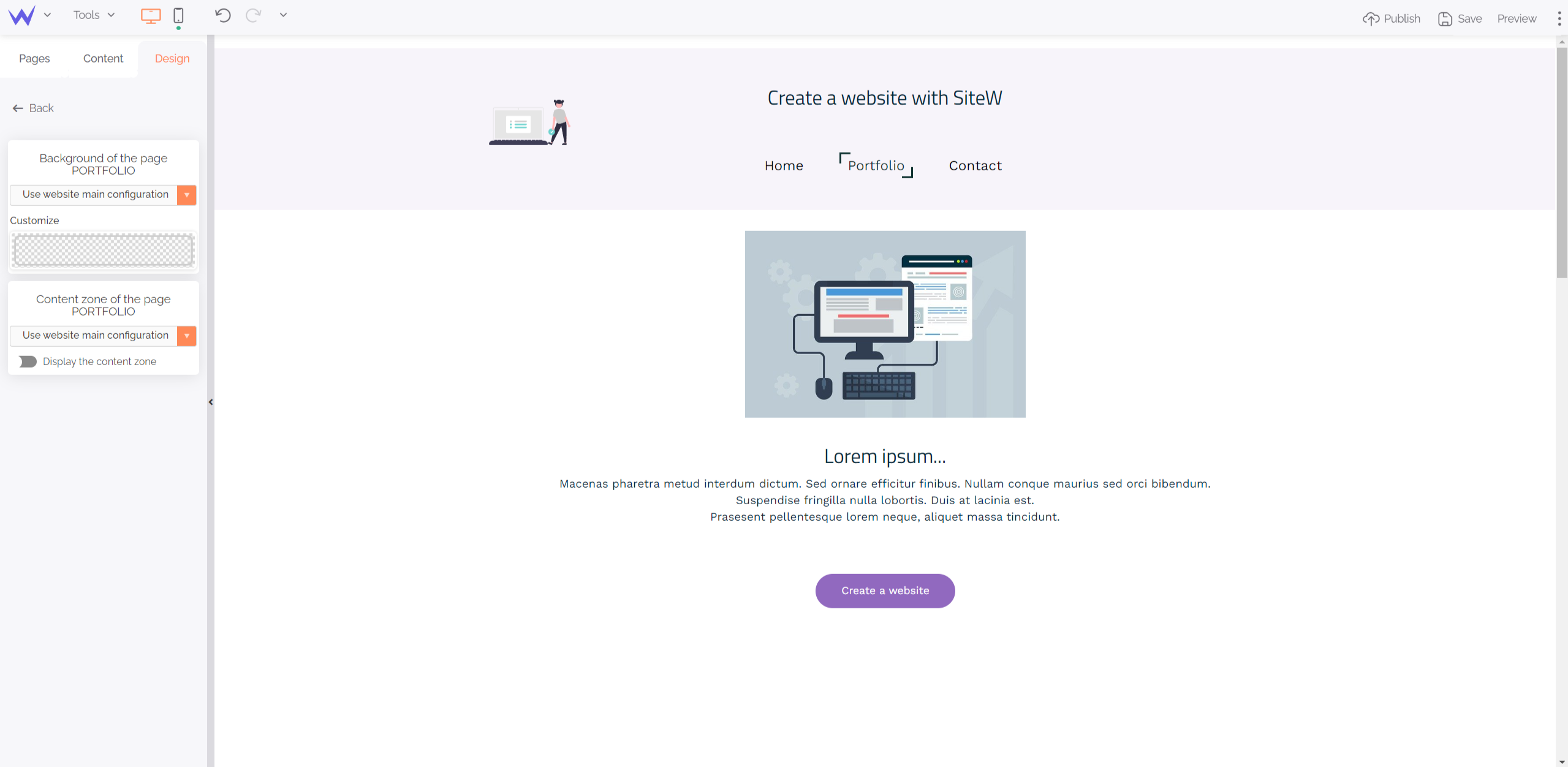
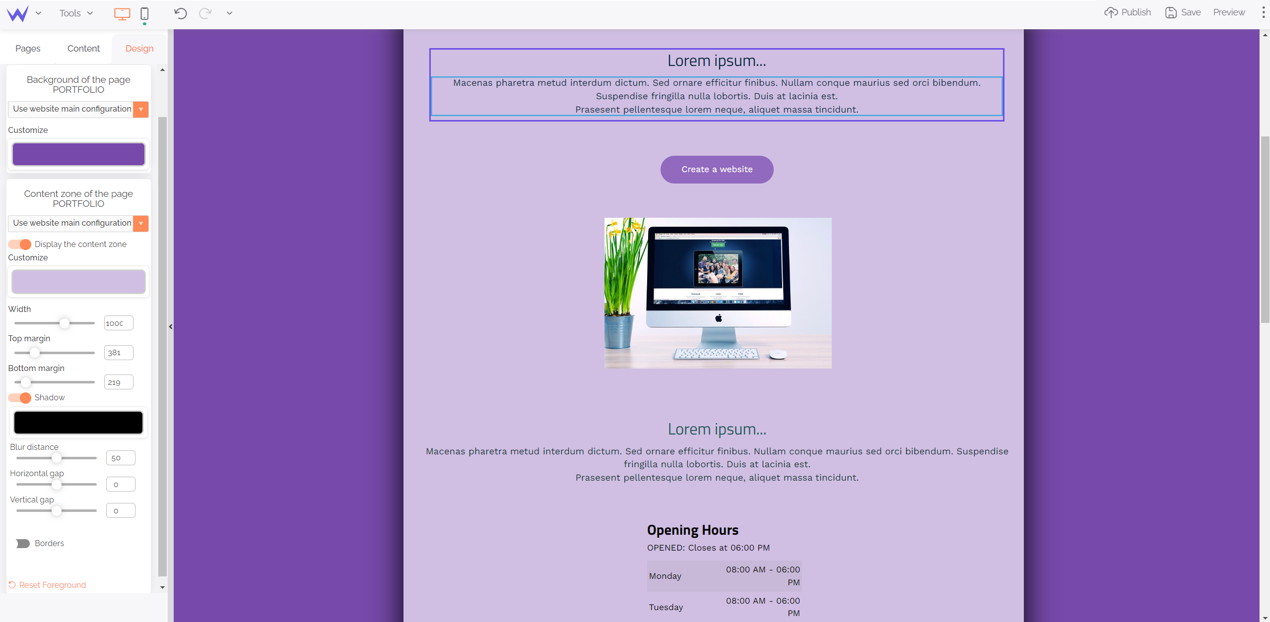
First, select design for your page background by clicking on “Website background and content area”. Then, two windows will appear on the left:

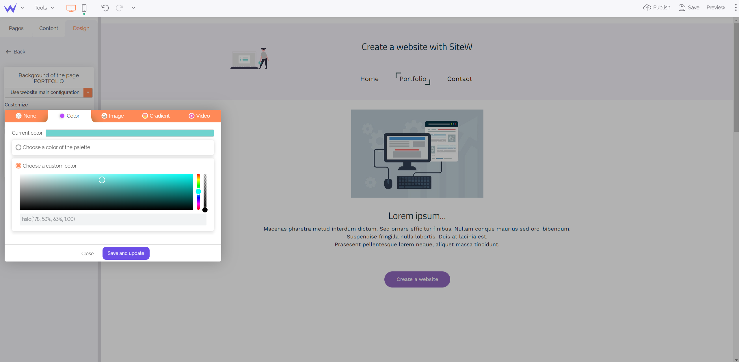
The first window enables you to edit your page background. You just need to click on “Customize” to add these elements:
-
A background colour,
-
An image,
-
A gradient,
-
A video.

All your pages will be modified in a few clicks.
However, if you want a single colour on all your pages, it’s possible that some content areas become less readable.
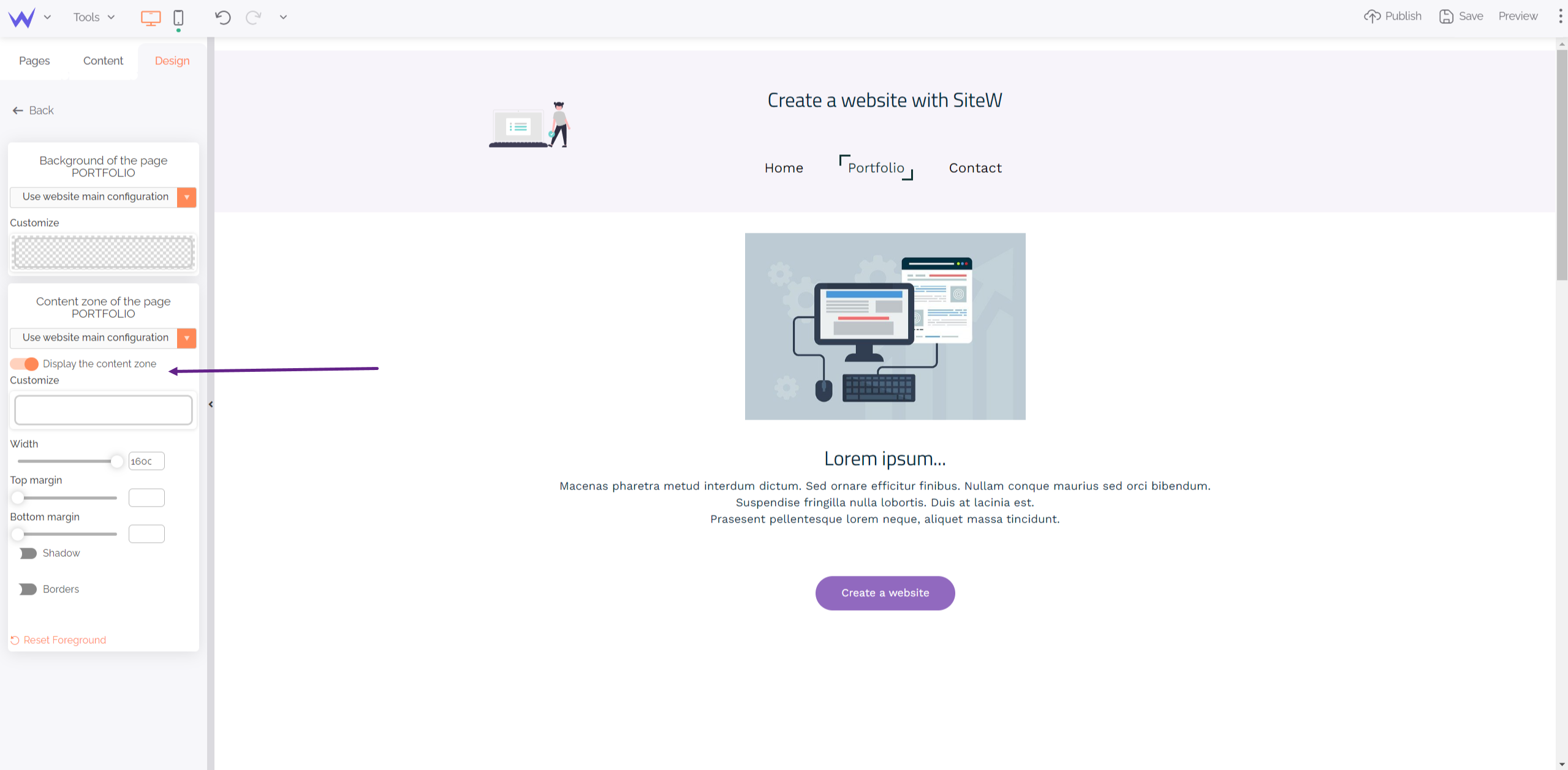
Don’t worry! Check the second window on the left called “Content zone of the page” and enable the button to display this zone. Thus, you’ll display a dropdown menu:

In this tutorial, the content zone has shadows to be more visible. You can modify its borders, colour, opacity, or style as you wish.
For colour, you have different options:
-
Keep content background transparent,
-
Use a colour of your palette,
-
Create a gradient.
You just need to move settings to find the background that suits you well, and that’s it!

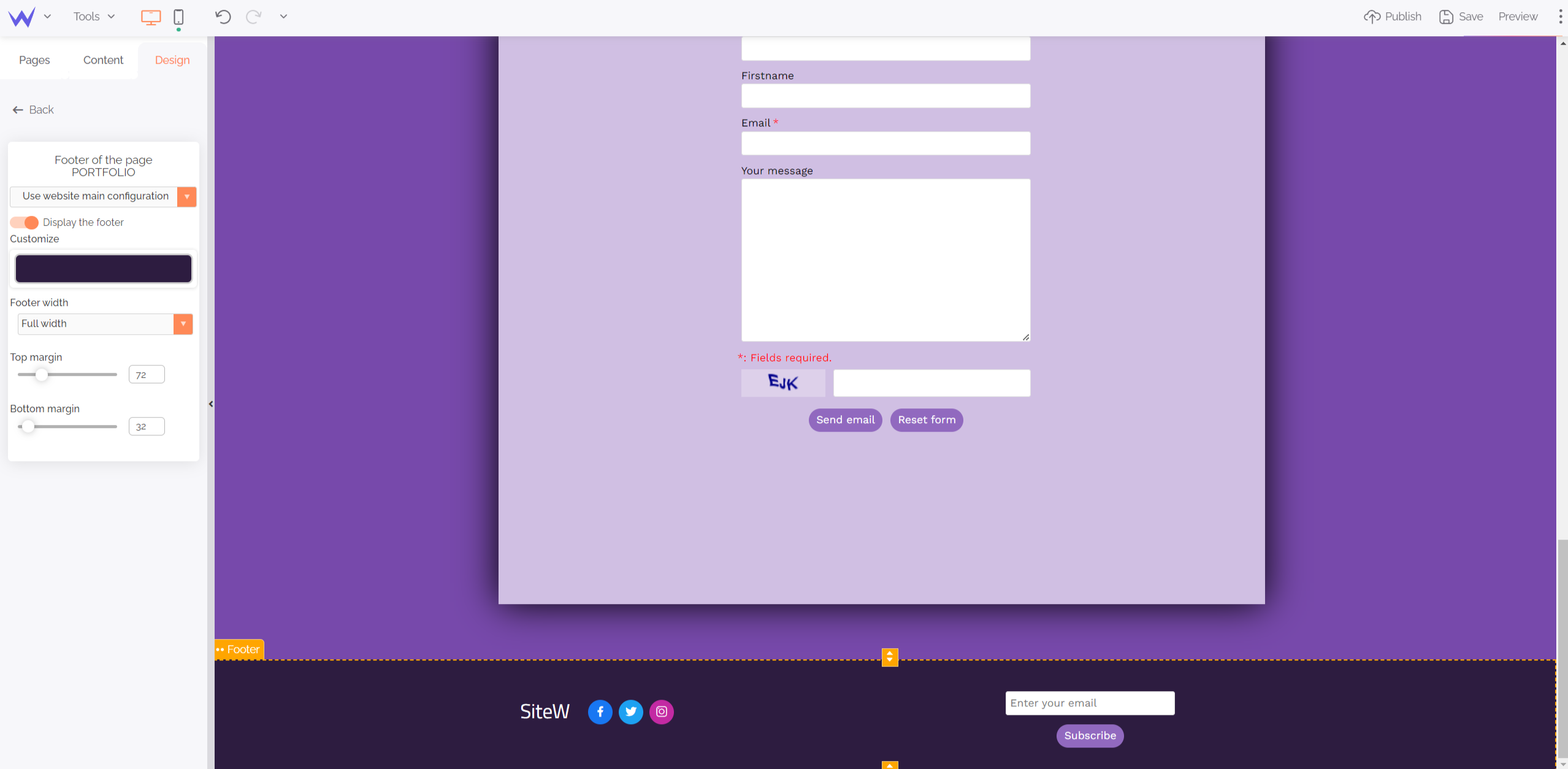
Final step: your footer.
The footer is an essential part of your design because it presents important information, such as legal notice, call-to-action buttons or, sometimes, a contact form.
It is at the bottom of each page and can be modified by clicking “Footer” next to “Website background and content area”.

From borders to colours, you can design a footer that matches the rest of your website to be able to add information easily.
Website elements
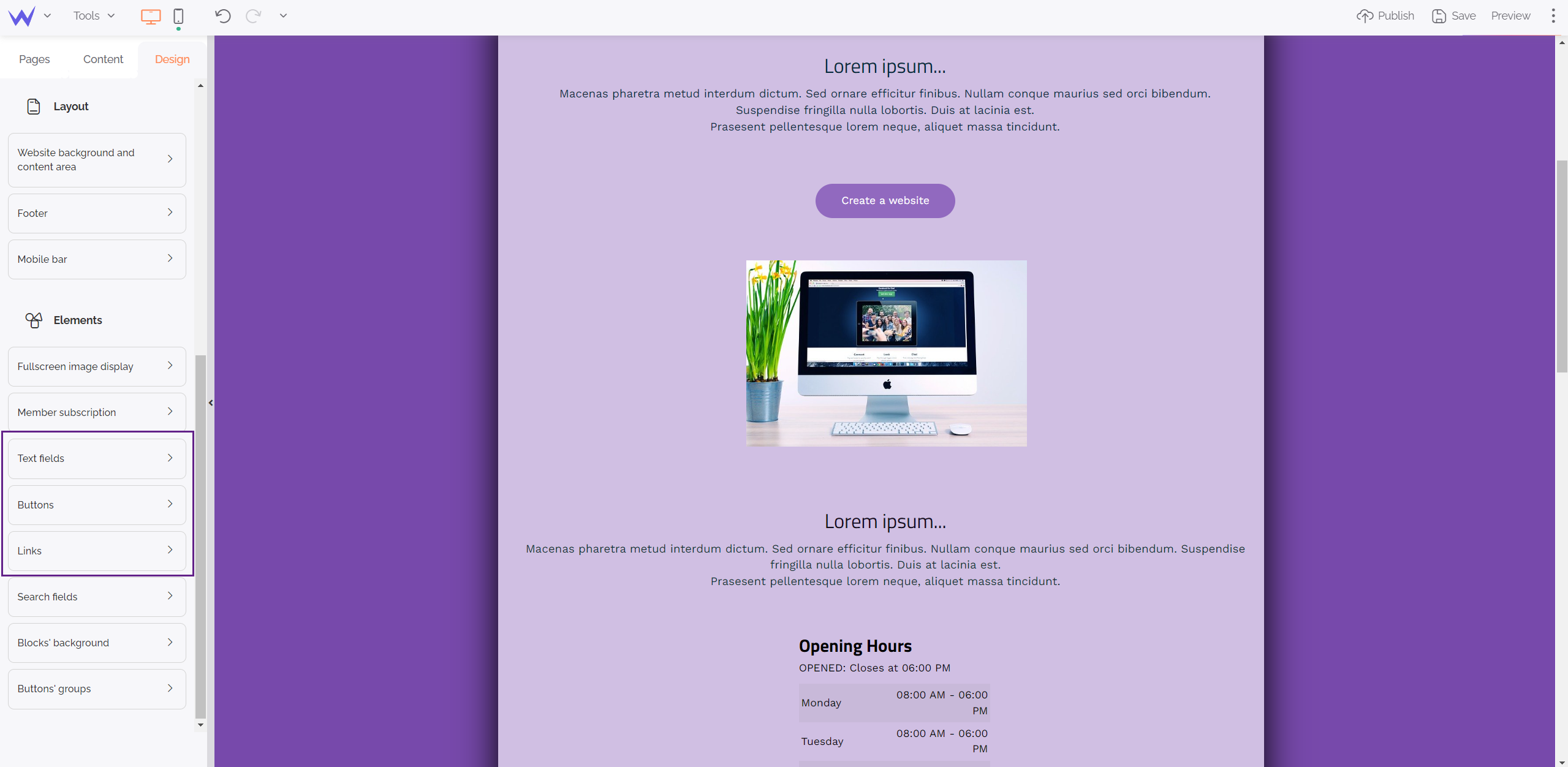
Under the Layout category, you will find the “Elements” category, with many possibilities for your website design. You’ll be able to create a custom design while saving time.
First, let’s begin with an important graphic element of your website: images.
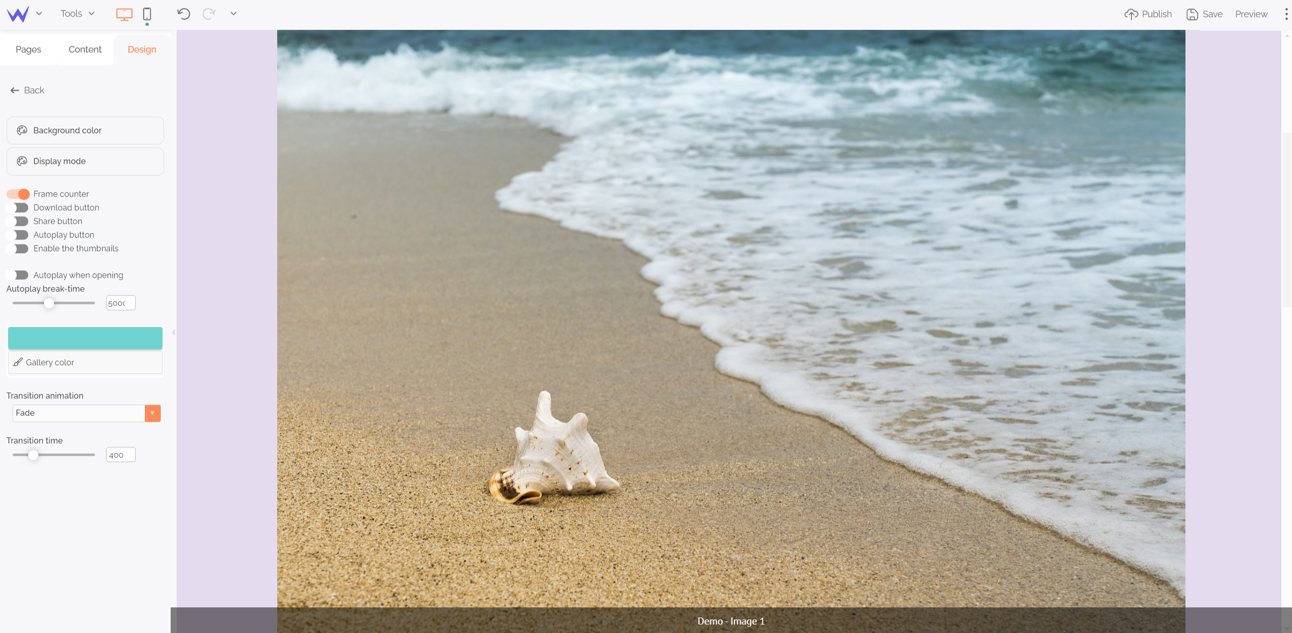
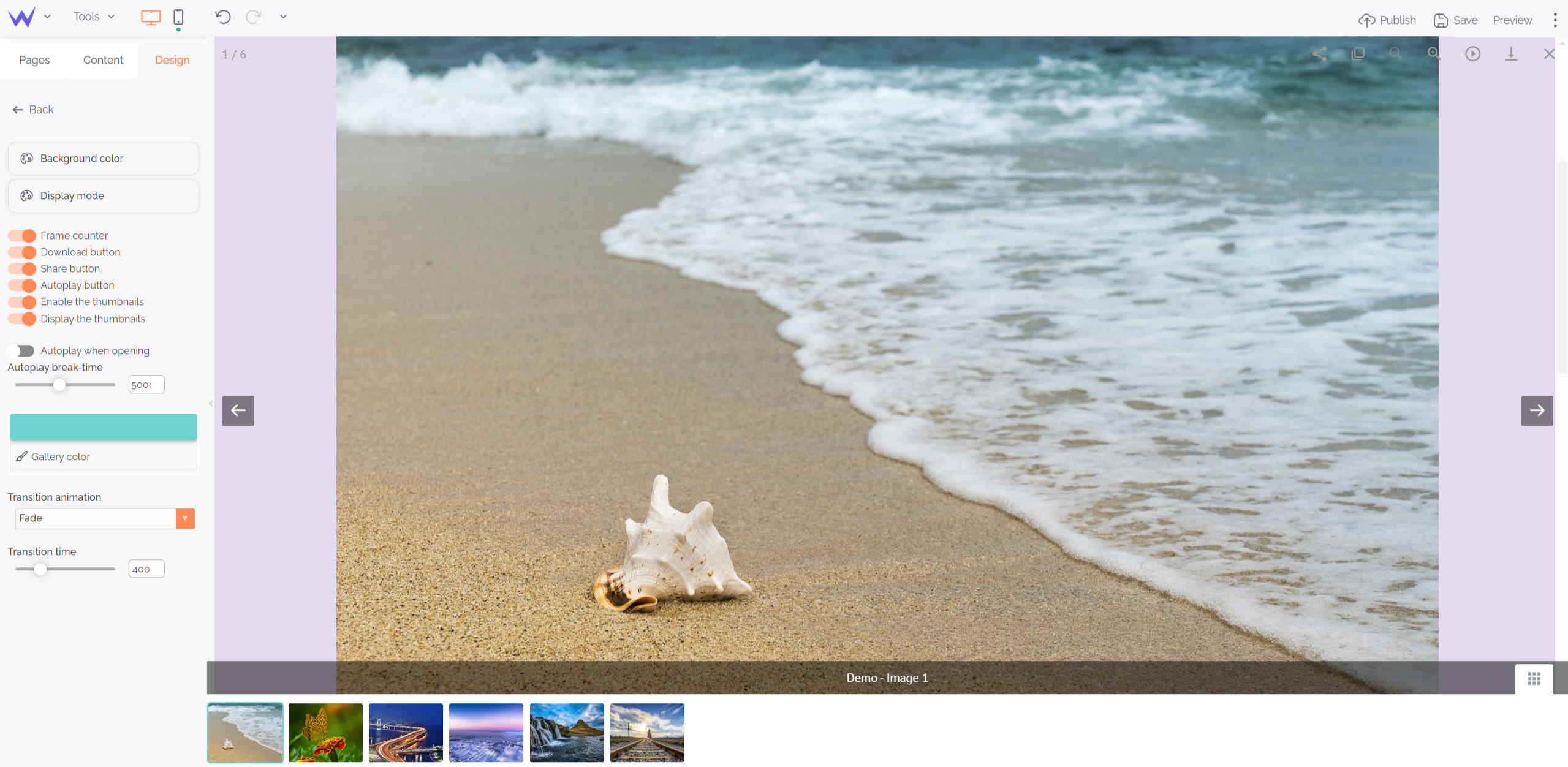
When users click your images, they’ll automatically have a full-screen display. You can choose the settings of this type of display to have the same on each page of any gallery.

Enjoy all the ready-to-use possibilities: background colour, time between images, transition effects, download…

Here are all your modifications!
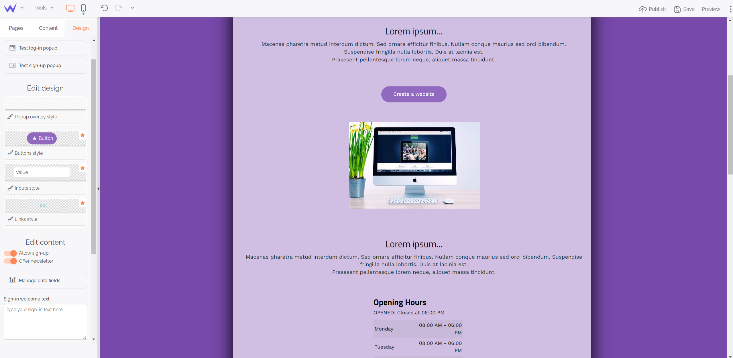
You can modify the content of sign up, sign in windows and edit design.

A form has a background, a button, fields to complete and links. You can configure these elements separately from the form in this Elements section.

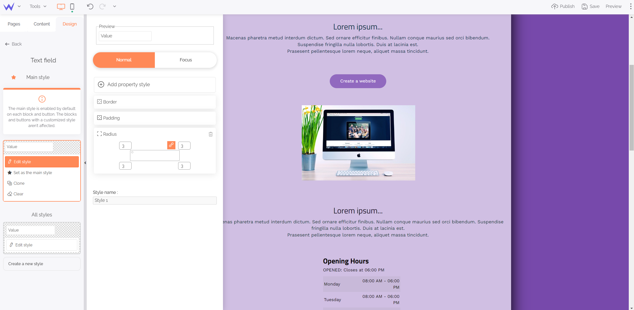
For example, when you modify the text field of the form, you are redirected to the global customization of text fields, like that:

You just need to click “Edit style” to be able to configure.
💡 Remember to name your style. Thus, you will more easily find it if you want to create different ones.
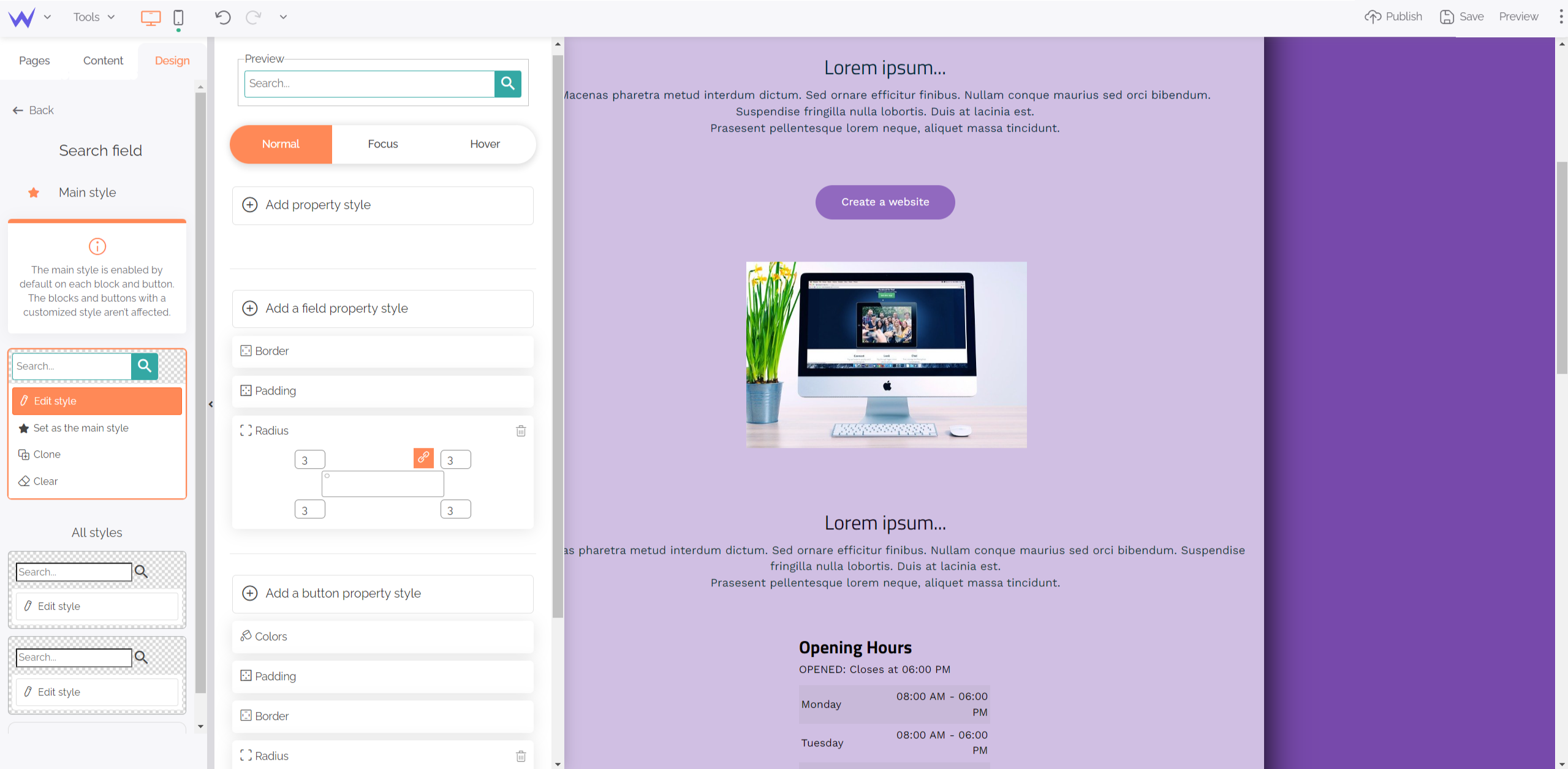
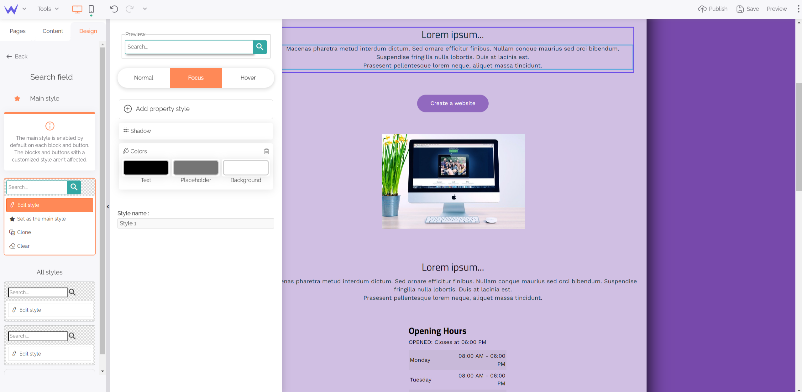
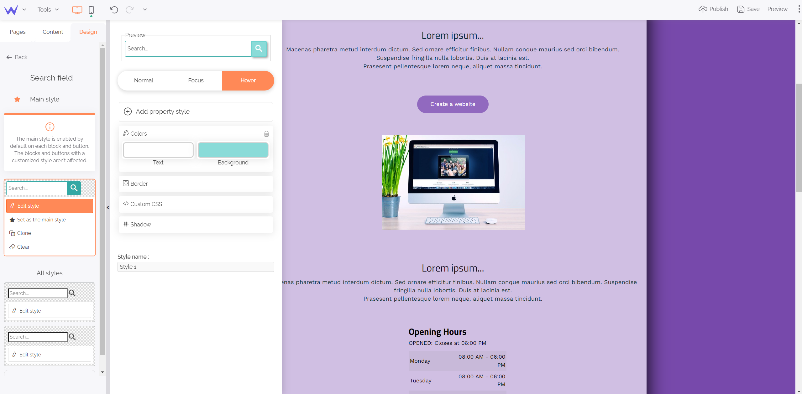
Search fields concern all your website elements, such as search or browsing bars. You can apply a predesigned style to them in these following cases: Normal, Focus, Hover.

The Normal mode means your search bar doesn’t interact with users. You can modify each aspect: button and background colour, fonts, size, radius, borders…
You’ll also be able to add CSS code if you want to go further.
Then, you can define the style of your search bar when users enter keywords.

You can modify the colour of the entered text, as well as the background or shadow behind your search field.
Finally, you can edit the style of your browsing bar on mouseover by clicking “Hover”.

Thus, you’ll enjoy advanced customization without loosing time.
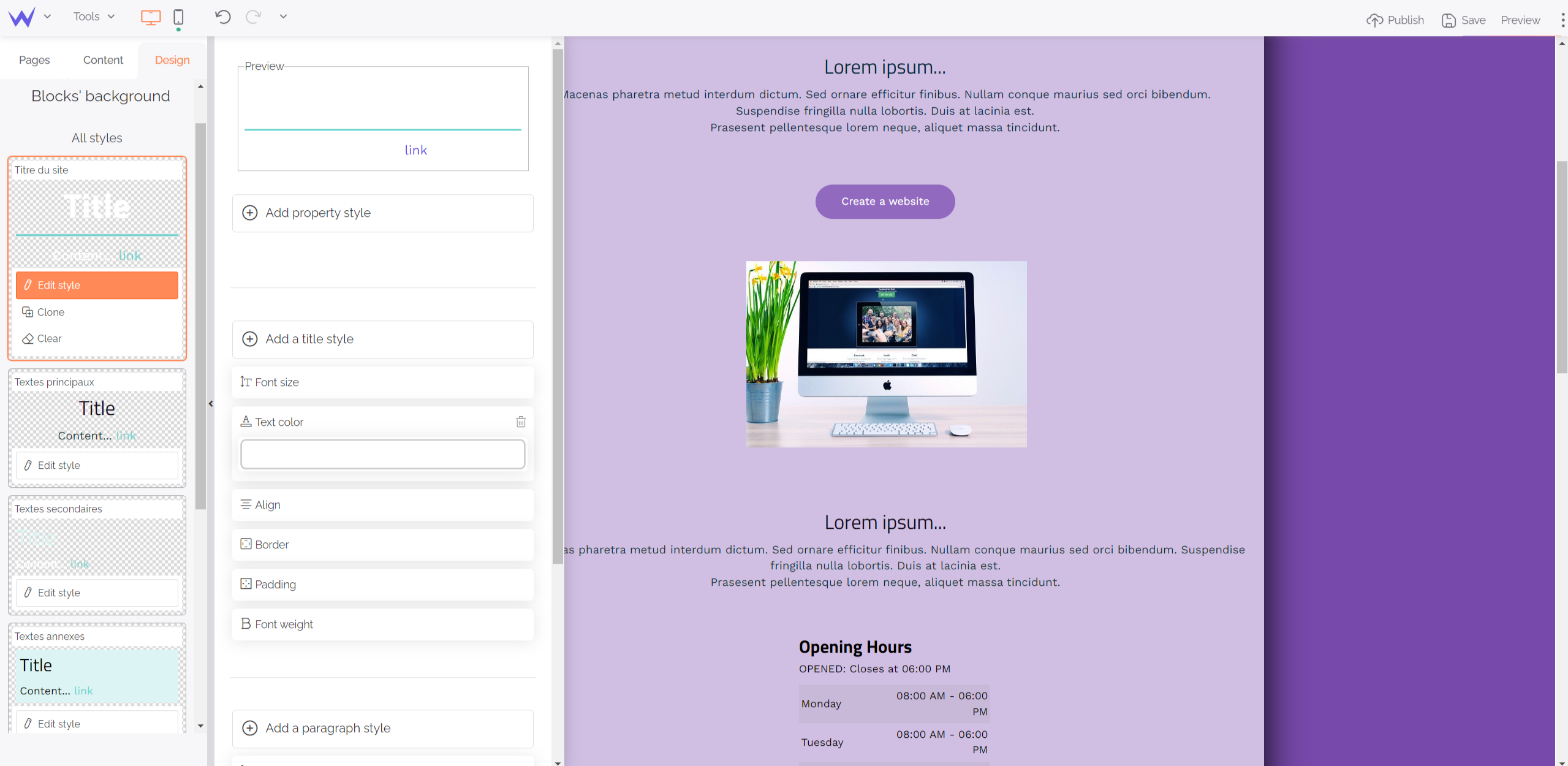
Block backgrounds can also have their style that will be the same on each page.

This section enables you to modify your Text blocks, such as titles and paragraphs. You can preview directly in the editor to anticipate more easily.
You can define your style for each element: fonts, colours, sizes, borders…
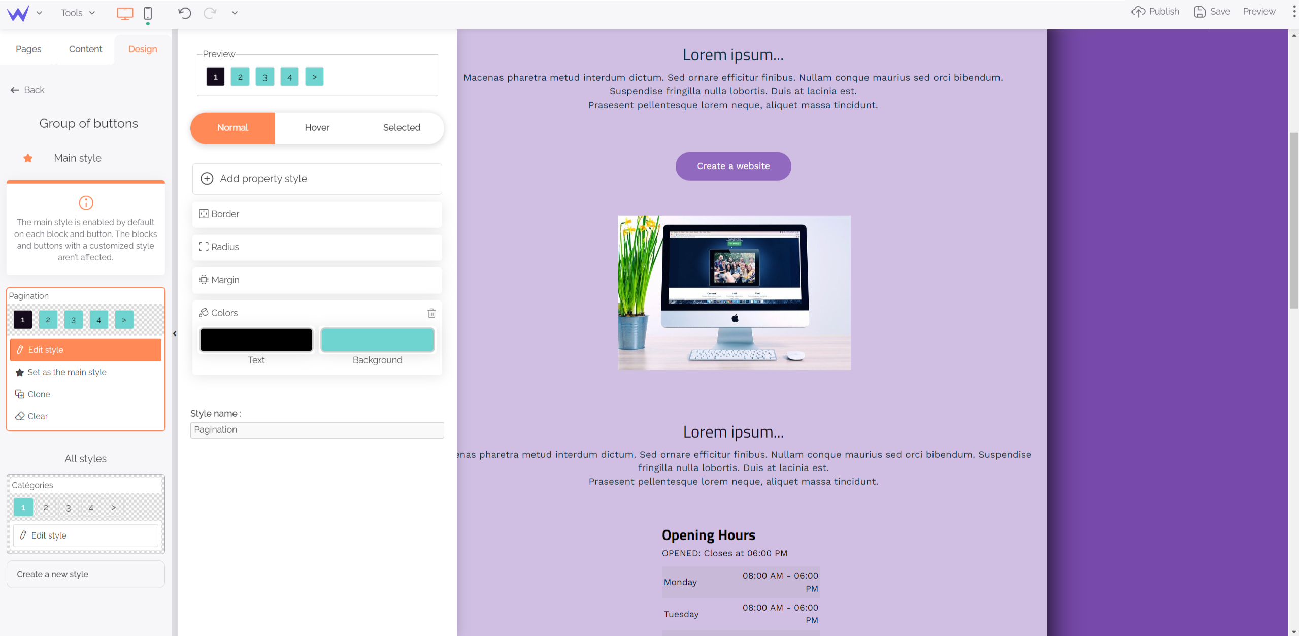
Once you have edited the style of your buttons, you can modify all your buttons to have a perfect, homogeneous design.

You also have three customization menus for your button groups when they’re normal, hovered or selected by users.
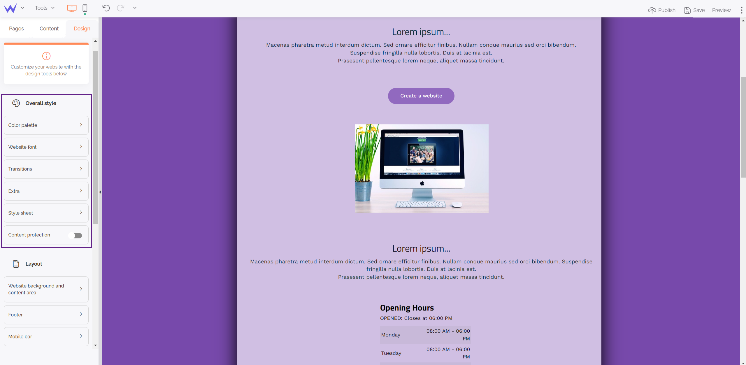
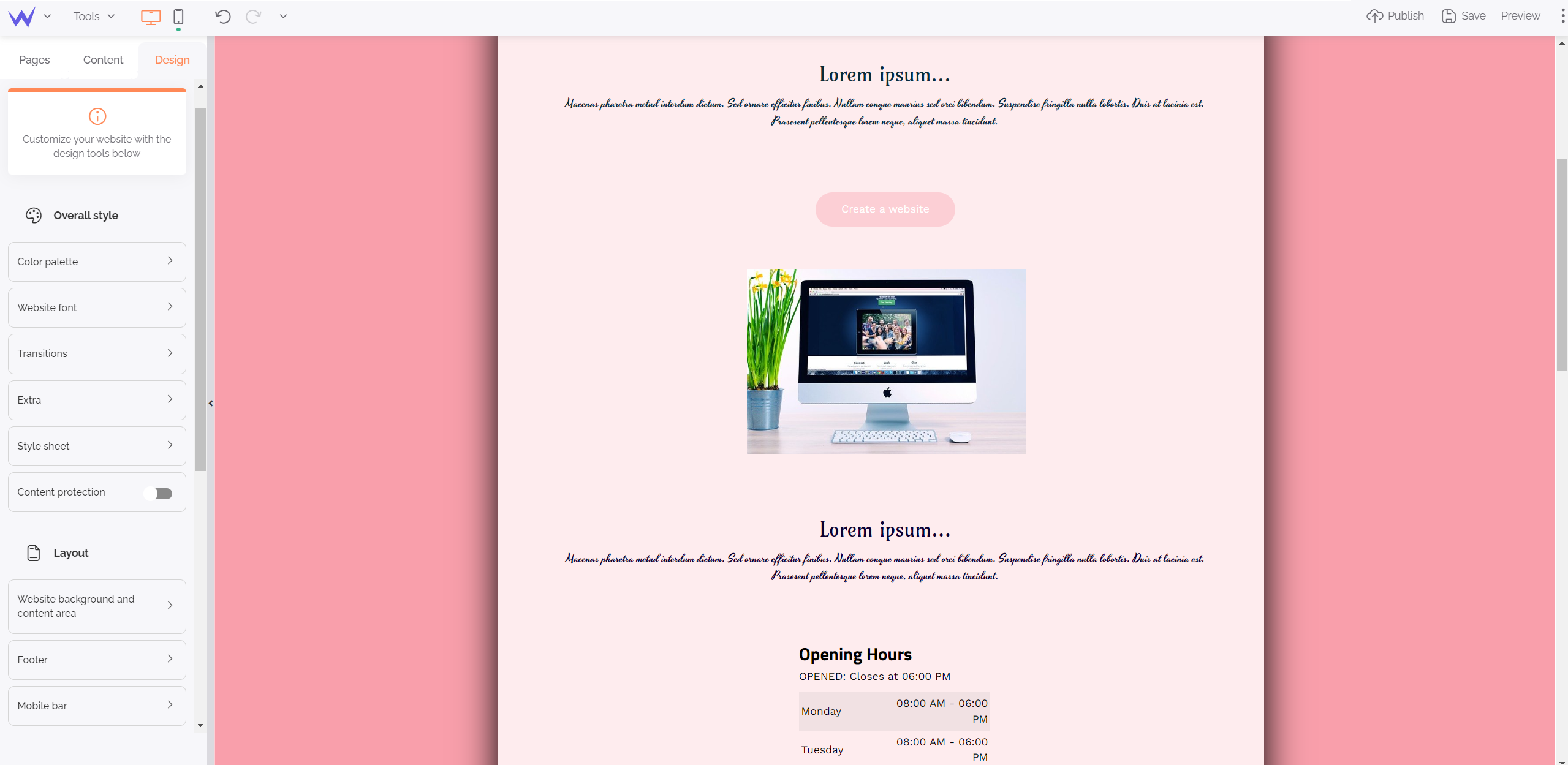
Overall style
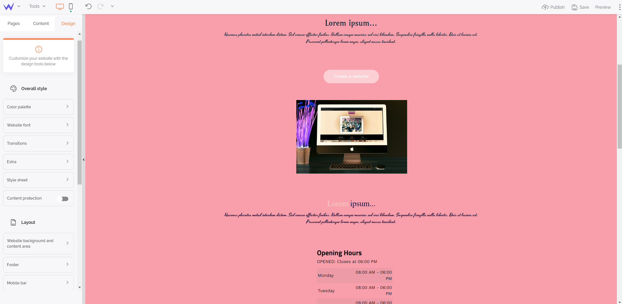
Now let’s have a look at your website overall style. You have the possibility to edit everything transversely to ensure all your graphic coherence.

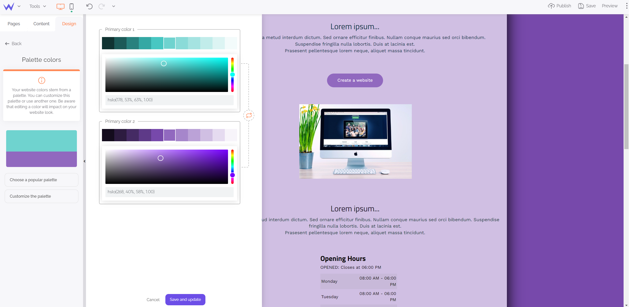
The colour palette is essential for your graphic charter. The coloured harmony must be coherent from the first to the last page of your website.
To that end, the colour palette enables you to anticipate all your website colours to find them more easily when you want to edit the design of an element.
(Effectively, we have changed the colour again, as we can change endlessly!)

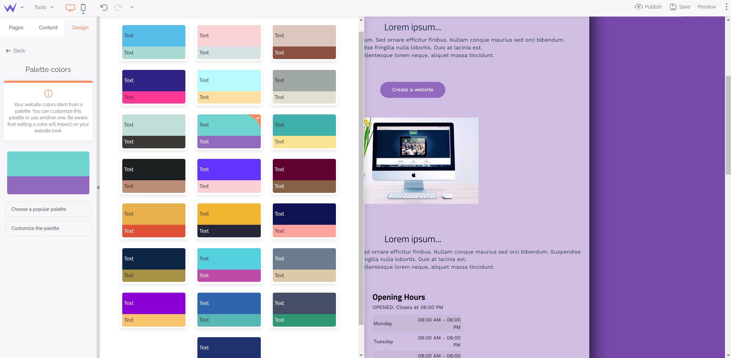
You can also consult a few popular palettes to draw your inspiration and consider new coloured harmonies.

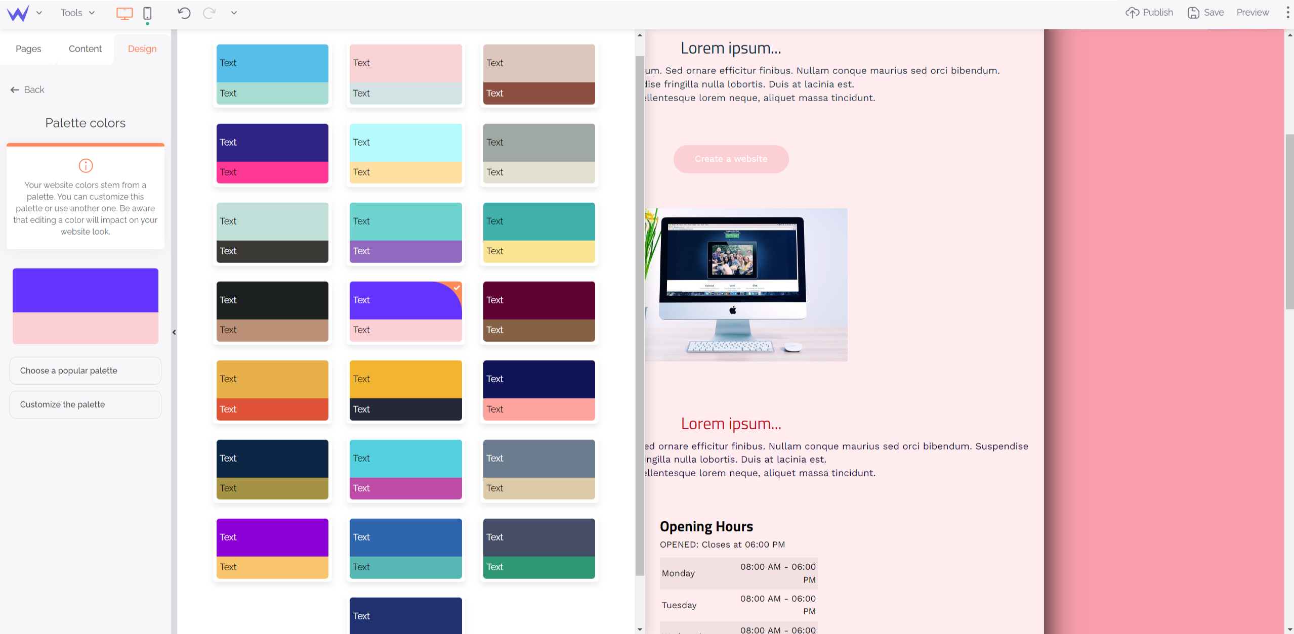
Your website changes immediately when you choose your new palette:

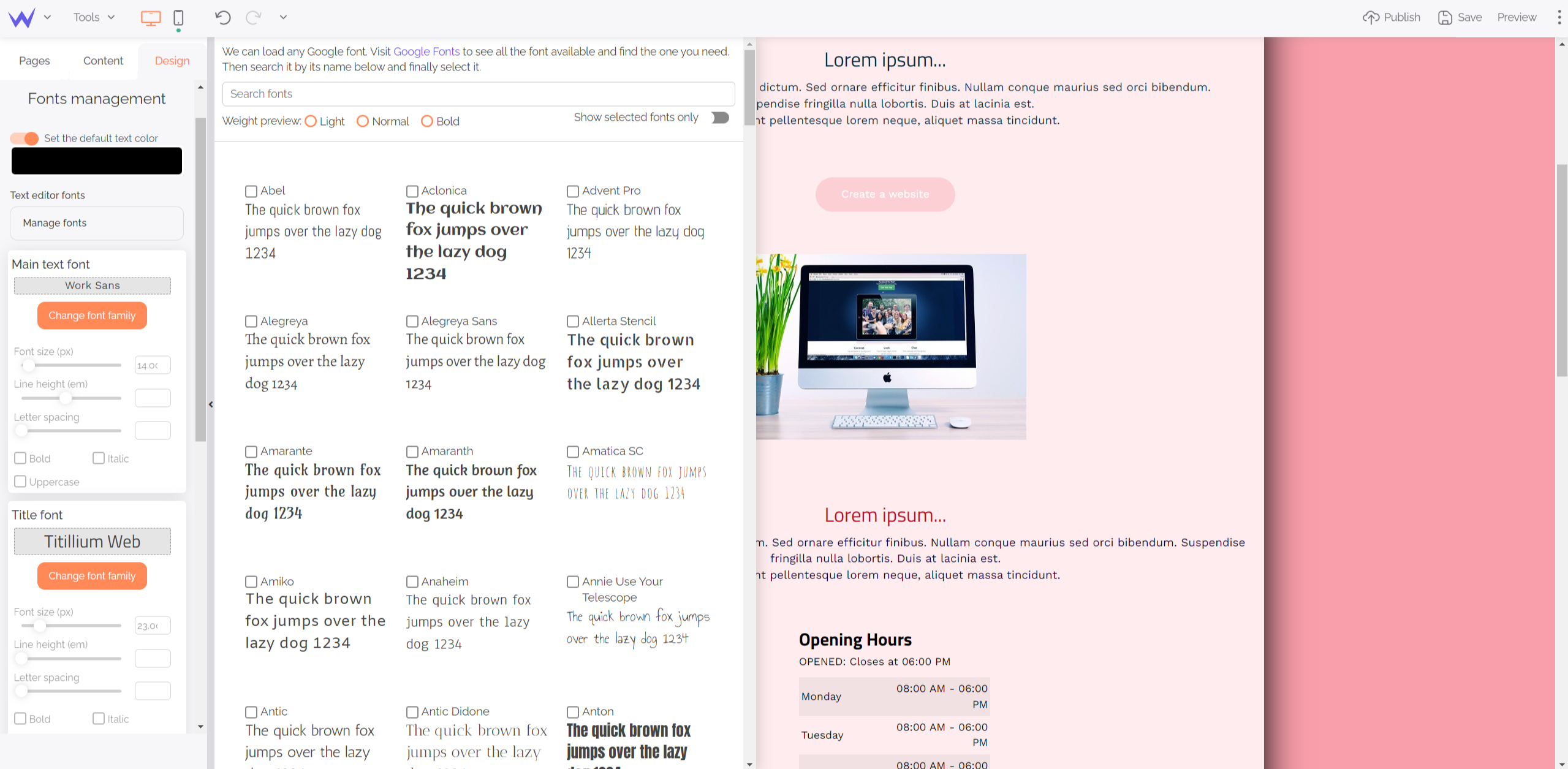
You can also define fonts for all your website to save time when you write content.

Consult the different fonts at your disposal, or search the fonts that suit you best directly thanks to the search bar.
You can modify everything in a few clicks!

For a more original website, you can add transitions and animations.
Transitions refer to movements between pages. You have several types of transitions, such as fade or slide, among others.
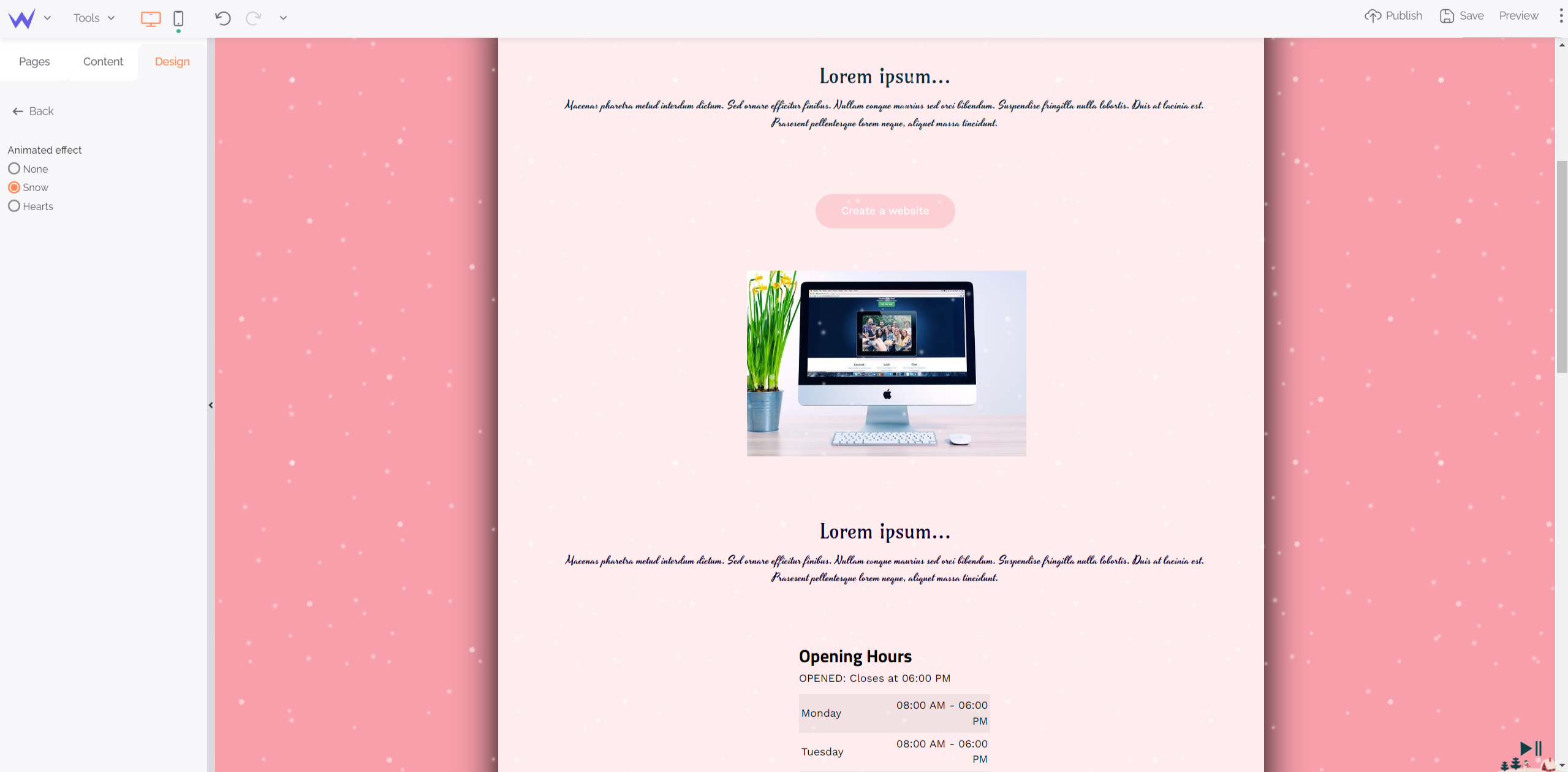
Then, extra enables you to add themed animations to your website, such as snow or hearts.

These animations are valid for all your website and can be easily disabled by users if they want.
To go further
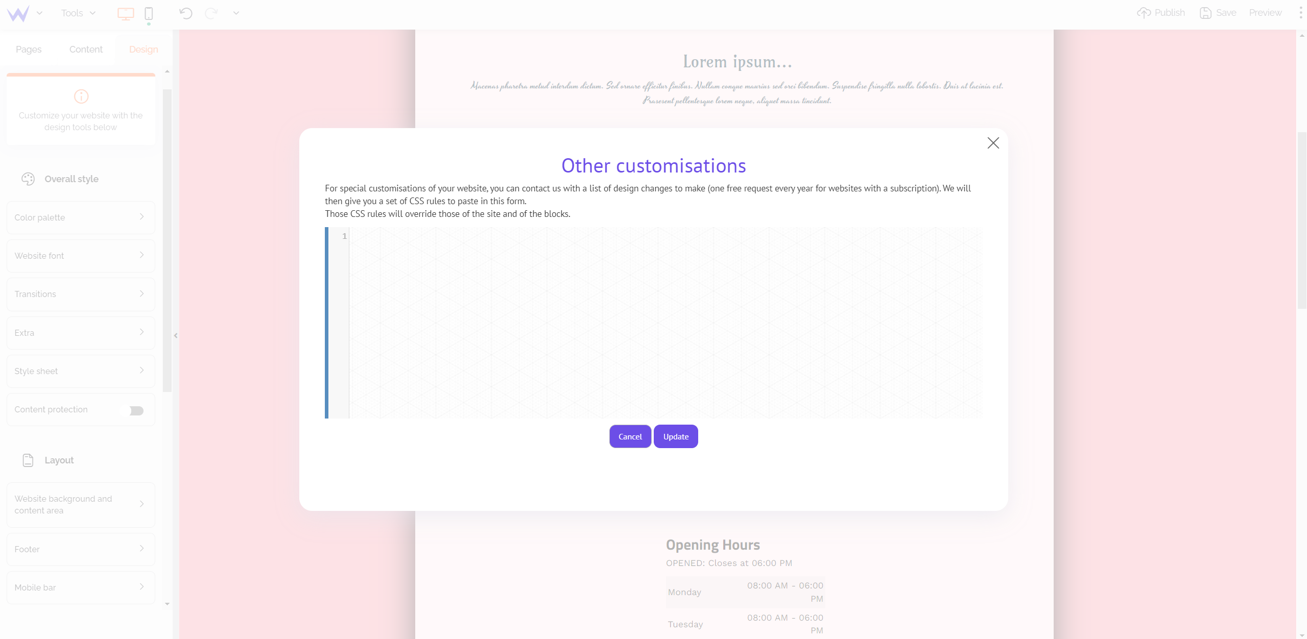
If you want to go further, click Style sheet to embed CSS code that will be given by the SiteW team on request.

Now you know how to customize all your website and create a coherent graphic structure.
However, it would be judicious to have an element that stands out from the rest, such as a call-to-action button?
Don’t tell more about that! Here is how to customize some website elements for a professional and detailed design.
Customize your website in detail
Do you want an orange button on a blue background? A picture instead of an icon, or a title with a different font?
Edit each element you want to highlight for your graphic coherence to grab visitors’ attention and boost their visibility.
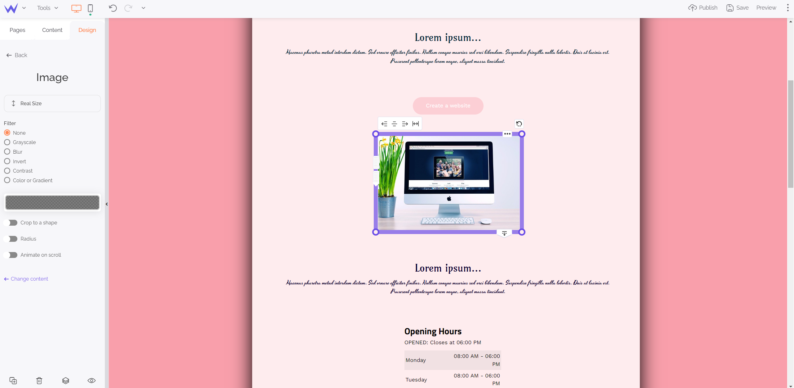
Change the colour of an illustration
To that end, you must select your blocks in the “Content” section. Here is an example below.

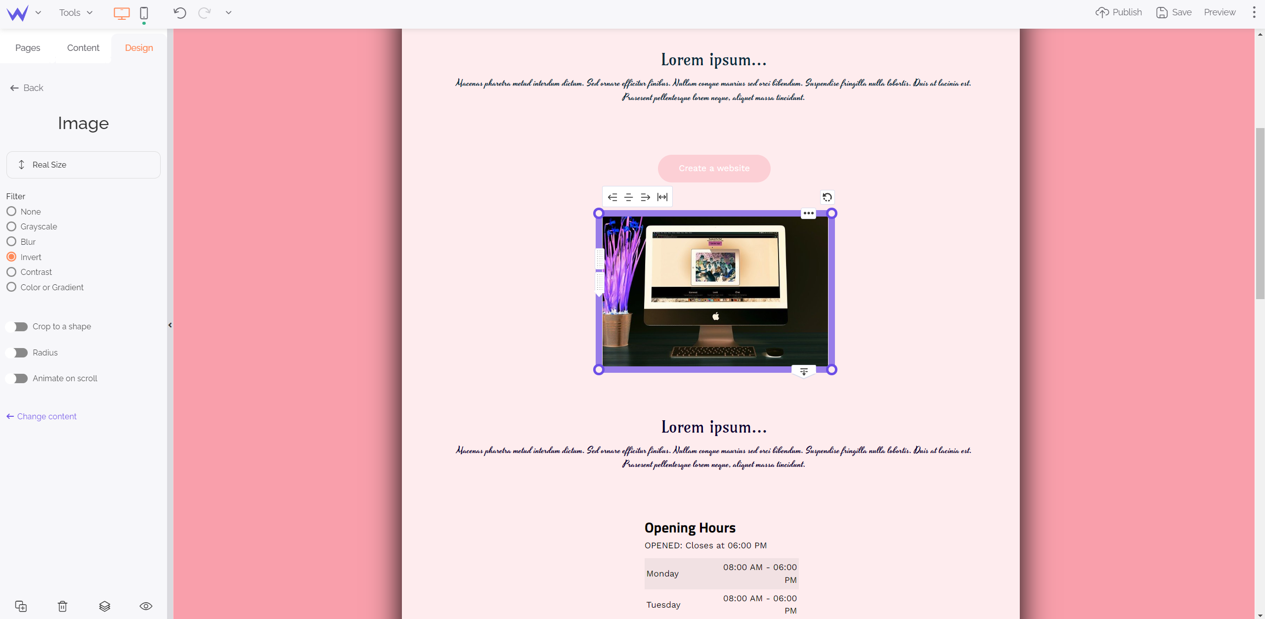
At the bottom of your lateral menu, you will see a Design button. Click it to customize the visual element only, and not touch other illustrations.

Made it! The visual element has inverted its colours in comparison to the rest of your graphic charter to highlight it.
Change a font on your website
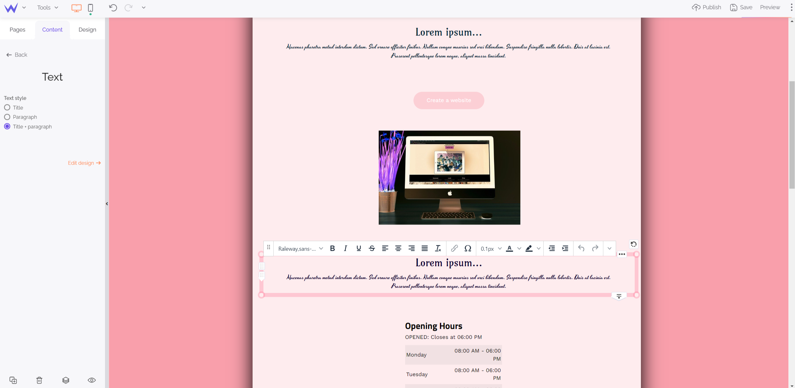
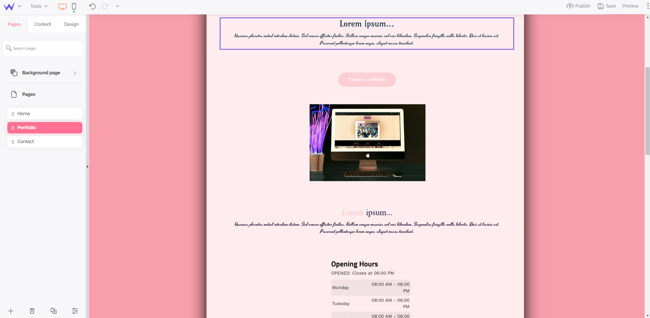
Do you want to highlight a title or paragraph on a page? You can change your main style by going to the content area of the editor and clicking the text you want to change.

You see a white bar above your Text block: this bar enables you to change the settings of your title, paragraph, or both at the same time.
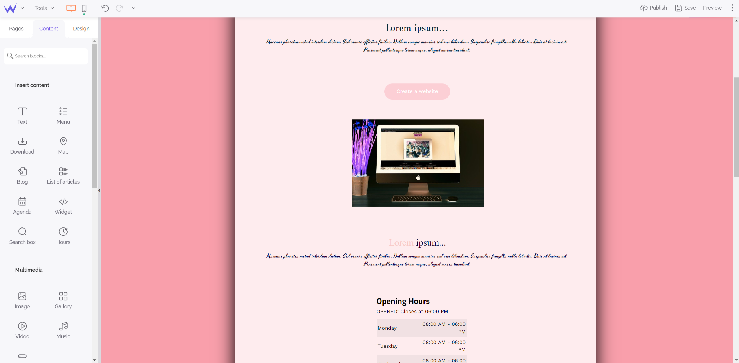
For example, we have changed the formatting of the title, but we haven’t changed subtitles.

As you can see, you can just modify a few words in a title for an original and memorable effect for your visitors.
Add a background image or video to a website
You have probably seen these websites, especially online stores, that have a background video on their homepage to showcase their products.
The SiteW editor enables you to add a background video or photo to one of your pages quickly. The element you will implement won’t become your main style.

First, go to the Pages tab of the editor to select the page you want to edit.
Then, go back to the Design tab and click the section called “Website background and content area”.
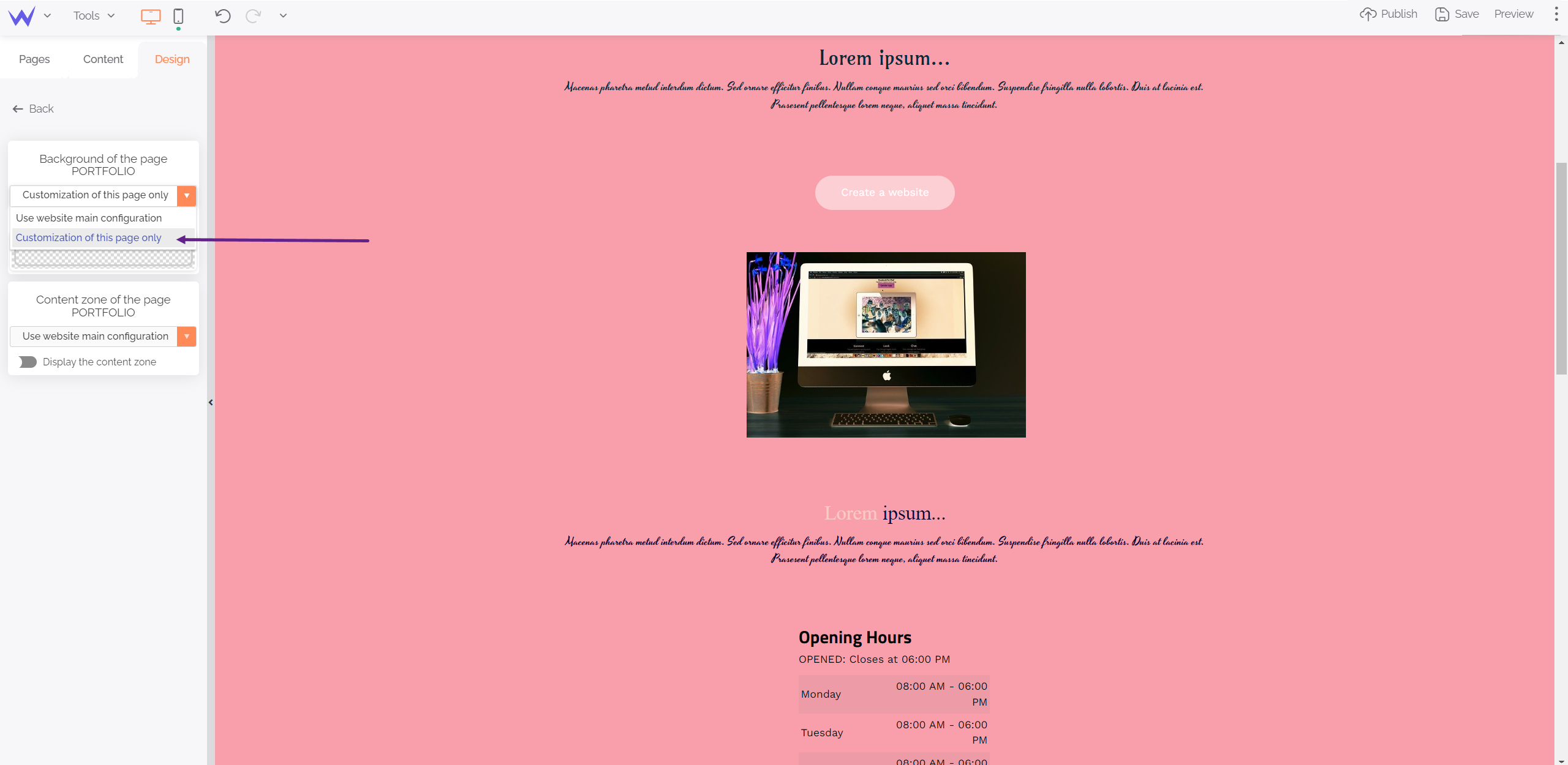
By clicking the arrow, you will display a small dropdown menu:

This will enable you to edit the background page where you are without modifying the style of other pages.
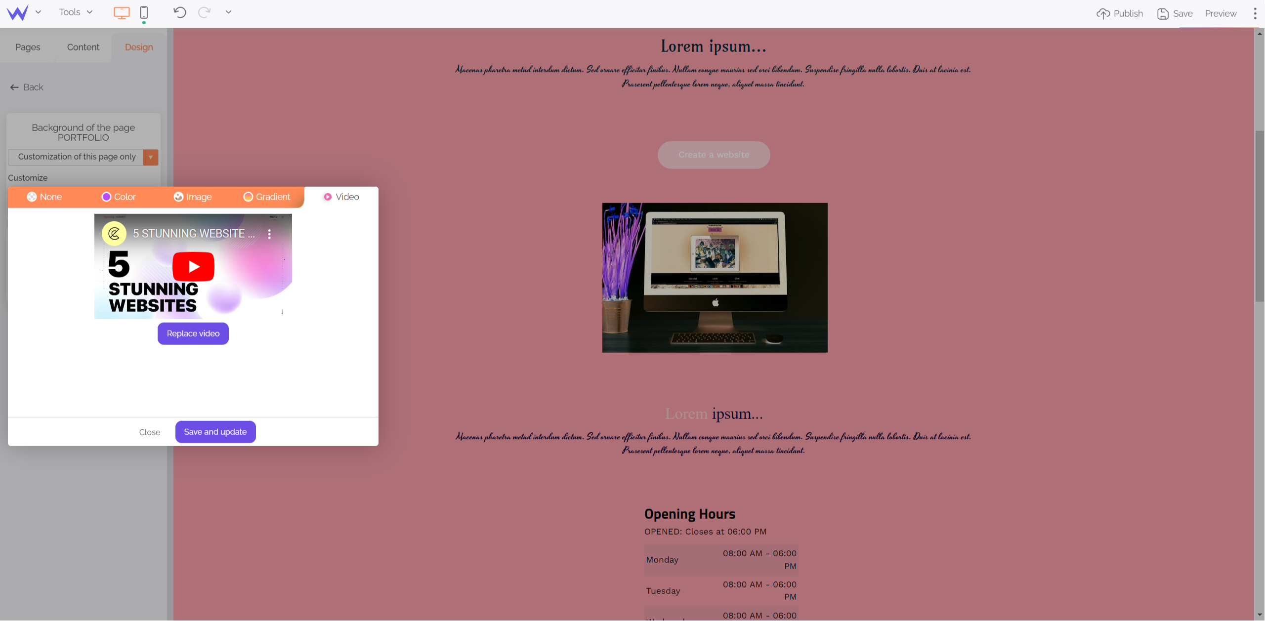
By clicking Customize, you can choose between the following options:
-
None
-
Color
-
Image
-
Gradient
-
Video

In this example, we will add a video (or replace the current one). Here are two options:
-
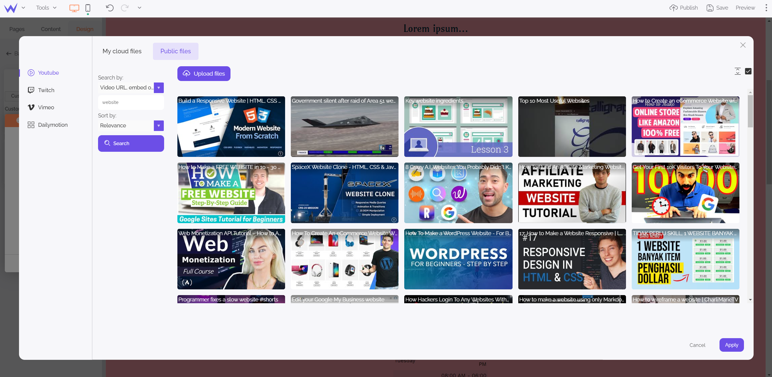
Use your videos and download them in your private library
-
Or search on YouTube, Twitch, Vimeo, or Dailymotion

With a search by URL or keywords, you will find the appropriate videos quickly among all the platforms for video sharing.
You just need to select your video, confirm your choice, and that’s it!

Fantastic, isn’t it?
In general, call-to-action buttons are essential for successful digital marketing strategies.
Thus, on a landing page or homepage, they must be highlighted related to your main graphic charter.
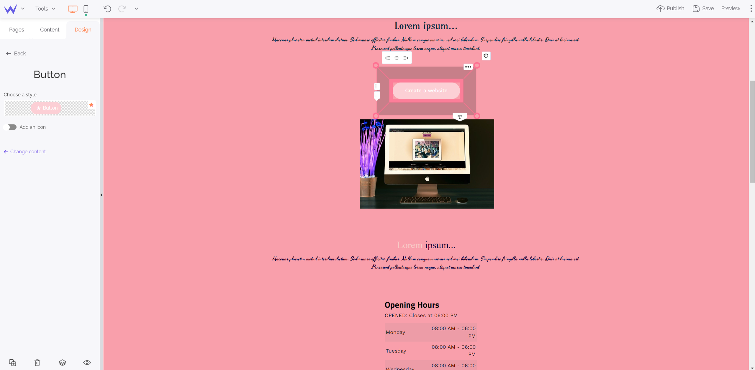
To that end, select the button you want to edit.

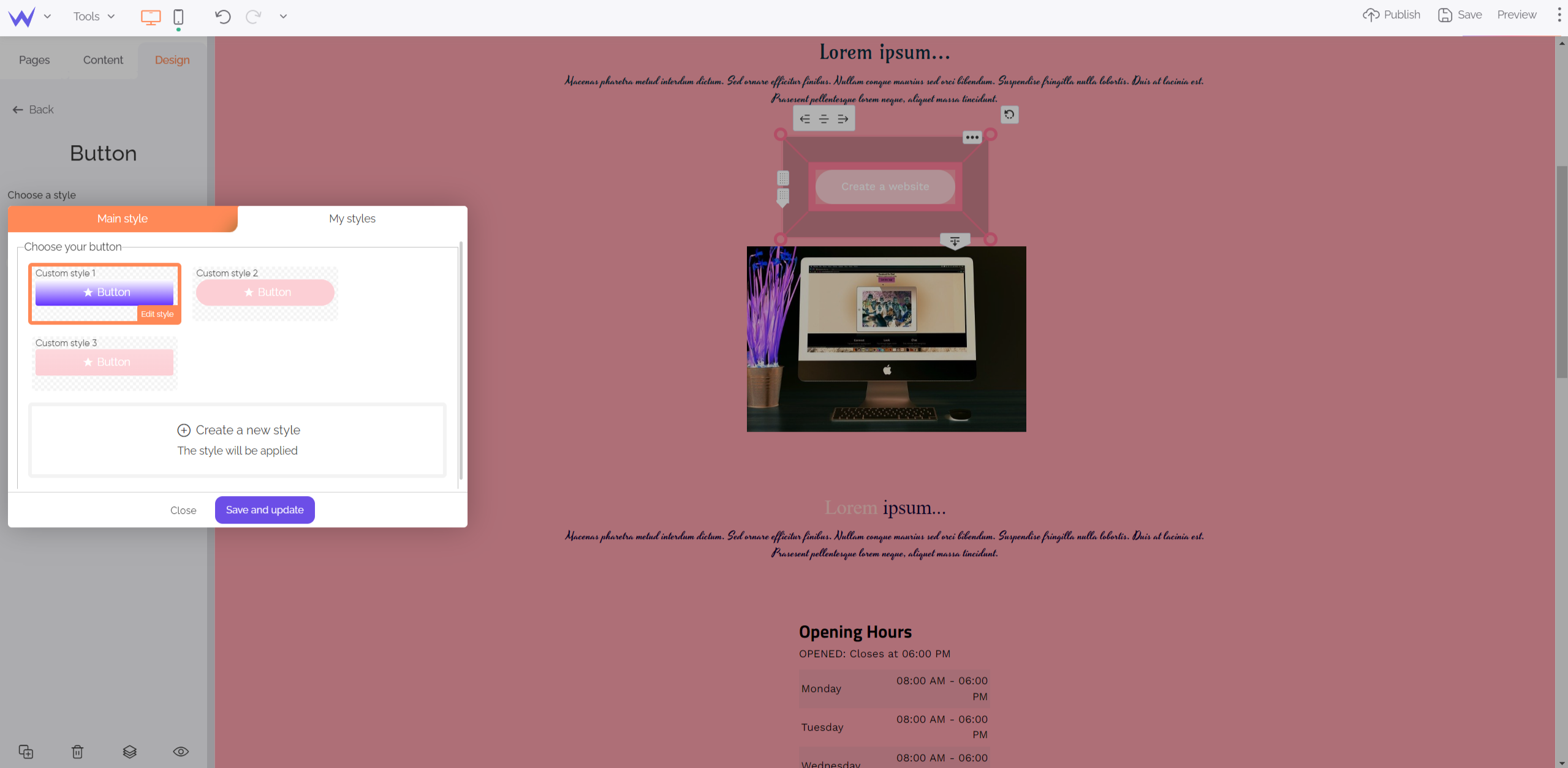
On the left panel, you can click Choose a style to apply a predefined style, or create its own style.

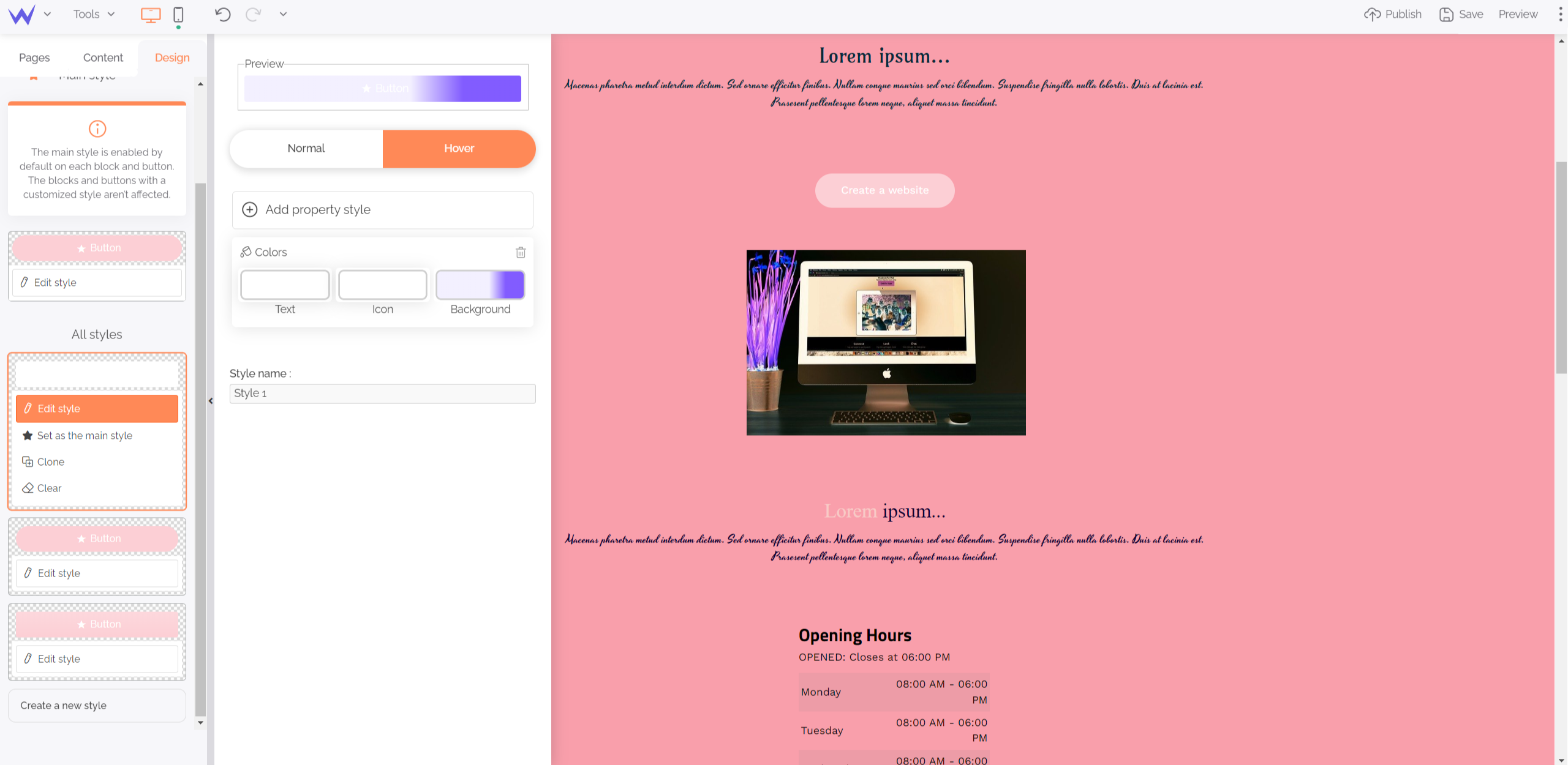
For example, on this pink graphic charter, you can choose a colour that stands out, such as a blue shading. Thus, your button will be showcased while being easy on the visitor’s eye.

You can customize everything quickly. You can keep this style to apply it to other buttons you want to highlight on other pages of your website.
This edition principle works on a case-by-case basis for several blocks:
Thus, you can play with overall styles and details to create a custom website.
Finally, it’s easy to build and customize your website to suit your desires and needs.
Become web artists with SiteW!
